

How Row Headers Work
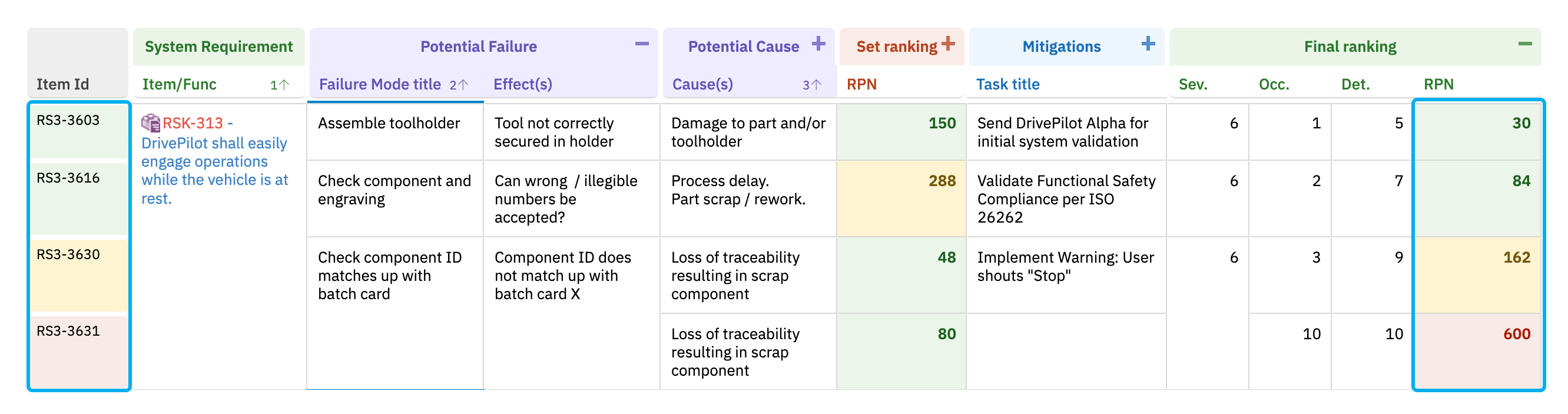
Row headers appear on the left side of the grid and display the work item ID (systemItemId) for each row. You assign a custom renderer function in the sheet configuration that applies conditional CSS classes based on work item data.
1
Define the Row Header Renderer
Row header renderers live in the The function uses
cellDecorators section of the sheet configuration. Each function receives an info object exposing the cell and the underlying work item, and uses the jQuery $(info.cell).toggleClass(...) form to add or remove CSS class names on the header cell:info.item['fieldId'] to access any field on the work item. In this example, it reads the rpnNew field (revised RPN after mitigations) and applies color classes based on configurable risk thresholds.Row headers use the same
$(info.cell).toggleClass(...) form as cellsRow header decorators use the same jQuery $(info.cell).toggleClass('className', condition) form as cell decorators for regular columns — this is the form the product’s reference templates use. (The wijmo signature wijmo.toggleClass(info.cell, 'className', condition) is an equivalent alternative — it converts to the same $(info.cell).toggleClass(...) call — but it is not the canonical form.)2
Assign the Renderer to Row Headers
Reference the renderer function from the The
headers.rowHeader.renderer property:renderer value must match the key name in cellDecorators exactly.3
Define Supporting Styles
The CSS classes referenced inside the renderer must be declared in the Use 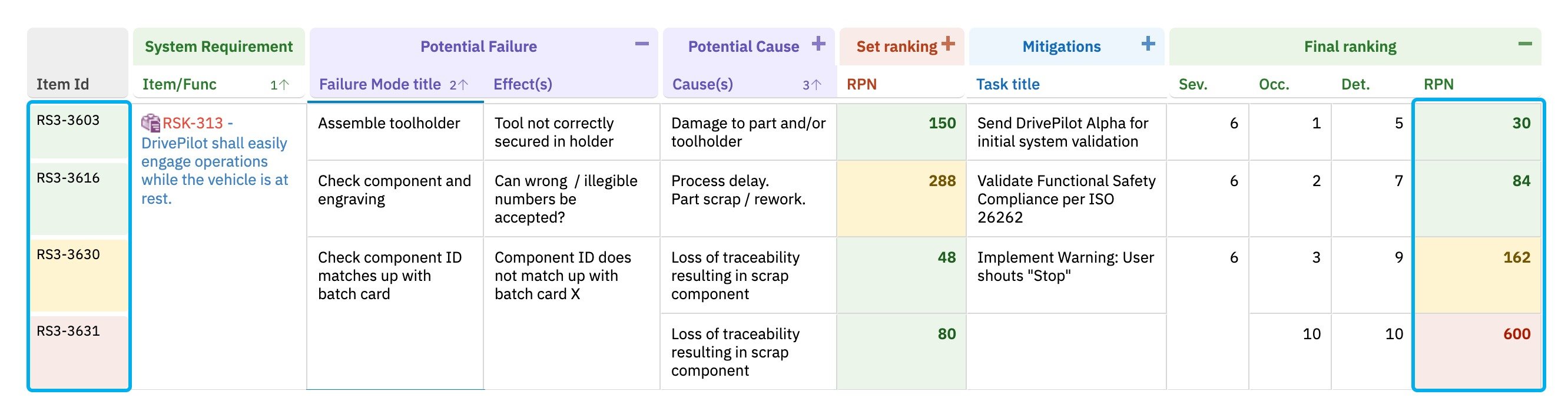
styles section. Each style value must be wrapped in {} braces:!important so the row header styling overrides the default grid theme.Row Header Renderer with Enum Values
For row headers colored by an enum field such as severity, compare against the enum IDs (not the display labels):Row Header Merging
When using multi-level hierarchies, row headers merge vertically for consecutive rows that share the samesystemItemId. This creates a single colored header cell spanning multiple sub-rows:
- Multiple rows belonging to the same work item (for example, multiple causes for one failure mode) display a single merged row header.
- The merged row header color is based on the parent work item’s field values, evaluated once per group.
Complete Example
A minimal end-to-end sheet configuration that wires togetherheaders, cellDecorators, and styles:
Troubleshooting
Verification
After saving your sheet configuration changes and reloading the page, you should see:- Row header cells colored based on the field values evaluated by your renderer.
- Low-risk items with green row headers, medium with yellow, and high with red (for the RPN-based example).
- Merged row headers maintaining a single consistent color across hierarchical multi-level row groups.
See Also
- Configure Cell Styles — style definition fundamentals
- Apply Conditional Formatting — cell decorator function reference
- Configure Item Colors — severity-based coloring patterns
- Styling and Formatting — overview of all styling options