

How Cell Styles Work
The styling system uses three interconnected configuration properties in the sheet configuration:styles— defines named CSS class rulescellDecorators— JavaScript functions that apply CSS classes conditionally based on cell valuescellCss/headerGroupCss— static CSS class assignment per column
cellRenderer property. The function name in cellRenderer must match a key in the cellDecorators section.
1
Define Style Classes
Add CSS class definitions to the
styles section of the sheet configuration. Each key is a CSS selector pattern and the value is the CSS rule. Style values must be wrapped in curly braces {} — without them, the styles will not be applied:Style Naming Patterns
2
Apply Static Styles to Columns
To apply a CSS class to every cell in a column regardless of its value, use the For header group styling, use
cellCss property on the column definition:headerGroupCss:3
Apply Conditional Styles via Decorators
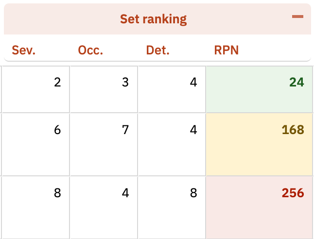
For dynamic styling based on cell values, define a decorator function in the The three Risk Priority Number (RPN) bands above are illustrative — 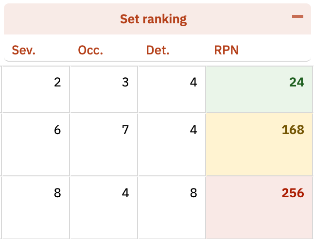
cellDecorators section and reference it from the column through the cellRenderer property. The column property is cellRenderer; the config section that holds the function bodies is cellDecorators:rpn1 (0-150, green), rpn2 (151-250, amber), rpn3 (251+, red). RPN thresholds are user-configurable; choose values that match your project’s risk acceptance criteria.info object with these properties:Always use
toggleClass() — never inline stylesCell decorators must apply styling through $(info.cell).toggleClass() (or wijmo.toggleClass()). Direct inline styles such as info.cell.style.backgroundColor = 'red' will break because the grid reuses cell DOM elements during virtual scrolling. A cell that becomes red for one row will keep that color when reused for a different row whose decorator does not set a style. Using toggleClass() with a boolean condition guarantees the class is added or removed correctly for every cell on every render pass.4
Style Column Group Headers
Use the This creates visual banding where the first row of a group gets a tinted background and the last row returns to white.
firstRow and lastRow pseudo-selectors to apply different styling to the first and last rows within a column group:5
Configure Header Heights
Control the pixel height of column headers and column group headers using the
headers section:6
Limit Row Height
Risksheet does not have a built-in row height limit, but you can control it using a cell decorator with CSS
max-height. Apply the class through toggleClass() rather than directly mutating info.cell.style:Export Considerations
Cell styles carry over to exports differently depending on the format:Verification
After saving your configuration changes and reloading the Risksheet page, you should now see:- Custom background colors and text colors applied to cells matching your style definitions
- Conditional coloring that changes dynamically as cell values are edited
- Column group headers with distinct first-row and last-row styling
- Bold text or other font styling on columns with
cellCssassigned - No visual artifacts when scrolling — because decorators use
toggleClass(), cells reused during virtual scrolling re-evaluate their classes correctly
See Also
- Apply Conditional Formatting — cell decorator function reference and advanced patterns
- Configure Row Header Styles — row header customization
- Configure Item Colors — severity-based coloring
- Add Header Tooltips — informative header tooltips