

What progress bars show
Planningboard renders two levels of progress bar when capacity load visualization is enabled:- Column header bars — appear in the calendar header above each Plan column and aggregate all work items in that time period across every swimlane.
- Cell bars — appear inside individual Planningboard cells and show progress for a specific swimlane–Plan intersection.
Each segment displays a numeric count label showing exactly how many work items belong to that category. When all status counts are zero, Planningboard automatically falls back to the default four-segment bar to prevent an empty or confusing visualization.
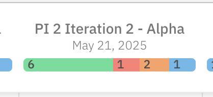

1
Enable capacity load visualization
Progress bars are only rendered when capacity load is turned on for the widget. Open the widget parameters for your Planningboard and set Default value:
capacityLoad to true:falseSave the widget and reload the page. Column header bars will now appear above each Plan column.2
Choose the capacity mode
Planningboard supports three capacity modes that affect how progress bars are calculated and where they appear.Use this mode when different swimlanes (for example, different assignees or teams) have different capacity allocations and you want per-cell visibility.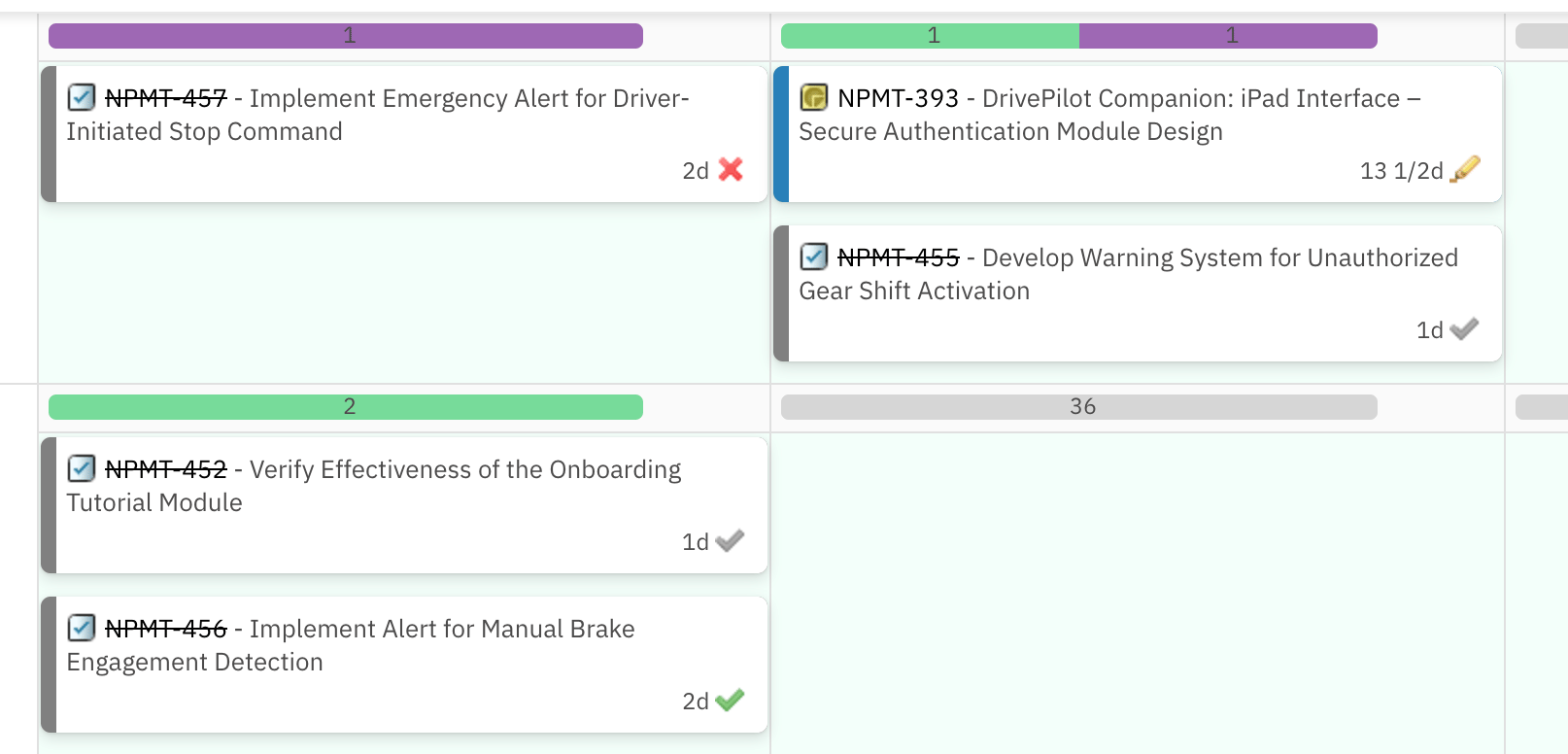
Single (column-level) capacity
The default whencapacityLoad = true. A single progress bar appears in each Plan column header. All swimlane cells share the same column total.Per-resource (cell-level) capacity
SetmultiCapacityLoad = true to render a separate progress bar inside each swimlane cell. Each cell shows its own capacity progress independently of other cells in the same column.User capacity
SetuserCapacityLoad = true together with Teams Service integration to load per-user capacity values from the Teams Service:3
Set the capacity field
Tell the board which work-item field holds the effort value used to calculate how full each progress bar segment is:Replace Default:
storyPoints with your project’s field ID (for example, estimate, timeSpent, or a custom field ID). If capacityField is not set, Planningboard uses the default effort field.Also confirm the number of working hours per day used in capacity math:84
Verify the result
After saving all widget parameters, reload the board. You should now see:
- Colored progress bars appearing in the calendar header above each Plan column.
- Numeric labels inside each segment showing the item count for that status category.
- (If
multiCapacityLoad = true) Individual progress bars inside each swimlane–Plan cell. - A detailed status breakdown tooltip when hovering over any bar.
Configuration example
The following widget parameter block shows a complete capacity-enabled configuration for a team board where each assignee swimlane needs its own capacity bar:Known limitations
- Progress bar coloring is based on work-item workflow status categories only. Custom enumeration fields cannot be used to color-code progress bar segments. This is a current product limitation — users migrating from Nextedy SCRUMBOARD should be aware that SCRUMBOARD’s custom-enum coloring is not available in Planningboard.
- Multi-assignee work items and sub-item effort distribution are not reflected in capacity bars. Each work item’s effort is counted once under its primary assignee. See Capacity Calculation Issues if totals look unexpected.
- The
PARENTswimlane assignment mode does not supportplanCellsMode; cell-level bars are not available in that configuration.