

What you can change
The following appearance properties are available through thecli object in the Item Script:
Card height is controlled separately via a CSS rule in the Config Script (see Adjust card height below).
1
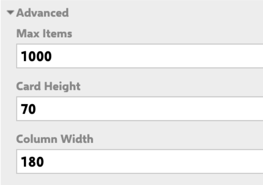
Open the widget's Advanced Properties
- Open the Polarion Wiki page or LiveDoc that contains your Planningboard widget.
- Switch to Edit mode for the page.
- Click the widget to select it, then open its Widget Parameters.
- Scroll to the Advanced Properties section. You will find two script fields:
- Item Script — runs once per card, controls per-item appearance.
- Config Script — runs once when the board loads, used for board-wide CSS overrides.
2
Set a card background color
Add the following to the Item Script to apply a fixed background color to every card:To apply color conditionally based on a work item field value (for example, a custom
crType enumeration field):3
Customize the fields line
The
cli.fieldsLine property controls what appears under the card title. You can combine multiple rendered fields using the workitem.fields() rendering API:4
Inherit color from a parent item
A common pattern is to color child cards based on a color value set on their parent item. This groups related cards visually without manual per-item configuration.Prerequisites:
- Create a custom field named
pbColor(type: String) on the parent work item type (for example, on your System Requirement type). - Enter a color value (
blue,red,green,yellow, or a HEX code) in this field for each parent item.
5
Adjust card height
If your card titles are long, or if your 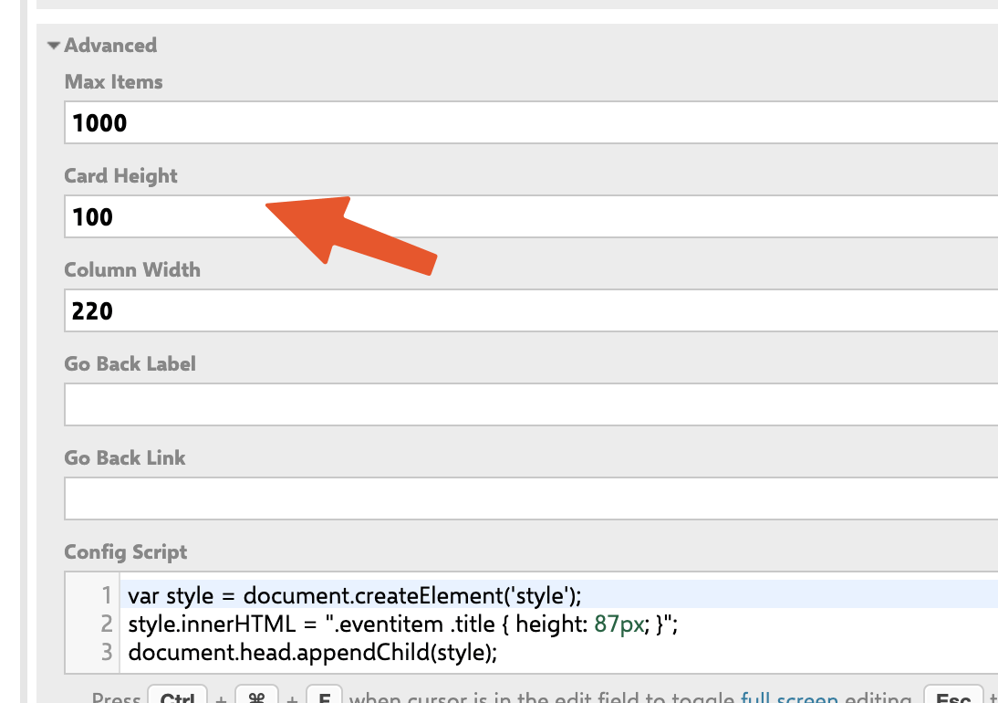
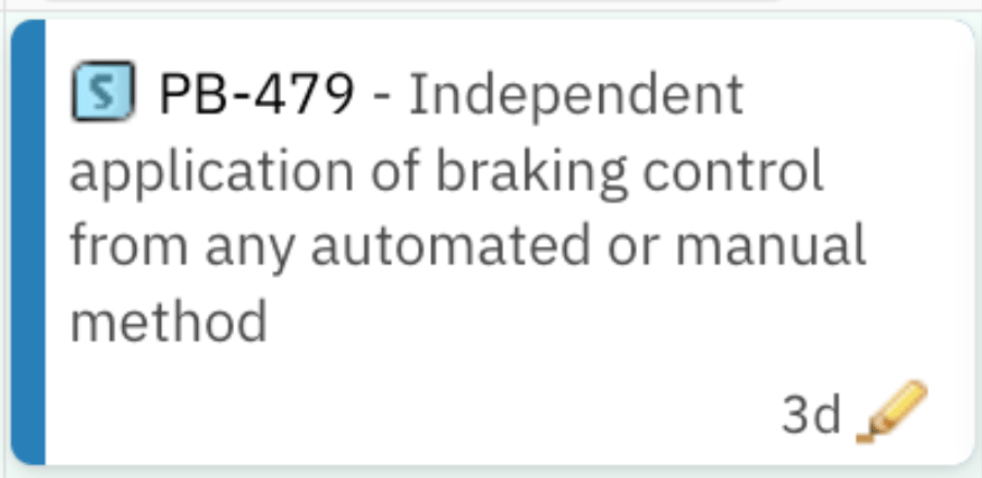
cli.fieldsLine spans multiple lines, increase the card height using the Config Script:Scripting API reference
The Item Script has access to three main objects:Card appearance flow
Limitation: color by custom enumeration is not supported
Planningboard card coloring through the standard widget configuration is based on workflow status only. Coloring cards based on a custom enumeration field (such as a topic category or priority field) via point-and-click configuration is not currently supported. If you need enumeration-based coloring, use the Item Script approach described above: read the enum field withwi.getValue("fieldId"), then map the enum ID to a HEX color and assign it to cli.cardColor.
Verification
Save the widget parameters and reload the board. You should now see:- Cards with the background color you configured (solid color or conditionally per item).
- The fields line showing the fields you specified under each card title.
- Cards with adjusted height if you added a Config Script CSS rule.
pbColor custom field is populated on parent items if you are using color inheritance.
See also
- Customize Card Content — control which fields appear on the card
- Customize Card Colors — color rules and status-based coloring
- Highlight Work Items by Rules — rule-based visual highlighting
- Item Scripts — full Item Script API reference
- Config Scripts — board-wide scripting
- Widget Parameters Overview — all widget parameters including Card Height