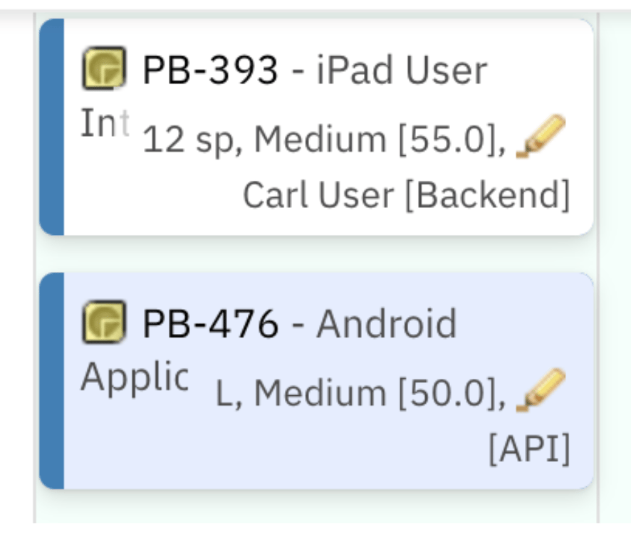
Cards in Planningboard display work item data by default, but you can tailor the visible fields, layout, and colors to match your team’s planning workflow. Customization is done through a JavaScript-based Item Script that runs for each card as the board renders.

Prerequisites

  • The Planningboard widget is embedded in a Polarion LiveDoc or Wiki page
  • You have editor access to the widget’s Advanced Properties

1

Open the Item Script editor

  1. Open the Polarion page containing your Planningboard widget.
  2. Switch to Edit mode on the page.
  3. Click the widget to select it, then open its properties.
  4. Navigate to Advanced Properties and locate the Item Script field.
This script runs once per card and has access to three objects:
2

Set the fields displayed on the card

Assign an HTML string to cli.fieldsLine to control what appears under the card title. You can render multiple fields and separate them with commas, spaces, or <br> line breaks.
The workitem.fields().get("fieldId") pattern accesses any standard or custom field by its Polarion field ID. Chain .render().htmlFor().forFrame() to produce the formatted HTML fragment.
Two Planningboard cards showing two lines of item details: story points, priority, status on the first line and assignee with team in brackets on the second line

3

Apply conditional logic by work item type

You can branch on any field value to render different content for different item types. The following example reads a custom enumeration field (crType) and applies a distinct fields line and card color for a specific value:

4

Inherit card color from a parent item

A common pattern is to color child cards based on a color value stored on their parent. This makes it easy to visually group items that belong to the same parent work item.Set up the custom field on the parent type:
  1. In Polarion Administration, add a custom field of type String to the parent work item type. Name it pbColor (or any ID you choose).
  2. For each parent item, enter a color value in this field: blue, red, green, yellow, or any valid CSS hex code.
Add the following to the Item Script:
The script uses the implements link role to traverse to the parent. Replace "implements" with whichever link role your project uses to represent the parent-child relationship. Using the wrong role means no parent is found and no color is applied — with no error shown on the card.
You can add additional else if branches for any named colors, or skip the name-mapping entirely and write hex codes directly into the pbColor field (e.g. #e3edff). Apply the value directly: cli.cardColor = pbColor;

5

Adjust card title height using the Config Script

If your work item titles are long, they may be clipped at the default card height. You can increase the title area by injecting a CSS rule through the Config Script (a separate field in the same Advanced Properties section).
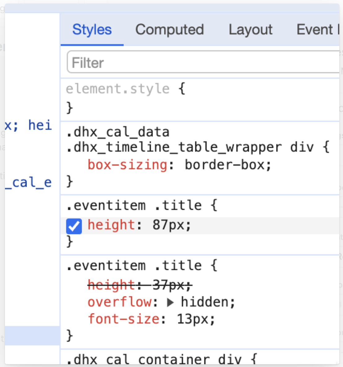
Set the title height to a value slightly smaller than the overall card height you have configured. If the title height equals or exceeds the card height, content below the title will be hidden or overflow. Use your browser’s Inspect tool (right-click a card → Inspect) to preview height values in real time before finalizing.
Browser DevTools Styles panel showing the injected .eventitem .title CSS rule with height: 87px overriding the default 37px value

Available cli properties reference

The table below lists all cli properties available in the Item Script.

Card content flow


Limitations

Out of the box, Planningboard colors cards by workflow status. Custom enumeration-based coloring (as available in Nextedy SCRUMBOARD) is not natively supported — it requires an Item Script like the ones above. If you need coloring based on an arbitrary custom enum field, you must implement the mapping manually in the script.

Verification

Save the widget, exit Edit mode, and reload the board. You should now see:
  • The fields you specified in cli.fieldsLine appearing under each card’s title
  • Any conditional background colors applied to matching cards
  • Parent-color inheritance visible across child cards that have a populated pbColor field on the parent
If cards look unchanged, confirm the Item Script was saved (re-open Advanced Properties and check the field is not empty) and that any custom fields referenced in the script exist and are populated in Polarion.

See also

KB Articles
  • Customize the content of the card
  • Planningboard interface & basic interactions
  • Planningboard: Customizable Statistics and Capacity Indicators
Support TicketsSource Code
  • PlanningBoardWidget.java
  • licenseReadonly.cy.ts
  • viewLicense.vm
  • Config.java
  • PlanningBoardWidgetRenderer.java
Last modified on June 26, 2026