

The Two-Dimensional Grid
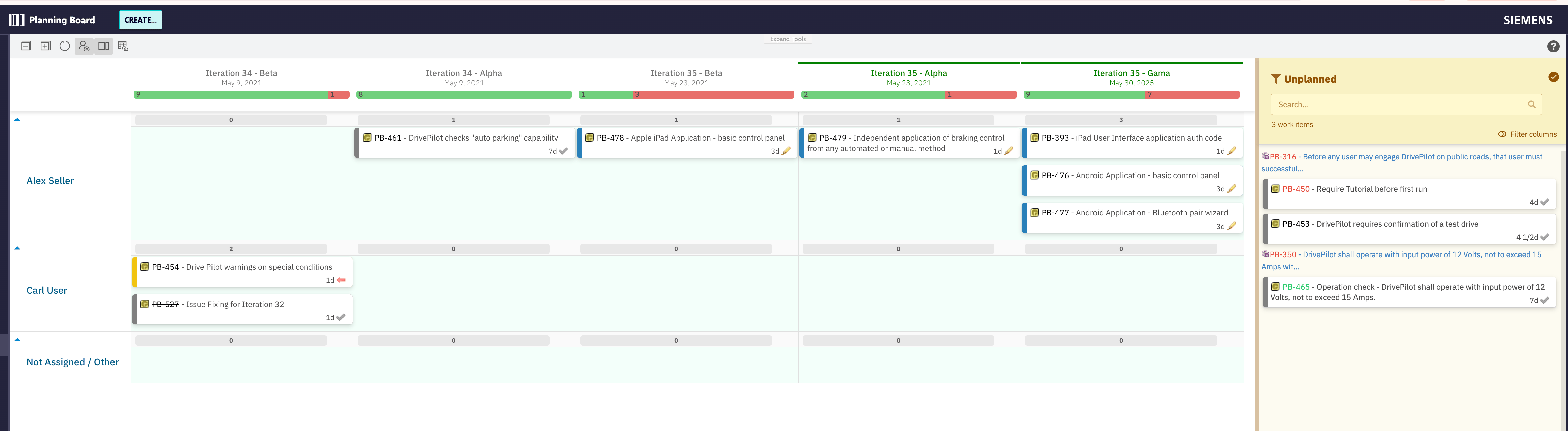
Think of the board as a spreadsheet where columns represent time (Plans) and rows represent ownership or scope (swimlanes). Every cell at a column–row intersection is a planning slot. When you drag a card into a cell, you are simultaneously saying when the work is scheduled (the Plan column) and who or what owns it (the swimlane row). This is distinct from a simple Kanban board, where columns represent workflow states. On Planningboard, columns represent Polarion Plans — iterations, sprints, program increments — not status values. Status progression happens inside Polarion as usual; the board’s job is to answer “what is planned in which sprint, for which team member?”
Columns: Plans
Each column on the board corresponds to one Polarion Plan (a sprint, iteration, program increment, or custom planning period). The Plans shown are determined by the Plan query configured in the widget parameters, together with two count parameters:lastPlans (default 1) controls how many past or completed Plans are visible, and nextPlans (default 5) controls how many upcoming Plans are shown. This windowing approach keeps the board focused on the near-horizon without showing an overwhelming history.
The plansMode widget parameter determines which kind of Plan objects are used as columns — for example, Project Plans (PROJECT_PLANS) or SAFe Program Increments. Changing plansMode changes which configuration options are available for Plans, which is why the widget configuration UI looks different depending on the mode selected.
A common first-time misconception is that columns represent work item statuses (To Do → In Progress → Done). They do not. Columns are Polarion Plan artifacts — time-boxed planning containers. Moving a card between columns re-assigns it to a different Plan; it does not change the work item’s status field.
Rows: Swimlanes
Swimlanes divide the board horizontally. Each swimlane represents a grouping of work items sharing a common attribute — an assignee, a parent work item, a project, or a custom enumeration field value. The swimlane assignment type (assignmentMode) determines which attribute drives the grouping.
The available assignment modes are:
The Not Assigned/Other Row
When a swimlane assignment mode is active, items that have no value for the grouping attribute appear in a special Not Assigned/Other row. This row is not just a display location — it is also a drag-drop target. Dragging a card from a user swimlane to the Not Assigned/Other row removes that specific user from the work item’s field, which is particularly relevant for multi-valued fields where an item can appear in more than one swimlane simultaneously.Multi-value Swimlane Appearance
When the grouping field supports multiple values (for example, a multi-user assignee field or a multi-enum custom field), a single work item can appear in more than one swimlane row at the same time. Each appearance represents one of the item’s values. This means the same card can be visible in Alice’s row and Bob’s row if both are assigned. Dragging from one of those rows to the Not Assigned/Other row removes only that row’s value, leaving the other assignments intact.Swimlane Sort Order
TheswimlaneSort property (default alphabetical) controls the vertical order of rows. For the Parent Item assignment mode, sort order can be configured by custom properties such as priority — a capability added in Planningboard 25.9.0. Note that the swimlane sort order is coupled to the item sort order within each swimlane; there is currently no independent sort control for items within a lane versus the lane itself.
Cards: Work Items
Each card on the board represents a single Polarion work item. The card’s position in the grid encodes two pieces of planning information simultaneously: which Plan it belongs to (column) and which swimlane group it belongs to (row). Card content is customizable through widget parameters, but the fundamental planning semantics — column = Plan, row = swimlane grouping — are fixed by the board’s structural model. Clicking a card opens the Work Item Properties sidebar, which shows configurable fields and allows in-context edits without leaving the board. The board preserves your swimlane and scroll position when you save sidebar changes, so you can work through a list of cards without losing your place on large boards. When hovering over a card, three quick actions become available: Show Links (highlights linked cards and hides all others), Add Link (creates a link to another card), and Unplan item (moves the card back to the Unplanned section).Cards with the work item status Verified cannot be moved or unplanned once placed. This is an intentional lock to protect verified work from accidental replanning.

The Unplanned Section
The Unplanned section on the right side of the board is a backlog panel — a holding area for all work items that have not yet been assigned to any Plan. It is the starting point for the primary board interaction: drag a card from the Unplanned section onto a Plan column and swimlane row to schedule it. The Unplanned section can be filtered by assignee, team, or predefined queries to help surface the right cards for the planning session. It can also be toggled off using the Show Unplanned toolbar button when you want to focus entirely on the board grid.Capacity Bars
Each cell at the intersection of a Plan column and a swimlane row can show a capacity bar — a visual indicator of how much capacity is consumed versus available for that swimlane within that Plan. Capacity bars require explicit configuration through widget parameters. Hovering over a capacity bar shows a detailed tooltip with per-plan capacity data, including total capacity, information about to-do, done, available, or over-planned days. Capacity bars shall show different data based on their configuration. When Team Service is enabled, the information is taken from the user capacity based on their Team Assignments; alternatively, the capacity bar may also show any custom data as per specific Configuration Properties.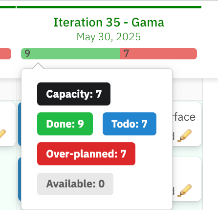
Toolbar Controls
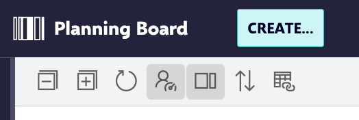
The Show Dependencies toolbar action is distinct from the Show Links card-level action. Show Links highlights only the links of the single card you hover; Show Dependencies reveals all dependency connections across the board simultaneously.
How the Structure Fits Together
The structural model of Planningboard can be summarised as a deliberate mapping from Polarion concepts to spatial positions:
plannedIn Plan in Polarion and, depending on the assignment mode, may also update the field used for swimlane grouping (such as the assignee field).
Common Misconceptions
“Moving a card changes its status.” It does not. Column position reflects Plan assignment, not workflow state. Status is a separate Polarion field edited through the sidebar or Polarion itself. “Swimlane rows are always assignees.” The assignment mode is configurable. Rows can represent parent work items, projects, enumeration field values, or SAFe structural roles — not just users. “The capacity bar shows story points remaining.” The capacity bar represents capacity consumed relative to available capacity, derived from team calendar data and thecapacityField you configure. The unit depends on your configuration (hours, story points, or another numeric field).
“All work items in the project appear on the board.” The work item dataset is filtered by the query widget parameter and capped at maxItems (default 1000). Items outside the query result are not visible even if they exist in Polarion.
Related Concepts
To understand the individual structural elements in depth, see:- Swimlane Assignment Modes — how each assignment type works and when to choose it
- Plans Modes — how Plan columns are generated for different planning methodologies
- Capacity Tracking — how capacity is calculated and displayed in each cell
- Normalization — how capacity figures are normalised across swimlanes with different team sizes
- Prioritization — how item ordering within swimlanes works