


Overview
Visibility Toggle
The sidebar can be shown or hidden using the Show Unplanned toolbar button (#btnShowUnplanned). This button is only visible to licensed users.
- When hidden, the board area expands to fill the full width.
- When shown, the board area narrows to accommodate the sidebar.
- The panel preference is saved between sessions.
License restrictionThe Show Unplanned button and the sidebar panel itself are only rendered for licensed users. Unlicensed users see neither the button nor the sidebar.
Item Display and Grouping
Items in the sidebar are grouped by parent hierarchy. TheupdateSidebarHeader function applies all active filters, sorts items by parent, groups them into parent-hierarchy dividers, and updates the item count indicator.
Item Counter
A counter at the bottom of the sidebar displays the number of currently visible items relative to the total:Parent Hierarchy Grouping
Items are organized under collapsible parent-group dividers. The depth of parent levels loaded is controlled by thePARAMETER_US_DEPTH widget parameter (see Work Items Parameters).
The link role used to determine parent-child relationships is set by PARAMETER_PARENTS_LINK_ROLE (see Work Items Parameters).
Filters
The sidebar supports multiple filter modes. Some filter modes are mutually exclusive — enabling one clears the other.Filter Controls
Filter: Resolved / Verified Items (toggleFilterResolved)
Toggles whether resolved (verified) work items appear in the sidebar.
- When active: resolved items are hidden from the sidebar.
- When inactive: resolved items are shown alongside unresolved items.
- Items with the
Verifiedstatus that have already been placed on the board cannot be moved or unplanned.
Filter: Column Filtering (toggleFilterColumns)
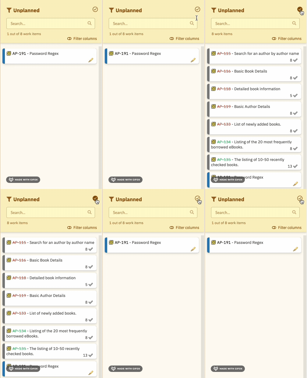
- Differs from the resolved toggle: this filter targets items that appear on the board in a plan column, regardless of their resolved status.
- Use this to keep the sidebar clean by removing items that have already been scheduled.
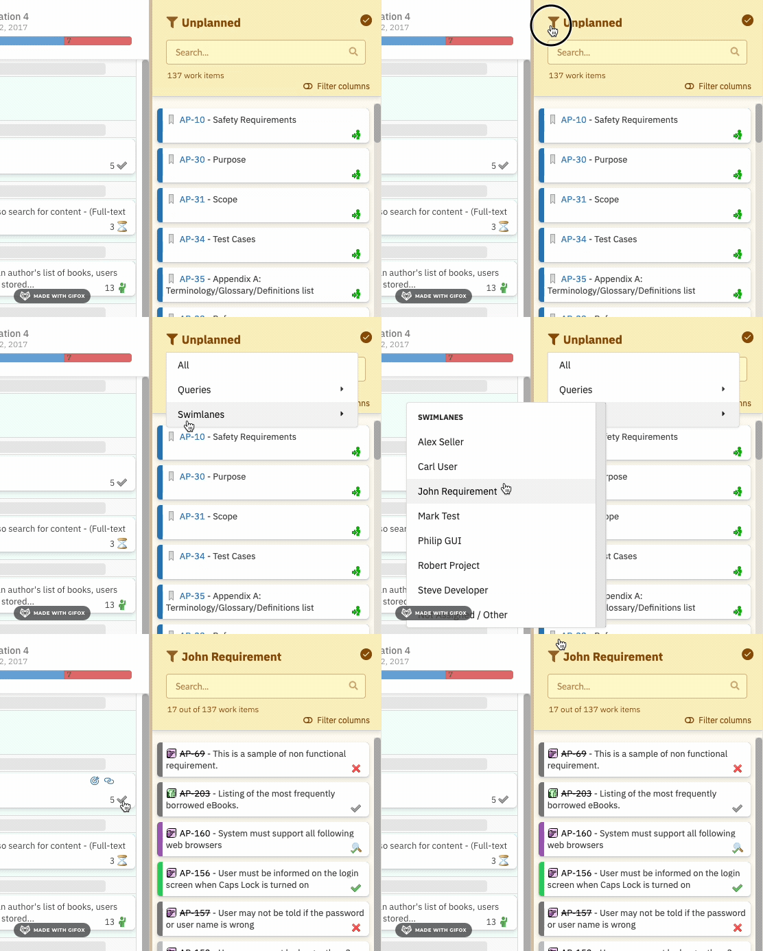
Filter: Resource Filter (filterSidebarByResource)
Filters sidebar items to show only those assigned to a specific resource (person or team).
- Accessed via the funnel icon filter panel.
- Mutually exclusive with query filtering — enabling a resource filter clears any active query filter.
- To remove: use the clear filter action (
clearSidebarFiler).
Filter: Query Filter (filterSidebarByQuery)
Filters sidebar items to show only those matching a specific Polarion query.
- Predefined queries must be configured via widget parameters (see Work Items Parameters).
- Accessed via the funnel icon filter panel under the Queries section.
- Mutually exclusive with resource filtering — enabling a query filter clears any active resource filter.
Filter: Search (searchSidebar)
Performs real-time text search across sidebar items.
Clearing Filters (clearSidebarFiler)
The clear filter action removes all active resource and query filters and shows all unplanned items (subject to the resolved toggle state).
What clear does NOT resetClearing filters does not reset the search text field or the resolved/verified toggle. Those must be cleared independently.
Filter Precedence and Combination

- Resource filter and query filter are mutually exclusive — enabling one clears the other.
- Search combines with whichever of the above filters are active.
- The resolved toggle and column filter apply independently before resource/query filtering.
Drag and Drop
The primary interaction with the sidebar is drag and drop: drag a card from the sidebar onto a board cell (Plan column × swimlane row) to schedule it.Alt+Drag to Duplicate
Holding Alt while dragging creates a duplicate assignment to another resource instead of moving the item:- Creates a multi-resource assignment (comma-separated resource list on the work item).
- Cannot duplicate to the Not Assigned/Other swimlane.
- When duplicating from Not Assigned/Other, the Not Assigned/Other assignment is automatically removed.
Click to Open Work Item Properties
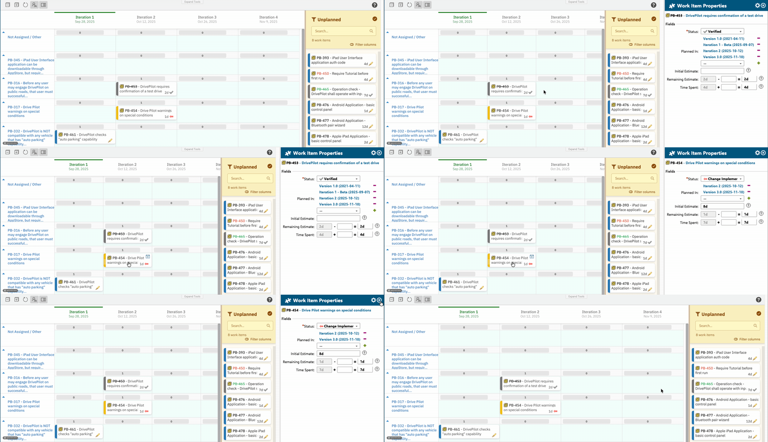
Clicking a card in the sidebar opens the Work Item Properties sidebar, where fields of the selected work item can be reviewed and modified.- Fields displayed in the properties sidebar are configured via the
PARAMETER_SIDEBAR_FIELDSwidget parameter. - Default fields:
title,status,plannedIn. - Users can personalize displayed fields using the Select Fields (gear icon) button in the sidebar. These additions are per-user and apply to all work items of the same type.
- After saving changes in the properties sidebar, the board preserves your swimlane and scroll position — the board does not jump back to the top.
Sidebar Fields Widget Parameter
See Work Items Parameters for the full field reference.
Height Management (modSchedHeight)
The sidebar and board area heights are automatically managed to fit the browser window or Polarion iframe. No manual height configuration is required.
- Height adjusts dynamically when the browser window is resized.
- Behavior differs slightly when embedded in a Polarion LiveDoc or Wiki page (iframe) versus standalone.
Unplanning Items from the Board
Items can be returned from the board to the sidebar using the Unplan card quick action (visible on hover). See Card Quick Actions for details. The Unplan action:- Moves the card from its current Plan/swimlane cell back into the Unplanned Sidebar.
- Clears the work item’s date and resource assignment.
- Makes the item available for re-planning.
Configuration Reference
Widget Parameters Affecting the Sidebar
Sidebar Behavior Summary
Related Pages
- Toolbar Controls — the Show Unplanned toggle button lives in the toolbar
- Card Quick Actions — the Unplan action that returns items to the sidebar
- Swimlane Controls — swimlane behavior that interacts with sidebar assignments
- Work Items Parameters —
PARAMETER_SIDEBAR_FIELDS,PARAMETER_US_DEPTH,PARAMETER_PARENTS_LINK_ROLE - UI and Display Parameters — additional display configuration
- License Panel — license enforcement that controls sidebar access