

Overview


Quick actions are available on every card that represents a work item on the board. They are only visible on hover — they do not occupy permanent space on the card face — so the card display remains clean when not in use.
Actions Reference
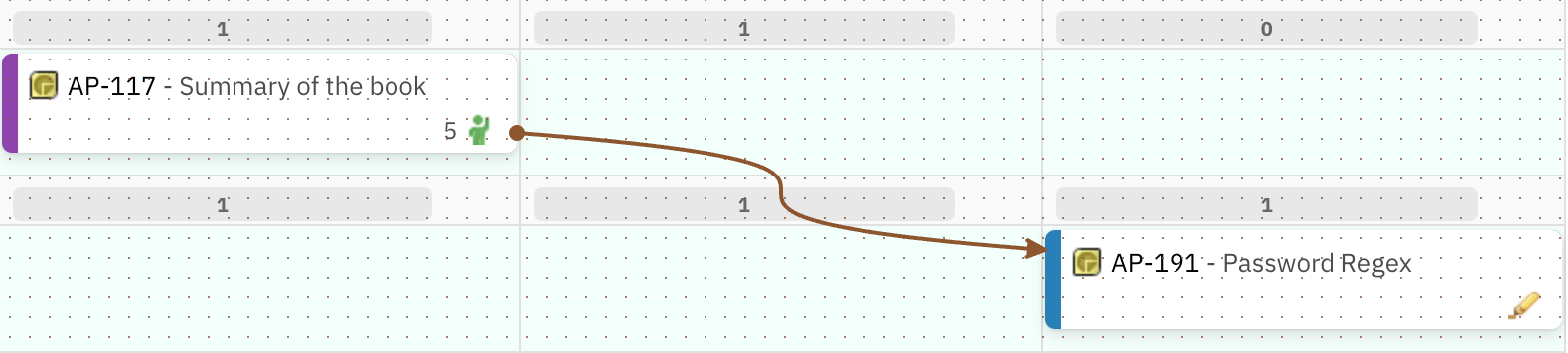
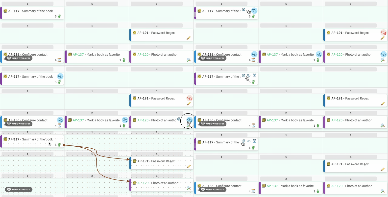
Show Links

- All cards that are directly linked to the selected card (in any direction) remain visible.
- All cards with no direct link to the selected card are hidden.
- The selected card itself stays in its position within its swimlane and column.
- To return to the full board view, click the Show Links action on the same card again, or use the Refresh data button in the toolbar.
Show Links vs Show DependenciesShow Links (card quick action) is a per-card, focused filter: it hides all cards not directly linked to the selected card. Show Dependencies in the toolbar is a board-level toggle that renders all link lines across all cards simultaneously without hiding any cards. Use Show Links for inspecting one card’s connections; use Show Dependencies for a board-wide dependency overview.

Add Link

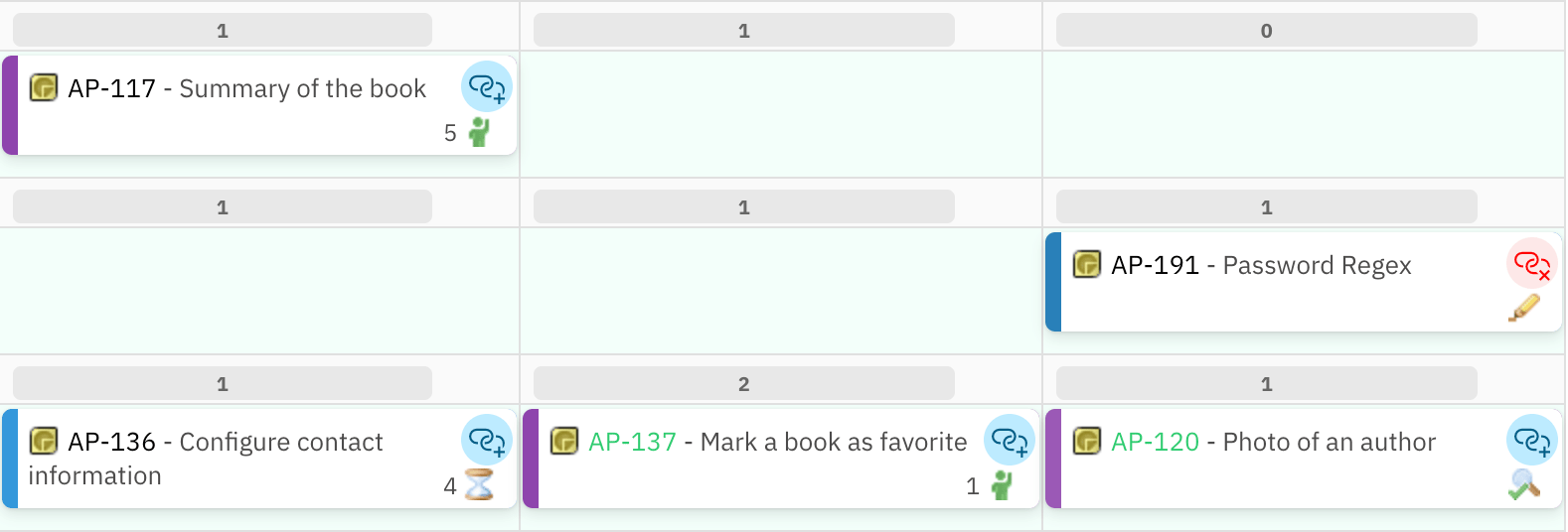
- When Add Link mode is active, every other card shows the link icon.
- A red icon on a target card indicates a link between that target and the originating card already exists. Clicking a card with the red icon opens the option to delete that existing link.
- After the link is created or an existing link is deleted, the board exits link-creation mode and returns to the normal view.
- If you change your mind and do not want to create a link, click the originating card’s link icon again (or click away from all cards) to cancel link-creation mode.

Unplan Item

- The card appears in the Unplanned section immediately after the action.
- The card is removed from the Plan (column) it was previously assigned to.
- This action is functionally equivalent to dragging the card from the board back into the Unplanned section.
- After unplanning, the card is available to be dragged back to any Plan column on the board.
Behavior Under License Restrictions
Quick actions are part of the interactive editing surface of the board. Nextedy PLANNINGBOARD enforces license-based access control. Unlicensed users can view the full board but cannot make any changes:
Specifically, for unlicensed users:
- The Unplan Item action is not accessible (the Unplanned sidebar is also hidden).
- The Add Link action is not accessible.
- The Show Links action availability for read-only users is .
- Drag-and-drop is also blocked — cards cannot be moved even if dragged.
Accessibility and Card Identification
Cards on the board are identified by anaria-label attribute that contains the work item ID and title (for example, MAP-531 - Fix login screen). This label is used by assistive technologies and is also what appears when the browser’s accessibility tree reads a card. The quick action icons inherit their context from the parent card’s label.
Interaction Summary
Edge Cases and Limitations
- Verified items: Cards in Verified status cannot be moved or unplanned via any mechanism, including quick actions and drag-and-drop.
- Show Links scope: Show Links only reveals direct (one-hop) links. Cards linked to the selected card’s linked cards (two-hop) are not shown.
- Add Link scope: Link-creation mode only shows cards that are currently rendered on the board (visible in their swimlanes and columns). Cards in the Unplanned section are not targetable in Add Link mode.
- Link type: The specific link role used when creating a link via Add Link is . Consult the Widget Parameters for any configuration affecting link behavior.
- Unlicensed read-only: All card editing actions, including quick actions, are blocked for unlicensed users. The board remains fully visible for transparency and collaboration.
Related Pages
- Toolbar Controls — board-level controls including Show Dependencies (all links at once), Refresh, Collapse/Expand All, and Prioritize
- Unplanned Sidebar — where cards go after the Unplan Item action; filtering, searching, and drag-and-drop back to the board
- Swimlane Controls — per-swimlane collapse, expand, and capacity information
- Basic Board Interactions — drag-and-drop planning, clicking cards to open the properties sidebar, and scroll/swimlane position preservation
- UI Elements — full index of Planningboard UI element reference pages
- License Panel — license status display and what read-only mode affects