> ## Documentation Index
> Fetch the complete documentation index at: https://learn.nextedy.com/llms.txt
> Use this file to discover all available pages before exploring further.
# Colours and Load Thresholds
> How to read a task card in Nextedy SCHEDULER: what each part of the card shows, which state wins when several apply, and the four load bands with their thresholds.
export const LastReviewed = ({date}) => {
if (!date) return null;
const formatted = new Date(`${date}T00:00:00Z`).toLocaleDateString("en-US", {
year: "numeric",
month: "long",
day: "numeric",
timeZone: "UTC"
});
return
Last reviewed on {formatted}
;
};
Almost everything Scheduler tells you at a glance, it tells you with colour: whether a task is finished, whether it is late, and whether the person it sits on can actually absorb it.
This page is the key to those colours, and to the card that carries them.
## Anatomy of a task card
A card on the timeline packs a work item into the width of its schedule.
Reading it from left to right:
| Part | What it shows |
| ------------------- | ------------------------------------------------------------------------------------------------------------------------------------------ |
| Colour bar | The band of colour along the card, carrying the state colour resolved in [Which colour wins](#which-colour-wins) below |
| Resolution checkbox | Polarion's own resolution indicator for the work item |
| Work-item type icon | The icon of the work item's type |
| Work-item ID | The ID, rendered as a link. Clicking it opens the work item in a new browser tab |
| Title | Follows the ID, separated by a dash |
| Fields line | Right-aligned on the card: the effort figure selected by the **Plans Type** parameter (for example `5d`), then the work item's status icon |
The card's height is set by the **Card Height** parameter, 50 pixels by default.
Raise it when your titles or effort figures need more room -- see [Widget Parameters](/scheduler/reference/widget-parameters).
With **Plans Type** set to **Remaining Estimate + Time Spent**, the fields line shows the remaining estimate followed by the combined figure in parentheses.
If neither a remaining estimate nor time spent is recorded, it falls back to the initial estimate.
### The hover handles
Hovering a card on the timeline reveals two handles:
| Handle | What it does |
| --------------- | ------------------------------------------------------------------------------------------------------------------------------------------------------------------------------------------------------------------------- |
| **Add Link** | Chain icon. Arms the two-click dependency gesture -- click this handle on the first task, then the same handle on the second to connect them. Present only when the widget has at least one entry in **Dependency Roles** |
| **Unplan item** | Calendar-with-a-cross icon. Clears the task's schedule so the card returns to the **Unplanned** sidebar. The work item itself is not deleted, and there is no confirmation dialog |
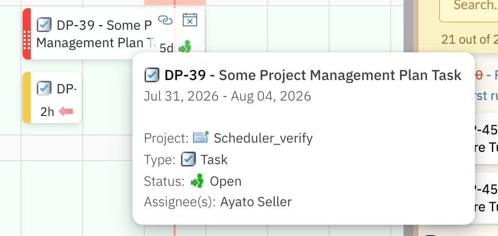 Neither handle appears on cards in the **Unplanned** sidebar -- those cards are dragged onto the board rather than edited in place.
A resolved work item is read-only on the board: its card cannot be dragged, and the **Unplan item** handle is not offered.
To reschedule it, reopen the work item in Polarion first.
Clicking the body of a card -- anywhere other than the ID link or the handles -- opens the work item in Polarion's work-item sidebar, and the board remembers your selection across a reload.
## Which colour wins
Several states can apply to the same task at once, so Scheduler resolves them in a fixed order.
The first match decides the card's colour:
The task asks for more hours than its swimlane can absorb over the days the bar spans.
This wins over everything else, including a resolution: an overloaded card is red even if it is finished.
The work item has a resolution set.
Grey also means the card is read-only: it cannot be dragged, and it offers no **Unplan item** handle.
Today is past the work item's due date.
An overdue task also adds a red **Overdue** line, with the due date, at the bottom of its hover tooltip.
With none of the above applying, the card takes the colour configured for its status in the project's work-item status enumeration.
This is the normal case, and it is why a healthy board reads like your Polarion statuses rather than like a traffic light.
Neither handle appears on cards in the **Unplanned** sidebar -- those cards are dragged onto the board rather than edited in place.
A resolved work item is read-only on the board: its card cannot be dragged, and the **Unplan item** handle is not offered.
To reschedule it, reopen the work item in Polarion first.
Clicking the body of a card -- anywhere other than the ID link or the handles -- opens the work item in Polarion's work-item sidebar, and the board remembers your selection across a reload.
## Which colour wins
Several states can apply to the same task at once, so Scheduler resolves them in a fixed order.
The first match decides the card's colour:
The task asks for more hours than its swimlane can absorb over the days the bar spans.
This wins over everything else, including a resolution: an overloaded card is red even if it is finished.
The work item has a resolution set.
Grey also means the card is read-only: it cannot be dragged, and it offers no **Unplan item** handle.
Today is past the work item's due date.
An overdue task also adds a red **Overdue** line, with the due date, at the bottom of its hover tooltip.
With none of the above applying, the card takes the colour configured for its status in the project's work-item status enumeration.
This is the normal case, and it is why a healthy board reads like your Polarion statuses rather than like a traffic light.
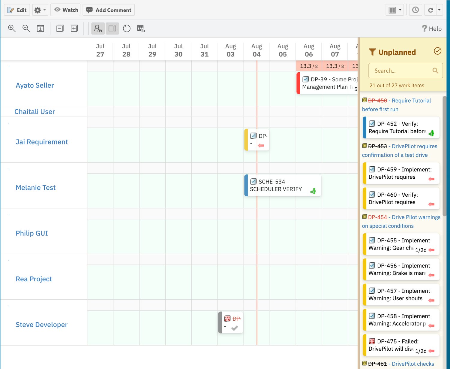 Because overload is evaluated per day and re-evaluated whenever the board redraws, a card can change colour without the work item changing.
Dragging a neighbouring task off a busy day, or shortening it, is enough to take a red card back to its status colour.
## The four load bands
In the timeline view, every day cell of a swimlane's summary row carries a load marker: the hours scheduled into that day for that swimlane, over the swimlane's capacity for the day -- for example `15.3 / 8`.
The marker's background is one of four bands:
| Band | Colour | Day load | What it tells you |
| ------- | --------------------- | ----------------------------------- | ---------------------------------------------------------- |
| No load | Grey `#E0E0E0` | Zero -- no effort booked | Nothing with recorded effort sits on the swimlane that day |
| Light | Light blue `#CFF5FC` | Up to 50% of capacity | Comfortably below capacity, with room to take work on |
| Normal | Light green `#DCFBB9` | Over 50% and up to 100% of capacity | Well used, at or under capacity |
| High | Salmon red `#FFC6B5` | Over 100% of capacity | Overloaded -- more hours scheduled than the day can hold |
Because overload is evaluated per day and re-evaluated whenever the board redraws, a card can change colour without the work item changing.
Dragging a neighbouring task off a busy day, or shortening it, is enough to take a red card back to its status colour.
## The four load bands
In the timeline view, every day cell of a swimlane's summary row carries a load marker: the hours scheduled into that day for that swimlane, over the swimlane's capacity for the day -- for example `15.3 / 8`.
The marker's background is one of four bands:
| Band | Colour | Day load | What it tells you |
| ------- | --------------------- | ----------------------------------- | ---------------------------------------------------------- |
| No load | Grey `#E0E0E0` | Zero -- no effort booked | Nothing with recorded effort sits on the swimlane that day |
| Light | Light blue `#CFF5FC` | Up to 50% of capacity | Comfortably below capacity, with room to take work on |
| Normal | Light green `#DCFBB9` | Over 50% and up to 100% of capacity | Well used, at or under capacity |
| High | Salmon red `#FFC6B5` | Over 100% of capacity | Overloaded -- more hours scheduled than the day can hold |
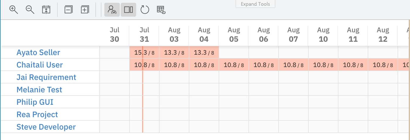 Capacity depends on what the swimlane represents:
| Swimlane mode | Capacity per day |
| ------------------------------------------------------- | ---------------- |
| **Users (Assignee)** -- one row per user | 8 hours |
| **Enumeration Field** -- one row per enumeration option | 24 hours |
Enumeration rows are filled against a 24-hour day rather than a working day, so their markers turn red far later than a user row's would.
Read them as a relative picture of where work is piling up, not as a person's workload.
See [Capacity and Load](/scheduler/concepts/capacity-and-load).
### How a task contributes to a day
A task's effort -- the figure chosen by **Plans Type** -- is spread across the working days its bar covers, and each of those days receives its share.
Two consequences worth knowing:
* **A long bar is a light bar.** The same effort stretched over more days lands less load on each of them, which is often the quickest way to clear a red day.
* **Over 100% is normal to see, not a data error.** A high marker simply means the hours booked into that day exceed the capacity of the row. It is the signal to reschedule, not a fault.
An overload also travels to the card: any task whose own share exceeds the day's capacity turns red, which is the first rule in [Which colour wins](#which-colour-wins).
## See Also
* [Capacity and Load](/scheduler/concepts/capacity-and-load) -- where capacity comes from and how load is built up
* [Dates, Duration and Effort](/scheduler/concepts/dates-duration-and-effort) -- the fields behind a bar's extent and its effort figure
* [Schedule and Reschedule Tasks](/scheduler/guides/schedule-and-reschedule-tasks) -- moving work to clear an overloaded day
* [Dependencies](/scheduler/concepts/dependencies) -- what the **Add Link** handle creates
* [Widget Parameters](/scheduler/reference/widget-parameters) -- **Card Height**, **Plans Type** and **Tooltip Fields**
Capacity depends on what the swimlane represents:
| Swimlane mode | Capacity per day |
| ------------------------------------------------------- | ---------------- |
| **Users (Assignee)** -- one row per user | 8 hours |
| **Enumeration Field** -- one row per enumeration option | 24 hours |
Enumeration rows are filled against a 24-hour day rather than a working day, so their markers turn red far later than a user row's would.
Read them as a relative picture of where work is piling up, not as a person's workload.
See [Capacity and Load](/scheduler/concepts/capacity-and-load).
### How a task contributes to a day
A task's effort -- the figure chosen by **Plans Type** -- is spread across the working days its bar covers, and each of those days receives its share.
Two consequences worth knowing:
* **A long bar is a light bar.** The same effort stretched over more days lands less load on each of them, which is often the quickest way to clear a red day.
* **Over 100% is normal to see, not a data error.** A high marker simply means the hours booked into that day exceed the capacity of the row. It is the signal to reschedule, not a fault.
An overload also travels to the card: any task whose own share exceeds the day's capacity turns red, which is the first rule in [Which colour wins](#which-colour-wins).
## See Also
* [Capacity and Load](/scheduler/concepts/capacity-and-load) -- where capacity comes from and how load is built up
* [Dates, Duration and Effort](/scheduler/concepts/dates-duration-and-effort) -- the fields behind a bar's extent and its effort figure
* [Schedule and Reschedule Tasks](/scheduler/guides/schedule-and-reschedule-tasks) -- moving work to clear an overloaded day
* [Dependencies](/scheduler/concepts/dependencies) -- what the **Add Link** handle creates
* [Widget Parameters](/scheduler/reference/widget-parameters) -- **Card Height**, **Plans Type** and **Tooltip Fields**