> ## Documentation Index
> Fetch the complete documentation index at: https://learn.nextedy.com/llms.txt
> Use this file to discover all available pages before exploring further.
# Your First Board
> By the end of this tutorial, you will have a Nextedy SCHEDULER board running on a Polarion page and you will be able to read every part of it.
export const LastReviewed = ({date}) => {
if (!date) return null;
const formatted = new Date(`${date}T00:00:00Z`).toLocaleDateString("en-US", {
year: "numeric",
month: "long",
day: "numeric",
timeZone: "UTC"
});
return
Last reviewed on {formatted}
;
};
## What you will achieve
By the end of this tutorial, you will have a working Scheduler board on a Polarion page.
You will place the widget, load your project's work items into it, and learn to read the four areas of the board: the timeline grid, the swimlane rows, the Unplanned sidebar, and the status footer.
Reading the board is the foundation for everything else — scheduling, capacity, and dependencies all show up in these four areas.
## Prerequisites
* The Scheduler plugin installed and active (see [Installation](/scheduler/getting-started/installation))
* A Polarion project containing work items — they do not need dates yet
* Permission to create or edit pages in that project
Scheduler is a Rich Page widget: it runs inside a Polarion page that accepts widgets, typically a Live Report page.
1. Open your Polarion project and go to **Documents & Pages**
2. Open the page that should host the board, or create a new page for it
3. Click **Expand Tools**, then **Edit** to put the page into edit mode
The page toolbar and the widget palette become available.
Keep one Scheduler widget per page.
If you need boards for different teams or different queries, create a separate page for each one.
1. Open the widget palette and locate the widget labelled **Scheduler** — it is tagged **Plans**, **Work Items** and **Nextedy**, and its details read "Nextedy SCHEDULER"
2. Place it on the page
3. Save the page
**What you should see:** the board renders in place of the widget and loads your project's work items.
It opens in the timeline view, with the resource load visualization switched on.
 The widget works out of the box with its default parameters.
When you are ready to point it at a specific query, swimlane mode, or date fields, see [Add the Scheduler Widget](/scheduler/guides/add-the-scheduler-widget) — the parameters live under **Expand Tools → Edit**, then the widget's **Edit widget parameters** action.
The grid occupies most of the board.
Each column is one day, and the header is two lines: the month on top, the day underneath.
| What you see | What it means |
| ------------------------------------ | -------------------------------------------------------- |
| A red vertical line | The current date |
| Missing Saturdays and Sundays | Weekends are hidden by default |
| A column with a black diagonal hatch | A non-working day from the calendar |
| A coloured bar spanning columns | A scheduled work item, from its start day to its end day |
The grid starts 10 days before today by default and runs forward across the configured window; the exact span is printed in the footer.
Day columns are 60 pixels wide by default and change in 30-pixel steps with **Zoom in the timeline** and **Zoom out the timeline**.
Your zoom level and your choice of view are stored in your browser, so the board comes back the way you left it.
Use **Scroll to today** to bring the red current-date line back into view.
The full toolbar is described in [Navigate the Timeline](/scheduler/guides/navigate-the-timeline) and [Toolbar Controls](/scheduler/reference/toolbar-controls).
Down the left edge of the grid is one row per resource.
Out of the box the rows are the project's users: the widget's **Swimlanes (Rows)** parameter has **Assignment Type** set to **Users (Assignee)**, and the set of users is narrowed by the **User Role** parameter, which defaults to `project_user`.
Each row carries a per-day load marker showing `load / capacity` — for example `6 / 8` for six hours booked against an eight-hour day.
The marker changes colour as the day fills up and turns red above capacity.
See [Capacity and Load](/scheduler/concepts/capacity-and-load) for the bands and [Configure Swimlanes](/scheduler/guides/configure-swimlanes) for the enumeration-field alternative to user rows.
A row can be shown two ways:
* **Expanded** — the row opens into child lines that hold the individual task bars
* **Collapsed** — the row folds into a single summary line that keeps only the load markers
**Collapse rows** and **Expand rows** switch all rows at once, and **Toggle Resource Load visualization** switches between this timeline layout and a flat layout with exactly one line per resource and no load markers.
The widget works out of the box with its default parameters.
When you are ready to point it at a specific query, swimlane mode, or date fields, see [Add the Scheduler Widget](/scheduler/guides/add-the-scheduler-widget) — the parameters live under **Expand Tools → Edit**, then the widget's **Edit widget parameters** action.
The grid occupies most of the board.
Each column is one day, and the header is two lines: the month on top, the day underneath.
| What you see | What it means |
| ------------------------------------ | -------------------------------------------------------- |
| A red vertical line | The current date |
| Missing Saturdays and Sundays | Weekends are hidden by default |
| A column with a black diagonal hatch | A non-working day from the calendar |
| A coloured bar spanning columns | A scheduled work item, from its start day to its end day |
The grid starts 10 days before today by default and runs forward across the configured window; the exact span is printed in the footer.
Day columns are 60 pixels wide by default and change in 30-pixel steps with **Zoom in the timeline** and **Zoom out the timeline**.
Your zoom level and your choice of view are stored in your browser, so the board comes back the way you left it.
Use **Scroll to today** to bring the red current-date line back into view.
The full toolbar is described in [Navigate the Timeline](/scheduler/guides/navigate-the-timeline) and [Toolbar Controls](/scheduler/reference/toolbar-controls).
Down the left edge of the grid is one row per resource.
Out of the box the rows are the project's users: the widget's **Swimlanes (Rows)** parameter has **Assignment Type** set to **Users (Assignee)**, and the set of users is narrowed by the **User Role** parameter, which defaults to `project_user`.
Each row carries a per-day load marker showing `load / capacity` — for example `6 / 8` for six hours booked against an eight-hour day.
The marker changes colour as the day fills up and turns red above capacity.
See [Capacity and Load](/scheduler/concepts/capacity-and-load) for the bands and [Configure Swimlanes](/scheduler/guides/configure-swimlanes) for the enumeration-field alternative to user rows.
A row can be shown two ways:
* **Expanded** — the row opens into child lines that hold the individual task bars
* **Collapsed** — the row folds into a single summary line that keeps only the load markers
**Collapse rows** and **Expand rows** switch all rows at once, and **Toggle Resource Load visualization** switches between this timeline layout and a flat layout with exactly one line per resource and no load markers.
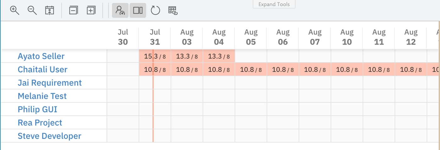 Row names are rendered as links, but clicking a row name does not navigate anywhere.
To filter the sidebar down to one resource, use the funnel menu's **Swimlanes** submenu instead — see [Filter the Unplanned Sidebar](/scheduler/guides/filter-the-unplanned-sidebar).
The panel on the right, headed **Unplanned**, holds the work items that match the board's query but are not scheduled on the timeline.
It takes up 20% of the board width by default and is switched on by the toolbar's **Show unscheduled items in sidebar** button.
| Sidebar element | What it does |
| --------------------------- | ----------------------------------------------------------------------------------------------------------------------- |
| Funnel menu (**Unplanned**) | Switches the sidebar between all unplanned items, a saved query, and a single swimlane |
| **Search…** box | Filters the visible cards by free text |
| Card groups | Groups cards under their parent work item when the widget loads parents; ungrouped items appear under `-- NO PARENT --` |
| Header count | Reads for example `21 out of 28 work items` when a filter narrows the list |
Row names are rendered as links, but clicking a row name does not navigate anywhere.
To filter the sidebar down to one resource, use the funnel menu's **Swimlanes** submenu instead — see [Filter the Unplanned Sidebar](/scheduler/guides/filter-the-unplanned-sidebar).
The panel on the right, headed **Unplanned**, holds the work items that match the board's query but are not scheduled on the timeline.
It takes up 20% of the board width by default and is switched on by the toolbar's **Show unscheduled items in sidebar** button.
| Sidebar element | What it does |
| --------------------------- | ----------------------------------------------------------------------------------------------------------------------- |
| Funnel menu (**Unplanned**) | Switches the sidebar between all unplanned items, a saved query, and a single swimlane |
| **Search…** box | Filters the visible cards by free text |
| Card groups | Groups cards under their parent work item when the widget loads parents; ungrouped items appear under `-- NO PARENT --` |
| Header count | Reads for example `21 out of 28 work items` when a filter narrows the list |
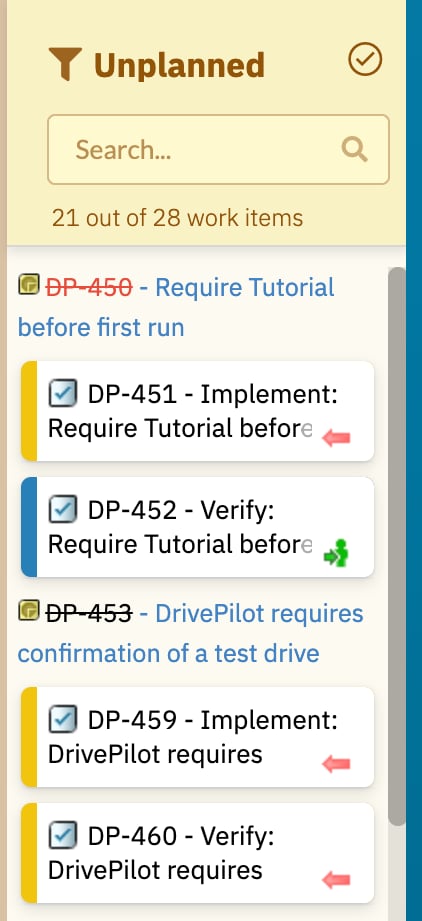 Cards here are draggable — that is how you schedule work, covered in [Schedule Your First Task](/scheduler/getting-started/schedule-your-first-task).
The footer runs along the bottom of the board and tells you what the board is currently showing.
| Footer area | Example | What it tells you |
| ------------------- | --------------------------------- | -------------------------------------------------------------------------------- |
| Items | `Items loaded: 25 / Scheduled: 3` | How many work items the query returned, and how many of them sit on the timeline |
| Range | `Timeline range: Jul 20 - Sep 28` | The first and last day of the window currently loaded |
| Product and version | `Nextedy SCHEDULER 26.6.0` | The product name and the installed plugin version |
| Settings gear | — | Opens **Administration → Nextedy SCHEDULER → Setup** in a new browser tab |
The **Scheduled** figure counts the work items currently drawn on the timeline; the rest of the loaded items are the unscheduled ones.
The Unplanned sidebar keeps its own count in its header, and that count is worked out separately — it follows the sidebar's own filter and includes the parent work items loaded for grouping, so it does not have to agree with **Items loaded** minus **Scheduled**.
If the query matches no work items, the board still draws the rows and day columns and the footer reads `Items loaded: 0`.
There is no separate "no results" message, so an empty grid means the query — not a rendering problem.
Check the widget's **Query** parameter and the sidebar's funnel filter.
Use **Refresh data** in the toolbar to reload the work items in place after someone changes them in Polarion.
## Next steps
Your board is up and reading correctly.
Continue with:
* [Schedule Your First Task](/scheduler/getting-started/schedule-your-first-task) — drag an item out of the sidebar onto a row
* [Board and Timeline](/scheduler/concepts/board-and-timeline) — the two views, the day grid, and the timeline window
* [Swimlanes and Resources](/scheduler/concepts/swimlanes-and-resources) — what the rows represent and how to change them
* [Navigate the Timeline](/scheduler/guides/navigate-the-timeline) — zoom, scroll, collapse, and the resource-load toggle
* [Add the Scheduler Widget](/scheduler/guides/add-the-scheduler-widget) — every widget parameter and where to set it
* [Toolbar Controls](/scheduler/reference/toolbar-controls) — each toolbar button and its effect
Cards here are draggable — that is how you schedule work, covered in [Schedule Your First Task](/scheduler/getting-started/schedule-your-first-task).
The footer runs along the bottom of the board and tells you what the board is currently showing.
| Footer area | Example | What it tells you |
| ------------------- | --------------------------------- | -------------------------------------------------------------------------------- |
| Items | `Items loaded: 25 / Scheduled: 3` | How many work items the query returned, and how many of them sit on the timeline |
| Range | `Timeline range: Jul 20 - Sep 28` | The first and last day of the window currently loaded |
| Product and version | `Nextedy SCHEDULER 26.6.0` | The product name and the installed plugin version |
| Settings gear | — | Opens **Administration → Nextedy SCHEDULER → Setup** in a new browser tab |
The **Scheduled** figure counts the work items currently drawn on the timeline; the rest of the loaded items are the unscheduled ones.
The Unplanned sidebar keeps its own count in its header, and that count is worked out separately — it follows the sidebar's own filter and includes the parent work items loaded for grouping, so it does not have to agree with **Items loaded** minus **Scheduled**.
If the query matches no work items, the board still draws the rows and day columns and the footer reads `Items loaded: 0`.
There is no separate "no results" message, so an empty grid means the query — not a rendering problem.
Check the widget's **Query** parameter and the sidebar's funnel filter.
Use **Refresh data** in the toolbar to reload the work items in place after someone changes them in Polarion.
## Next steps
Your board is up and reading correctly.
Continue with:
* [Schedule Your First Task](/scheduler/getting-started/schedule-your-first-task) — drag an item out of the sidebar onto a row
* [Board and Timeline](/scheduler/concepts/board-and-timeline) — the two views, the day grid, and the timeline window
* [Swimlanes and Resources](/scheduler/concepts/swimlanes-and-resources) — what the rows represent and how to change them
* [Navigate the Timeline](/scheduler/guides/navigate-the-timeline) — zoom, scroll, collapse, and the resource-load toggle
* [Add the Scheduler Widget](/scheduler/guides/add-the-scheduler-widget) — every widget parameter and where to set it
* [Toolbar Controls](/scheduler/reference/toolbar-controls) — each toolbar button and its effect