> ## Documentation Index
> Fetch the complete documentation index at: https://learn.nextedy.com/llms.txt
> Use this file to discover all available pages before exploring further.
# Capacity and Load
> Nextedy SCHEDULER colours every day of every swimlane according to how much effort is scheduled against that row's daily capacity, so over-commitment is visible before it becomes a slipped date.
export const LastReviewed = ({date}) => {
if (!date) return null;
const formatted = new Date(`${date}T00:00:00Z`).toLocaleDateString("en-US", {
year: "numeric",
month: "long",
day: "numeric",
timeZone: "UTC"
});
return
Last reviewed on {formatted}
;
};
## The Load Marker
In the timeline view, every day cell of a swimlane's summary row carries a **load marker**: a coloured cell reading `load / capacity`, both in hours.
A marker of `6 / 8` means six hours of work are scheduled that day against an eight-hour capacity. A marker of `15.3 / 8` means the row is committed to nearly twice what it can absorb. Figures are rounded to one decimal place.
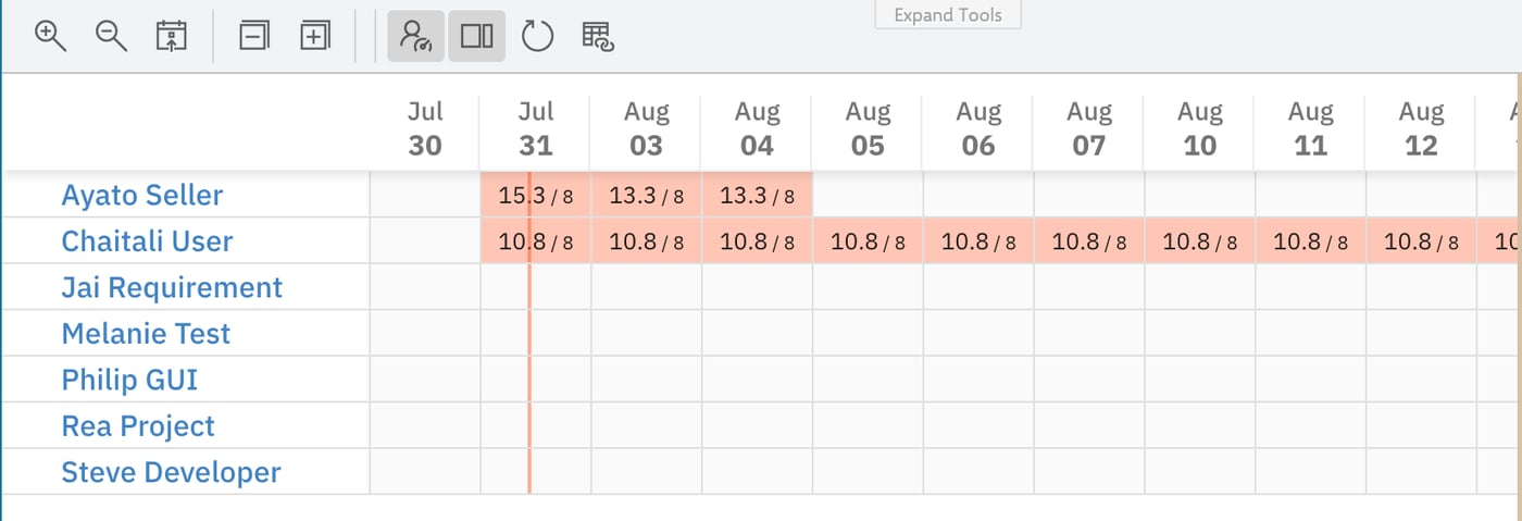 Two things determine the marker, and it is worth keeping them apart:
* **Capacity** -- the denominator -- comes from the kind of row.
* **Load** -- the numerator -- comes from the effort of the task bars sitting in that row on that day.
Load markers belong to the timeline view. Turning **Toggle Resource Load visualization** off switches the board to the flat one-row-per-resource layout, which draws bars only and no markers. Collapsing the swimlanes in the timeline view does the opposite: it leaves the summary rows alone, turning the board into a pure heatmap. See [Board and Timeline](/scheduler/concepts/board-and-timeline).
## Capacity
Capacity is per row and per day.
| Row type | Capacity per day |
| ------------------------------------------------- | ------------------------------------------------------------------------------ |
| User row (**Users (Assignee)** swimlanes) | The user's own Polarion working calendar -- 8 hours under the default calendar |
| Enumeration row (**Enumeration Field** swimlanes) | 24 hours |
User rows take their capacity from the working calendar Polarion holds for that user, day by day, so a user on a non-standard calendar is measured against their own hours rather than a fixed figure. Under Polarion's default calendar that is a standard eight-hour working day, which is why most boards read against `8`. Enumeration rows do not represent a person, so Scheduler treats them as available around the clock -- which is why the same twelve hours of work read as `12 / 24` on a team row and as an overload on a user row.
Days a row treats as non-working carry no capacity. They are drawn with a diagonal hatch in the grid and show no load figure at all, so nothing is ever reported as scheduled against a day the row cannot work.
When comparing rows, check the denominator before reading the colour. A `12 / 24` enumeration row and a `12 / 8` user row hold identical amounts of work, but only the second one is an overload -- the bands are relative to each row's own capacity, not to an absolute number of hours.
## How Effort Becomes Load
Load is driven by **effort**, not by the length of the bar. Which Polarion effort field is read is set by the widget's **Plans Type** parameter -- Initial Estimate, Remaining Estimate, or Remaining Estimate + Time Spent -- as described in [Dates, Duration and Effort](/scheduler/concepts/dates-duration-and-effort).
From there, the calculation for a single day of a single row is:
1. Take each task bar that covers that day in that row.
2. Spread the task's effort evenly across the working days its bar spans, giving that task's share for the day.
3. Add the shares of all the bars in the row for that day. That sum is the `load` figure.
The consequences follow directly from step 2:
* **A longer bar is a lighter load.** The same 20 hours of effort stretched over ten days contributes 2 hours a day instead of 4 hours over five days.
* **A work item with no effort adds nothing.** Its bar is drawn, but it does not raise the load figure, and a day with nothing but effortless bars stays at zero.
* **Changing dates changes the colours.** The markers are recalculated as soon as you drop a bar in a new position.
If a row is red, check the schedule before you question the estimate: load is the estimate divided across the scheduled working days, so a task given too few days looks exactly like an over-committed resource. Note that a bar cannot be stretched by dragging its edge -- lengthen the task through the mapped Duration or end-date field instead, as described in [Schedule and Reschedule Tasks](/scheduler/guides/schedule-and-reschedule-tasks).
## The Four Bands
The colour of a marker is decided by the load as a percentage of that row's capacity for the day.
| Band | Condition | Colour | Marker text |
| ---------- | --------------------------------------- | --------------------- | ------------------------------- |
| No load | Nothing scheduled | Grey `#e0e0e0` | Empty -- no figures are printed |
| Up to 50% | Load is at most half of capacity | Light blue `#cff5fc` | `load / capacity` |
| Up to 100% | Load is above half and at most capacity | Light green `#dcfbb9` | `load / capacity` |
| Over 100% | Load exceeds capacity | Salmon red `#ffc6b5` | `load / capacity` |
The thresholds are boundaries, not gaps: on an eight-hour row exactly `4 / 8` is still light blue and exactly `8 / 8` is still light green. Salmon red starts the moment the load passes capacity.
A grey cell is the zero case: Scheduler prints no figures when a day carries no load, so a grey run across a row means no estimated work lands there. Read it as zero load rather than as an empty day -- a bar carrying no effort leaves its day at zero too, so work can be sitting on a grey cell.
## Overload on the Task Bar
Load also feeds back onto the individual bar. When a task's own effort exceeds the capacity available over the days it is scheduled for, the bar itself turns red -- so an overloaded row usually shows you which bar caused it without any arithmetic.
That red takes precedence over the other card colours: a bar is coloured red for overload first, then grey when the work item is resolved, then red again when it is overdue, and otherwise takes the colour of the work item's status. [Colours and Load Thresholds](/scheduler/reference/colours-and-load-thresholds) lists the full precedence and the card anatomy that goes with it.
## Using Load in Practice
**Levelling a person's week.** Switch to the timeline view, collapse all rows, and scan for red. Every red cell is a day where the commitments exceed eight hours; drag bars out of it until the colour drops to green.
**Sanity-checking a plan before it starts.** A plan made only of light-blue days is usually under-estimated rather than comfortable: it means the effort recorded on the work items accounts for less than half of the scheduled time.
**Planning against enumeration rows.** Remember that a 24-hour capacity will almost never turn red for one person's worth of work. Enumeration swimlanes are best read as relative pressure between options, not as a true availability check.
## See Also
* [Swimlanes and Resources](/scheduler/concepts/swimlanes-and-resources) -- where the 8-hour and 24-hour capacities come from
* [Dates, Duration and Effort](/scheduler/concepts/dates-duration-and-effort) -- the **Plans Type** effort modes and the date mapping that sets bar length
* [Board and Timeline](/scheduler/concepts/board-and-timeline) -- the timeline and flat views, and where markers are drawn
* [Colours and Load Thresholds](/scheduler/reference/colours-and-load-thresholds) -- the colour table and the card colour precedence
* [Schedule and Reschedule Tasks](/scheduler/guides/schedule-and-reschedule-tasks) -- moving bars to level a row
Two things determine the marker, and it is worth keeping them apart:
* **Capacity** -- the denominator -- comes from the kind of row.
* **Load** -- the numerator -- comes from the effort of the task bars sitting in that row on that day.
Load markers belong to the timeline view. Turning **Toggle Resource Load visualization** off switches the board to the flat one-row-per-resource layout, which draws bars only and no markers. Collapsing the swimlanes in the timeline view does the opposite: it leaves the summary rows alone, turning the board into a pure heatmap. See [Board and Timeline](/scheduler/concepts/board-and-timeline).
## Capacity
Capacity is per row and per day.
| Row type | Capacity per day |
| ------------------------------------------------- | ------------------------------------------------------------------------------ |
| User row (**Users (Assignee)** swimlanes) | The user's own Polarion working calendar -- 8 hours under the default calendar |
| Enumeration row (**Enumeration Field** swimlanes) | 24 hours |
User rows take their capacity from the working calendar Polarion holds for that user, day by day, so a user on a non-standard calendar is measured against their own hours rather than a fixed figure. Under Polarion's default calendar that is a standard eight-hour working day, which is why most boards read against `8`. Enumeration rows do not represent a person, so Scheduler treats them as available around the clock -- which is why the same twelve hours of work read as `12 / 24` on a team row and as an overload on a user row.
Days a row treats as non-working carry no capacity. They are drawn with a diagonal hatch in the grid and show no load figure at all, so nothing is ever reported as scheduled against a day the row cannot work.
When comparing rows, check the denominator before reading the colour. A `12 / 24` enumeration row and a `12 / 8` user row hold identical amounts of work, but only the second one is an overload -- the bands are relative to each row's own capacity, not to an absolute number of hours.
## How Effort Becomes Load
Load is driven by **effort**, not by the length of the bar. Which Polarion effort field is read is set by the widget's **Plans Type** parameter -- Initial Estimate, Remaining Estimate, or Remaining Estimate + Time Spent -- as described in [Dates, Duration and Effort](/scheduler/concepts/dates-duration-and-effort).
From there, the calculation for a single day of a single row is:
1. Take each task bar that covers that day in that row.
2. Spread the task's effort evenly across the working days its bar spans, giving that task's share for the day.
3. Add the shares of all the bars in the row for that day. That sum is the `load` figure.
The consequences follow directly from step 2:
* **A longer bar is a lighter load.** The same 20 hours of effort stretched over ten days contributes 2 hours a day instead of 4 hours over five days.
* **A work item with no effort adds nothing.** Its bar is drawn, but it does not raise the load figure, and a day with nothing but effortless bars stays at zero.
* **Changing dates changes the colours.** The markers are recalculated as soon as you drop a bar in a new position.
If a row is red, check the schedule before you question the estimate: load is the estimate divided across the scheduled working days, so a task given too few days looks exactly like an over-committed resource. Note that a bar cannot be stretched by dragging its edge -- lengthen the task through the mapped Duration or end-date field instead, as described in [Schedule and Reschedule Tasks](/scheduler/guides/schedule-and-reschedule-tasks).
## The Four Bands
The colour of a marker is decided by the load as a percentage of that row's capacity for the day.
| Band | Condition | Colour | Marker text |
| ---------- | --------------------------------------- | --------------------- | ------------------------------- |
| No load | Nothing scheduled | Grey `#e0e0e0` | Empty -- no figures are printed |
| Up to 50% | Load is at most half of capacity | Light blue `#cff5fc` | `load / capacity` |
| Up to 100% | Load is above half and at most capacity | Light green `#dcfbb9` | `load / capacity` |
| Over 100% | Load exceeds capacity | Salmon red `#ffc6b5` | `load / capacity` |
The thresholds are boundaries, not gaps: on an eight-hour row exactly `4 / 8` is still light blue and exactly `8 / 8` is still light green. Salmon red starts the moment the load passes capacity.
A grey cell is the zero case: Scheduler prints no figures when a day carries no load, so a grey run across a row means no estimated work lands there. Read it as zero load rather than as an empty day -- a bar carrying no effort leaves its day at zero too, so work can be sitting on a grey cell.
## Overload on the Task Bar
Load also feeds back onto the individual bar. When a task's own effort exceeds the capacity available over the days it is scheduled for, the bar itself turns red -- so an overloaded row usually shows you which bar caused it without any arithmetic.
That red takes precedence over the other card colours: a bar is coloured red for overload first, then grey when the work item is resolved, then red again when it is overdue, and otherwise takes the colour of the work item's status. [Colours and Load Thresholds](/scheduler/reference/colours-and-load-thresholds) lists the full precedence and the card anatomy that goes with it.
## Using Load in Practice
**Levelling a person's week.** Switch to the timeline view, collapse all rows, and scan for red. Every red cell is a day where the commitments exceed eight hours; drag bars out of it until the colour drops to green.
**Sanity-checking a plan before it starts.** A plan made only of light-blue days is usually under-estimated rather than comfortable: it means the effort recorded on the work items accounts for less than half of the scheduled time.
**Planning against enumeration rows.** Remember that a 24-hour capacity will almost never turn red for one person's worth of work. Enumeration swimlanes are best read as relative pressure between options, not as a true availability check.
## See Also
* [Swimlanes and Resources](/scheduler/concepts/swimlanes-and-resources) -- where the 8-hour and 24-hour capacities come from
* [Dates, Duration and Effort](/scheduler/concepts/dates-duration-and-effort) -- the **Plans Type** effort modes and the date mapping that sets bar length
* [Board and Timeline](/scheduler/concepts/board-and-timeline) -- the timeline and flat views, and where markers are drawn
* [Colours and Load Thresholds](/scheduler/reference/colours-and-load-thresholds) -- the colour table and the card colour precedence
* [Schedule and Reschedule Tasks](/scheduler/guides/schedule-and-reschedule-tasks) -- moving bars to level a row