> ## Documentation Index
> Fetch the complete documentation index at: https://learn.nextedy.com/llms.txt
> Use this file to discover all available pages before exploring further.
# Configure Cell Styles
> Define custom CSS styles that control the visual appearance of cells, headers, and column groups in the Nextedy RISKSHEET grid using the `styles`, `cellDecorators`, and `cellCss` configuration properties.
export const LastReviewed = ({date}) => {
if (!date) return null;
const formatted = new Date(`${date}T00:00:00Z`).toLocaleDateString("en-US", {
year: "numeric",
month: "long",
day: "numeric",
timeZone: "UTC"
});
return
Last reviewed on {formatted}
;
};
## How Cell Styles Work
The styling system uses three interconnected configuration properties in the sheet configuration:
1. **`styles`** -- defines named CSS class rules
2. **`cellDecorators`** -- JavaScript functions that apply CSS classes conditionally based on cell values
3. **`cellCss`** / `headerGroupCss` -- static CSS class assignment per column
A column references a decorator function through its `cellRenderer` property. The function name in `cellRenderer` must match a key in the `cellDecorators` section.
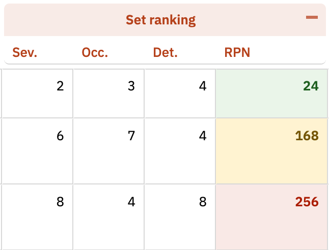 Add CSS class definitions to the `styles` section of the sheet configuration. Each key is a CSS selector pattern and the value is the CSS rule. Style values **must** be wrapped in curly braces `{}` -- without them, the styles will not be applied:
```yaml theme={null}
styles:
.boldCol: '{font-weight: 600;}'
.rpn1: '{background-color: #eaf5e9 !important; color: #1d5f20 !important;}'
.rpn2: '{background-color: #fff3d2 !important; color: #735602 !important;}'
.rpn3: '{background-color: #f8eae7 !important; color: #ab1c00 !important;}'
```
The grid applies default styling to cells. Your custom styles must include `!important` on `background-color` and `color` properties to override these defaults. Without `!important`, your custom colors will not appear.
### Style Naming Patterns
| Pattern | Purpose | Example |
| ---------------------- | --------------------------- | ----------------------- |
| `.className` | General cell class | `.boldCol`, `.rpn1` |
| `.firstRow .groupName` | First row of a column group | `.firstRow .headSysReq` |
| `.lastRow .groupName` | Last row of a column group | `.lastRow .headSysReq` |
To apply a CSS class to every cell in a column regardless of its value, use the `cellCss` property on the column definition:
```yaml theme={null}
columns:
- id: rpn
header: RPN
bindings: rpn
formula: commonRpn
cellCss: boldCol
```
For header group styling, use `headerGroupCss`:
```yaml theme={null}
columns:
- id: sev
header: Severity
headerGroup: Initial Assessment
headerGroupCss: headInitialAssessment
```
For dynamic styling based on cell values, define a decorator function in the `cellDecorators` section and reference it from the column through the `cellRenderer` property. The column property is `cellRenderer`; the config section that holds the function bodies is `cellDecorators`:
```yaml theme={null}
cellDecorators:
rpn: "function(info){ var val = info.value; $(info.cell).toggleClass('boldCol', true); $(info.cell).toggleClass('rpn1', val > 0 && val <= 150); $(info.cell).toggleClass('rpn2', val > 150 && val <= 250); $(info.cell).toggleClass('rpn3', val > 250); }"
styles:
.rpn1: '{background-color: #eaf5e9 !important; color: #1d5f20 !important;}'
.rpn2: '{background-color: #fff3d2 !important; color: #735602 !important;}'
.rpn3: '{background-color: #f8eae7 !important; color: #ab1c00 !important;}'
columns:
- id: rpn
header: RPN
bindings: rpn
formula: commonRpn
cellRenderer: rpn
```
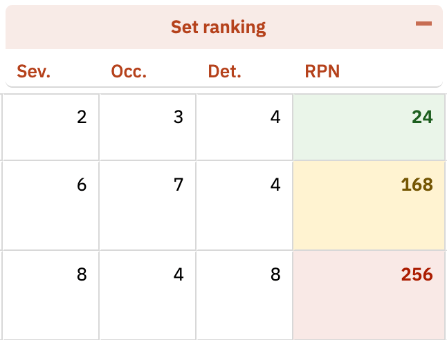
The three Risk Priority Number (RPN) bands above are illustrative -- `rpn1` (0-150, green), `rpn2` (151-250, amber), `rpn3` (251+, red). RPN thresholds are user-configurable; choose values that match your project's risk acceptance criteria.
Add CSS class definitions to the `styles` section of the sheet configuration. Each key is a CSS selector pattern and the value is the CSS rule. Style values **must** be wrapped in curly braces `{}` -- without them, the styles will not be applied:
```yaml theme={null}
styles:
.boldCol: '{font-weight: 600;}'
.rpn1: '{background-color: #eaf5e9 !important; color: #1d5f20 !important;}'
.rpn2: '{background-color: #fff3d2 !important; color: #735602 !important;}'
.rpn3: '{background-color: #f8eae7 !important; color: #ab1c00 !important;}'
```
The grid applies default styling to cells. Your custom styles must include `!important` on `background-color` and `color` properties to override these defaults. Without `!important`, your custom colors will not appear.
### Style Naming Patterns
| Pattern | Purpose | Example |
| ---------------------- | --------------------------- | ----------------------- |
| `.className` | General cell class | `.boldCol`, `.rpn1` |
| `.firstRow .groupName` | First row of a column group | `.firstRow .headSysReq` |
| `.lastRow .groupName` | Last row of a column group | `.lastRow .headSysReq` |
To apply a CSS class to every cell in a column regardless of its value, use the `cellCss` property on the column definition:
```yaml theme={null}
columns:
- id: rpn
header: RPN
bindings: rpn
formula: commonRpn
cellCss: boldCol
```
For header group styling, use `headerGroupCss`:
```yaml theme={null}
columns:
- id: sev
header: Severity
headerGroup: Initial Assessment
headerGroupCss: headInitialAssessment
```
For dynamic styling based on cell values, define a decorator function in the `cellDecorators` section and reference it from the column through the `cellRenderer` property. The column property is `cellRenderer`; the config section that holds the function bodies is `cellDecorators`:
```yaml theme={null}
cellDecorators:
rpn: "function(info){ var val = info.value; $(info.cell).toggleClass('boldCol', true); $(info.cell).toggleClass('rpn1', val > 0 && val <= 150); $(info.cell).toggleClass('rpn2', val > 150 && val <= 250); $(info.cell).toggleClass('rpn3', val > 250); }"
styles:
.rpn1: '{background-color: #eaf5e9 !important; color: #1d5f20 !important;}'
.rpn2: '{background-color: #fff3d2 !important; color: #735602 !important;}'
.rpn3: '{background-color: #f8eae7 !important; color: #ab1c00 !important;}'
columns:
- id: rpn
header: RPN
bindings: rpn
formula: commonRpn
cellRenderer: rpn
```
The three Risk Priority Number (RPN) bands above are illustrative -- `rpn1` (0-150, green), `rpn2` (151-250, amber), `rpn3` (251+, red). RPN thresholds are user-configurable; choose values that match your project's risk acceptance criteria.
 The cell decorator function receives an `info` object with these properties:
| Property | Description |
| ------------ | -------------------------- |
| `info.value` | Current cell value |
| `info.cell` | DOM element of the cell |
| `info.item` | Full work item data object |
Cell decorators **must** apply styling through `$(info.cell).toggleClass()` (or `wijmo.toggleClass()`). Direct inline styles such as `info.cell.style.backgroundColor = 'red'` will **break** because the grid reuses cell DOM elements during virtual scrolling. A cell that becomes red for one row will keep that color when reused for a different row whose decorator does not set a style. Using `toggleClass()` with a boolean condition guarantees the class is added or removed correctly for every cell on every render pass.
Cell decorator functions compare against enum IDs, not display values. For example, use `val === 'yes'` (the enum ID), not `val === 'Y'` (the display name). Using the display value will cause the conditional styling to fail silently.
Use the `firstRow` and `lastRow` pseudo-selectors to apply different styling to the first and last rows within a column group:
```yaml theme={null}
styles:
.firstRow .headSysReq: '{background-color: rgba(62, 175, 63, 0.12) !important; color: #2A792D !important;}'
.lastRow .headSysReq: '{background-color: #FFF !important; color: #2A792D !important;}'
```
This creates visual banding where the first row of a group gets a tinted background and the last row returns to white.
Control the pixel height of column headers and column group headers using the `headers` section:
```yaml theme={null}
headers:
columnHeader:
height: 32
columnGroupHeader:
height: 32
```
Increase the `columnHeader.height` value to allow long header text to wrap across multiple lines. Combine with appropriate column `width` settings for optimal readability.
Risksheet does not have a built-in row height limit, but you can control it using a cell decorator with CSS `max-height`. Apply the class through `toggleClass()` rather than directly mutating `info.cell.style`:
```yaml theme={null}
styles:
.limitHeight: '{max-height: 80px; overflow: hidden;}'
cellDecorators:
limitDescription: "function(info){ $(info.cell).toggleClass('limitHeight', true); }"
columns:
- id: description
header: Description
cellRenderer: limitDescription
```
## Export Considerations
Cell styles carry over to exports differently depending on the format:
| Export Format | Style Behavior |
| ------------- | ------------------------------------------------------------------------------------------------------------ |
| Excel | Background colors and text colors from the grid are preserved |
| PDF | Cell formatting is controlled by the PDF export configuration (`risksheetPdfExport.vm`), not the grid styles |
## Verification
After saving your configuration changes and reloading the Risksheet page, you should now see:
* Custom background colors and text colors applied to cells matching your style definitions
* Conditional coloring that changes dynamically as cell values are edited
* Column group headers with distinct first-row and last-row styling
* Bold text or other font styling on columns with `cellCss` assigned
* No visual artifacts when scrolling -- because decorators use `toggleClass()`, cells reused during virtual scrolling re-evaluate their classes correctly
## See Also
* [Apply Conditional Formatting](/risksheet/guides/styling/conditional-formatting) -- cell decorator function reference and advanced patterns
* [Configure Row Header Styles](/risksheet/guides/styling/row-header-styles) -- row header customization
* [Configure Item Colors](/risksheet/guides/styling/item-colors) -- severity-based coloring
* [Add Header Tooltips](/risksheet/guides/styling/header-tooltips) -- informative header tooltips
The cell decorator function receives an `info` object with these properties:
| Property | Description |
| ------------ | -------------------------- |
| `info.value` | Current cell value |
| `info.cell` | DOM element of the cell |
| `info.item` | Full work item data object |
Cell decorators **must** apply styling through `$(info.cell).toggleClass()` (or `wijmo.toggleClass()`). Direct inline styles such as `info.cell.style.backgroundColor = 'red'` will **break** because the grid reuses cell DOM elements during virtual scrolling. A cell that becomes red for one row will keep that color when reused for a different row whose decorator does not set a style. Using `toggleClass()` with a boolean condition guarantees the class is added or removed correctly for every cell on every render pass.
Cell decorator functions compare against enum IDs, not display values. For example, use `val === 'yes'` (the enum ID), not `val === 'Y'` (the display name). Using the display value will cause the conditional styling to fail silently.
Use the `firstRow` and `lastRow` pseudo-selectors to apply different styling to the first and last rows within a column group:
```yaml theme={null}
styles:
.firstRow .headSysReq: '{background-color: rgba(62, 175, 63, 0.12) !important; color: #2A792D !important;}'
.lastRow .headSysReq: '{background-color: #FFF !important; color: #2A792D !important;}'
```
This creates visual banding where the first row of a group gets a tinted background and the last row returns to white.
Control the pixel height of column headers and column group headers using the `headers` section:
```yaml theme={null}
headers:
columnHeader:
height: 32
columnGroupHeader:
height: 32
```
Increase the `columnHeader.height` value to allow long header text to wrap across multiple lines. Combine with appropriate column `width` settings for optimal readability.
Risksheet does not have a built-in row height limit, but you can control it using a cell decorator with CSS `max-height`. Apply the class through `toggleClass()` rather than directly mutating `info.cell.style`:
```yaml theme={null}
styles:
.limitHeight: '{max-height: 80px; overflow: hidden;}'
cellDecorators:
limitDescription: "function(info){ $(info.cell).toggleClass('limitHeight', true); }"
columns:
- id: description
header: Description
cellRenderer: limitDescription
```
## Export Considerations
Cell styles carry over to exports differently depending on the format:
| Export Format | Style Behavior |
| ------------- | ------------------------------------------------------------------------------------------------------------ |
| Excel | Background colors and text colors from the grid are preserved |
| PDF | Cell formatting is controlled by the PDF export configuration (`risksheetPdfExport.vm`), not the grid styles |
## Verification
After saving your configuration changes and reloading the Risksheet page, you should now see:
* Custom background colors and text colors applied to cells matching your style definitions
* Conditional coloring that changes dynamically as cell values are edited
* Column group headers with distinct first-row and last-row styling
* Bold text or other font styling on columns with `cellCss` assigned
* No visual artifacts when scrolling -- because decorators use `toggleClass()`, cells reused during virtual scrolling re-evaluate their classes correctly
## See Also
* [Apply Conditional Formatting](/risksheet/guides/styling/conditional-formatting) -- cell decorator function reference and advanced patterns
* [Configure Row Header Styles](/risksheet/guides/styling/row-header-styles) -- row header customization
* [Configure Item Colors](/risksheet/guides/styling/item-colors) -- severity-based coloring
* [Add Header Tooltips](/risksheet/guides/styling/header-tooltips) -- informative header tooltips