Last reviewed on {formatted}
; }; This page is the exhaustive property reference for column definitions. For binding path syntax details, see [Binding Syntax](/powersheet/reference/sheet-config/binding-syntax). For column grouping, see [Column Groups](/powersheet/reference/sheet-config/column-groups). For multi-value columns, see [Multi-Item Columns](/powersheet/reference/sheet-config/multi-item-columns). *** ## Column Configuration Hierarchy All column types share the same set of properties described in this reference. The **binding path** (the YAML key) determines which entity and property the column is bound to. Every segment of a navigation path must have a corresponding `expand` entry in the [Sources](/powersheet/reference/sheet-config/sources) configuration.
***
## Column Properties Reference
| Name | Type | Default | Description |
| ------------- | ---------------------- | -------------------------------------- | -------------------------------------------------------------------------------------------------------------------------------------------------------------------------------------------------------- |
| `title` | `string` | Binding path (e.g. `0.UserNeed.title`) | Display label for the column header. If omitted, defaults to the level index, entity type, and property name derived from the binding path. |
| `width` | `number` or `string` | `'*'` | Column width. Numeric values are in pixels. String values support star-sizing (e.g. `'2*'` for double proportional width). |
| `minWidth` | `number` | `150` | Minimum column width in pixels. Prevents the column from being resized below this value. |
| `visible` | `boolean` | `true` | Controls whether the column is shown by default. Can be overridden per-view in [Views](/powersheet/reference/sheet-config/views). |
| `hasFocus` | `boolean` | `false` | Designates this column as the primary focus column for its entity level. See [Focus and URL Resolution](#focus-and-url-resolution). |
| `hasUrl` | `boolean` | `false` | Designates this column to display a link to the record in the target platform. See [Focus and URL Resolution](#focus-and-url-resolution). |
| `formatter` | `string` or `string[]` | None | References a formatter name (or array of names) from the `formatters` section. See [Formatters](/powersheet/reference/sheet-config/formatters). |
| `columnGroup` | `string` | None | Assigns the column to a visual column group. Value must be a key defined in `columnGroups`. See [Column Groups](/powersheet/reference/sheet-config/column-groups). |
| `multiItem` | `boolean` | `false` | Turns the column into a multi-item picker for many-to-many relationships. Does not create a new hierarchy level. See [Multi-Item Columns](#multi-item-columns). |
| `display` | `string` | `id` | Specifies which property of a referenced entity to display. Accepts any property path on the entity object, or a dynamic expression starting with `() =>`. See [Display vs. Render](#display-vs-render). |
| `render` | `string` | None | Server-side rendered output via a renderer or JavaScript expression. Display-only -- does not affect underlying data. See [Display vs. Render](#display-vs-render). |
| `sort` | `string` | None | Default sort direction for this column: `asc` or `desc`. Applied in addition to the global [Sort By](/powersheet/reference/sheet-config/sortby) configuration. |
| `groupBy` | `boolean` or `object` | `false` | Enables row grouping by this column's values. Can be a boolean or `{ hideCounter: boolean }`. See [Row Grouping](#row-grouping-groupby). |
| `isReadOnly` | `boolean` | `false` | Makes the column read-only regardless of user permissions or document-level settings. Use a `readOnly` formatter separately to apply visual styling. |
| `isRequired` | `boolean` | `false` | Marks the column as required. Creates custom validation before save -- a save is blocked if this column has no value. |
| `header` | `object` | None | Custom styling for the column header. Contains a `style` property referencing a named style from the `styles` section. See [Header Styling](#header-styling). |
| `list` | `object` | None | Configuration for picker/dropdown behavior when selecting related entities. See [Picker Configuration](#picker-configuration-list). |
| `frozen` | `boolean` | `false` | Freezes the column so it remains visible during horizontal scrolling. If multiple columns have `frozen: true`, the freeze boundary is set at the last frozen column. |
| `aggregate` | `string` | `sum` | Defines the calculation for the aggregate row. Accepted values: `sum`, `avg`, `min`, `max`, `count`. If omitted or invalid, defaults to `sum`. |
| `filter` | `object` | None | Defines an initial client-side value filter. See [Client-Side Filtering](#client-side-filtering-filter). |
| `format` | `string` | None | Data format string for numeric or date values (e.g. `c0$` for currency). |
| `formula` | `string` | None | JavaScript arrow function for computed column values that affect the data model. See [Formula Columns](#formula-columns). |
| `multiLine` | `boolean` | `true` | Controls whether the cell editor supports multi-line text input. |
| `wordWrap` | `boolean` | `true` | Controls whether text wraps within the cell or is clipped. |
| `type` | `string` | None | Overrides the column data type. Use `enum` for enumeration columns. |
***
## Basic Column Definition
The YAML key under `columns:` is the **binding path** -- a dot-separated path from the root entity to the target property:
```yaml theme={null}
columns:
title:
title: Title
width: 200
hasFocus: true
description:
title: Description
width: 300
multiLine: true
severity:
title: Severity
width: 100
isReadOnly: true
```
Direct property columns bind to a property on the root entity type defined in the first source.
***
## Navigation Path Columns
To display properties from related entities, use a navigation path. Each segment alternates between the **navigation property name** (the relationship) and the **entity type name** (from the data model):
```yaml theme={null}
columns:
systemRequirements.systemRequirement.title:
title: System Req Title
width: 200
hasFocus: true
systemRequirements.systemRequirement.designRequirements.designRequirement.title:
title: Design Req Title
width: 200
```
All column types share the same set of properties described in this reference. The **binding path** (the YAML key) determines which entity and property the column is bound to. Every segment of a navigation path must have a corresponding `expand` entry in the [Sources](/powersheet/reference/sheet-config/sources) configuration.
***
## Column Properties Reference
| Name | Type | Default | Description |
| ------------- | ---------------------- | -------------------------------------- | -------------------------------------------------------------------------------------------------------------------------------------------------------------------------------------------------------- |
| `title` | `string` | Binding path (e.g. `0.UserNeed.title`) | Display label for the column header. If omitted, defaults to the level index, entity type, and property name derived from the binding path. |
| `width` | `number` or `string` | `'*'` | Column width. Numeric values are in pixels. String values support star-sizing (e.g. `'2*'` for double proportional width). |
| `minWidth` | `number` | `150` | Minimum column width in pixels. Prevents the column from being resized below this value. |
| `visible` | `boolean` | `true` | Controls whether the column is shown by default. Can be overridden per-view in [Views](/powersheet/reference/sheet-config/views). |
| `hasFocus` | `boolean` | `false` | Designates this column as the primary focus column for its entity level. See [Focus and URL Resolution](#focus-and-url-resolution). |
| `hasUrl` | `boolean` | `false` | Designates this column to display a link to the record in the target platform. See [Focus and URL Resolution](#focus-and-url-resolution). |
| `formatter` | `string` or `string[]` | None | References a formatter name (or array of names) from the `formatters` section. See [Formatters](/powersheet/reference/sheet-config/formatters). |
| `columnGroup` | `string` | None | Assigns the column to a visual column group. Value must be a key defined in `columnGroups`. See [Column Groups](/powersheet/reference/sheet-config/column-groups). |
| `multiItem` | `boolean` | `false` | Turns the column into a multi-item picker for many-to-many relationships. Does not create a new hierarchy level. See [Multi-Item Columns](#multi-item-columns). |
| `display` | `string` | `id` | Specifies which property of a referenced entity to display. Accepts any property path on the entity object, or a dynamic expression starting with `() =>`. See [Display vs. Render](#display-vs-render). |
| `render` | `string` | None | Server-side rendered output via a renderer or JavaScript expression. Display-only -- does not affect underlying data. See [Display vs. Render](#display-vs-render). |
| `sort` | `string` | None | Default sort direction for this column: `asc` or `desc`. Applied in addition to the global [Sort By](/powersheet/reference/sheet-config/sortby) configuration. |
| `groupBy` | `boolean` or `object` | `false` | Enables row grouping by this column's values. Can be a boolean or `{ hideCounter: boolean }`. See [Row Grouping](#row-grouping-groupby). |
| `isReadOnly` | `boolean` | `false` | Makes the column read-only regardless of user permissions or document-level settings. Use a `readOnly` formatter separately to apply visual styling. |
| `isRequired` | `boolean` | `false` | Marks the column as required. Creates custom validation before save -- a save is blocked if this column has no value. |
| `header` | `object` | None | Custom styling for the column header. Contains a `style` property referencing a named style from the `styles` section. See [Header Styling](#header-styling). |
| `list` | `object` | None | Configuration for picker/dropdown behavior when selecting related entities. See [Picker Configuration](#picker-configuration-list). |
| `frozen` | `boolean` | `false` | Freezes the column so it remains visible during horizontal scrolling. If multiple columns have `frozen: true`, the freeze boundary is set at the last frozen column. |
| `aggregate` | `string` | `sum` | Defines the calculation for the aggregate row. Accepted values: `sum`, `avg`, `min`, `max`, `count`. If omitted or invalid, defaults to `sum`. |
| `filter` | `object` | None | Defines an initial client-side value filter. See [Client-Side Filtering](#client-side-filtering-filter). |
| `format` | `string` | None | Data format string for numeric or date values (e.g. `c0$` for currency). |
| `formula` | `string` | None | JavaScript arrow function for computed column values that affect the data model. See [Formula Columns](#formula-columns). |
| `multiLine` | `boolean` | `true` | Controls whether the cell editor supports multi-line text input. |
| `wordWrap` | `boolean` | `true` | Controls whether text wraps within the cell or is clipped. |
| `type` | `string` | None | Overrides the column data type. Use `enum` for enumeration columns. |
***
## Basic Column Definition
The YAML key under `columns:` is the **binding path** -- a dot-separated path from the root entity to the target property:
```yaml theme={null}
columns:
title:
title: Title
width: 200
hasFocus: true
description:
title: Description
width: 300
multiLine: true
severity:
title: Severity
width: 100
isReadOnly: true
```
Direct property columns bind to a property on the root entity type defined in the first source.
***
## Navigation Path Columns
To display properties from related entities, use a navigation path. Each segment alternates between the **navigation property name** (the relationship) and the **entity type name** (from the data model):
```yaml theme={null}
columns:
systemRequirements.systemRequirement.title:
title: System Req Title
width: 200
hasFocus: true
systemRequirements.systemRequirement.designRequirements.designRequirement.title:
title: Design Req Title
width: 200
```
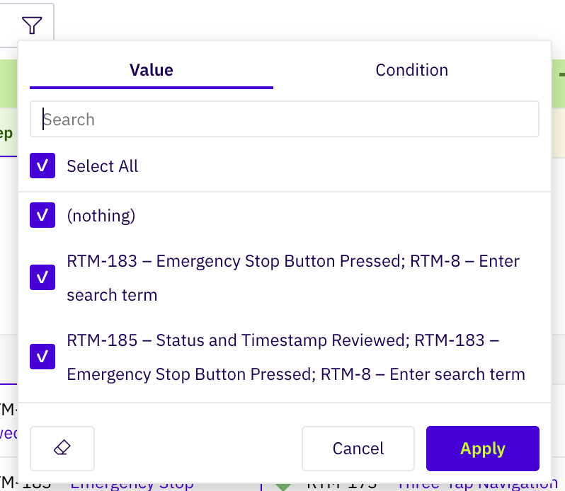
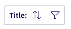 Clicking the funnel opens a filter dialog with two tabs: **Value** (pick the specific values to keep visible) and **Condition** (define a filter expression). The dialog supports a search field, Select All, an eraser to clear the filter, and Cancel/Apply buttons.
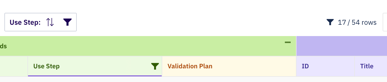
 Once a filter is active, the funnel icon in the column header turns green, and the toolbar shows the filtered row count (e.g. **17 / 54 rows**) alongside a global funnel indicator:
 To remove all active filters at once, use **Menu > Filter & Sort > Clear all filters**:
 ***
## Row Grouping (`groupBy`)
The `groupBy` property enables grouping rows by the column's values. It supports two forms:
**Boolean (legacy):**
```yaml theme={null}
columns:
category:
title: Category
groupBy: true
```
**Object with options:**
```yaml theme={null}
columns:
category:
title: Category
groupBy:
hideCounter: true
```
When `hideCounter` is `true`, the item count next to each group header is hidden. By default, the group row counter visibility is controlled by the root-level `showGroupRowCounter` property.
***
## Header Styling
The `header` property controls the visual appearance of the column header. It references a named style from the `styles` section.
```yaml theme={null}
columns:
severity:
title: Severity
header:
style: dangerHeader
styles:
dangerHeader:
color: red700
backgroundColor: red100
```
The `header.style` value can be shared across columns using YAML anchors:
```yaml theme={null}
columns:
probability:
title: Probability
header: &riskHeader
style: riskStyle
severity:
title: Severity
header: *riskHeader
```
The `headerStyle` value from the column's `columnGroup` is applied by default and can be overridden by `header.style` on the individual column.
For the full style reference, see [Styles](/powersheet/reference/sheet-config/styles).
***
## Frozen Columns
Setting `frozen: true` freezes the column so it remains visible when scrolling horizontally. If multiple columns have `frozen: true`, the freeze boundary is placed at the **last** frozen column -- all columns up to and including that column are frozen.
```yaml theme={null}
columns:
id:
title: ID
width: 80
frozen: true
title:
title: Title
width: 200
frozen: true
```
***
## Aggregate Row
The `aggregate` property defines a calculation displayed in the aggregate (summary) row at the bottom of the sheet.
| Value | Calculation |
| ------- | --------------------------- |
| `sum` | Sum of all values (default) |
| `avg` | Average of all values |
| `min` | Minimum value |
| `max` | Maximum value |
| `count` | Count of non-empty values |
```yaml theme={null}
columns:
storyPoints:
title: Story Points
aggregate: sum
probability:
title: Probability
aggregate: avg
```
***
## Column with Formatter
Reference a formatter to apply conditional styling or enforce read-only behavior:
```yaml theme={null}
columns:
outlineNumber:
title: "#"
width: 80
formatter: readonly
isReadOnly: true
```
The referenced formatter must be defined in the `formatters` section:
```yaml theme={null}
formatters:
readonly:
expression: "true"
style: readOnlyStyle
```
A column can also reference multiple formatters using an array:
```yaml theme={null}
columns:
severity:
title: Severity
formatter:
- severityHighlight
- readonly
```
See [Formatters](/powersheet/reference/sheet-config/formatters) for the full formatter reference.
***
## Complete YAML Example
A complete sheet configuration demonstrating the key column properties in a requirements traceability context:
```yaml theme={null}
columnGroups:
userNeeds:
groupName: User Needs
groupStyle: indigo
headerStyle: indigo
sysReqs:
groupName: System Requirements
groupStyle: purple
headerStyle: purple
collapseTo: systemRequirements.systemRequirement.title
designReqs:
groupName: Design Requirements
groupStyle: orange
headerStyle: orange
columns:
outlineNumber:
title: "#"
width: 80
sort: asc
formatter: readonly
isReadOnly: true
frozen: true
title:
title: User Need
width: 250
hasFocus: true
hasUrl: true
columnGroup: userNeeds
wordWrap: true
severity:
title: Severity
width: 100
columnGroup: userNeeds
formatter: severityFormatter
description:
title: Description
width: 300
visible: false
multiLine: true
systemRequirements.systemRequirement.title:
title: System Req
width: 200
hasFocus: true
hasUrl: true
columnGroup: sysReqs
display: titleOrName
header: &sysReqHeader
style: purple
systemRequirements.systemRequirement.status:
title: Status
width: 100
columnGroup: sysReqs
groupBy: true
header: *sysReqHeader
filter:
values:
- Open
- In Review
systemRequirements.systemRequirement.designRequirements.designRequirement.title:
title: Design Req
width: 200
hasFocus: true
columnGroup: designReqs
display: title
list:
search:
- title
- id
riskScore:
title: Risk Score
width: 80
formula: "() => context.item.Probability * context.item.Severity"
isReadOnly: true
aggregate: avg
sortBy:
- columnId: severity
direction: desc
sources:
- id: UserNeed
query:
from: UserNeed
expand:
- name: systemRequirements
expand:
- name: designRequirements
formatters:
severityFormatter:
expression: "context.item.severity === 'Critical'"
style: criticalStyle
readonly:
expression: "true"
style: readOnlyStyle
styles:
criticalStyle:
color: red700
backgroundColor: red100
readOnlyStyle:
backgroundColor: grey100
views:
Without Design Reqs:
columns:
systemRequirements.systemRequirement.designRequirements.designRequirement.title:
visible: false
Critical Only:
default: true
columns:
severity:
filter:
values:
- Critical
```
***
## Row Grouping (`groupBy`)
The `groupBy` property enables grouping rows by the column's values. It supports two forms:
**Boolean (legacy):**
```yaml theme={null}
columns:
category:
title: Category
groupBy: true
```
**Object with options:**
```yaml theme={null}
columns:
category:
title: Category
groupBy:
hideCounter: true
```
When `hideCounter` is `true`, the item count next to each group header is hidden. By default, the group row counter visibility is controlled by the root-level `showGroupRowCounter` property.
***
## Header Styling
The `header` property controls the visual appearance of the column header. It references a named style from the `styles` section.
```yaml theme={null}
columns:
severity:
title: Severity
header:
style: dangerHeader
styles:
dangerHeader:
color: red700
backgroundColor: red100
```
The `header.style` value can be shared across columns using YAML anchors:
```yaml theme={null}
columns:
probability:
title: Probability
header: &riskHeader
style: riskStyle
severity:
title: Severity
header: *riskHeader
```
The `headerStyle` value from the column's `columnGroup` is applied by default and can be overridden by `header.style` on the individual column.
For the full style reference, see [Styles](/powersheet/reference/sheet-config/styles).
***
## Frozen Columns
Setting `frozen: true` freezes the column so it remains visible when scrolling horizontally. If multiple columns have `frozen: true`, the freeze boundary is placed at the **last** frozen column -- all columns up to and including that column are frozen.
```yaml theme={null}
columns:
id:
title: ID
width: 80
frozen: true
title:
title: Title
width: 200
frozen: true
```
***
## Aggregate Row
The `aggregate` property defines a calculation displayed in the aggregate (summary) row at the bottom of the sheet.
| Value | Calculation |
| ------- | --------------------------- |
| `sum` | Sum of all values (default) |
| `avg` | Average of all values |
| `min` | Minimum value |
| `max` | Maximum value |
| `count` | Count of non-empty values |
```yaml theme={null}
columns:
storyPoints:
title: Story Points
aggregate: sum
probability:
title: Probability
aggregate: avg
```
***
## Column with Formatter
Reference a formatter to apply conditional styling or enforce read-only behavior:
```yaml theme={null}
columns:
outlineNumber:
title: "#"
width: 80
formatter: readonly
isReadOnly: true
```
The referenced formatter must be defined in the `formatters` section:
```yaml theme={null}
formatters:
readonly:
expression: "true"
style: readOnlyStyle
```
A column can also reference multiple formatters using an array:
```yaml theme={null}
columns:
severity:
title: Severity
formatter:
- severityHighlight
- readonly
```
See [Formatters](/powersheet/reference/sheet-config/formatters) for the full formatter reference.
***
## Complete YAML Example
A complete sheet configuration demonstrating the key column properties in a requirements traceability context:
```yaml theme={null}
columnGroups:
userNeeds:
groupName: User Needs
groupStyle: indigo
headerStyle: indigo
sysReqs:
groupName: System Requirements
groupStyle: purple
headerStyle: purple
collapseTo: systemRequirements.systemRequirement.title
designReqs:
groupName: Design Requirements
groupStyle: orange
headerStyle: orange
columns:
outlineNumber:
title: "#"
width: 80
sort: asc
formatter: readonly
isReadOnly: true
frozen: true
title:
title: User Need
width: 250
hasFocus: true
hasUrl: true
columnGroup: userNeeds
wordWrap: true
severity:
title: Severity
width: 100
columnGroup: userNeeds
formatter: severityFormatter
description:
title: Description
width: 300
visible: false
multiLine: true
systemRequirements.systemRequirement.title:
title: System Req
width: 200
hasFocus: true
hasUrl: true
columnGroup: sysReqs
display: titleOrName
header: &sysReqHeader
style: purple
systemRequirements.systemRequirement.status:
title: Status
width: 100
columnGroup: sysReqs
groupBy: true
header: *sysReqHeader
filter:
values:
- Open
- In Review
systemRequirements.systemRequirement.designRequirements.designRequirement.title:
title: Design Req
width: 200
hasFocus: true
columnGroup: designReqs
display: title
list:
search:
- title
- id
riskScore:
title: Risk Score
width: 80
formula: "() => context.item.Probability * context.item.Severity"
isReadOnly: true
aggregate: avg
sortBy:
- columnId: severity
direction: desc
sources:
- id: UserNeed
query:
from: UserNeed
expand:
- name: systemRequirements
expand:
- name: designRequirements
formatters:
severityFormatter:
expression: "context.item.severity === 'Critical'"
style: criticalStyle
readonly:
expression: "true"
style: readOnlyStyle
styles:
criticalStyle:
color: red700
backgroundColor: red100
readOnlyStyle:
backgroundColor: grey100
views:
Without Design Reqs:
columns:
systemRequirements.systemRequirement.designRequirements.designRequirement.title:
visible: false
Critical Only:
default: true
columns:
severity:
filter:
values:
- Critical
```
 ### Display Properties
| Property | Type | Default | Description |
| ---------- | ------------- | ------- | ---------------------------------------------------------------------------------------------------------------------------------------- |
| `title` | string | None | Display label for the column header |
| `width` | number/string | `"*"` | Column width in pixels (number) or proportional width (string with `*`, e.g., `"*"`, `"2*"`) |
| `minWidth` | number | `150` | Minimum column width in pixels for responsive layouts |
| `visible` | boolean | `true` | Controls whether the column is shown in the default view. Can be overridden in [views](/powersheet/reference/sheet-config/views). |
| `display` | string | `id` | Specifies which property of a referenced entity to display. See [Display Property](/powersheet/reference/sheet-config/display-property). |
| `render` | string | None | Custom HTML rendering function or predefined renderer name. See [Render Property](/powersheet/reference/sheet-config/render-property). |
### Behavior Properties
| Property | Type | Default | Description |
| ------------ | ------- | ------- | ----------------------------------------------------------------------------------------------------------------------------------------------------- |
| `hasFocus` | boolean | `false` | Indicates this column receives initial focus for user interaction. Auto-configured to first editable column if not set. |
| `isReadOnly` | boolean | `false` | Prevents user editing of this column. To also apply visual read-only styling (greyed-out background), add a separate `formatter: readOnly` reference. |
| `multiItem` | boolean | `false` | Indicates this column displays multiple related items. See [Multi-Item Columns](/powersheet/reference/sheet-config/multi-item-columns). |
| `sort` | string | None | Default sort direction for this column. Values: `"asc"`, `"desc"`. |
| `groupBy` | boolean | `false` | Enables row grouping by this column's values |
### Styling Properties
| Property | Type | Default | Description |
| -------------- | ------ | ------- | ------------------------------------------------------------------------------------------------------------------------------------- |
| `header` | object | None | Custom styling for the column header. Contains `style` sub-property referencing a named style. |
| `header.style` | string | None | Name of a predefined or custom [style](/powersheet/reference/sheet-config/styles) to apply to the column header |
| `formatter` | string | None | References a formatter name from the [formatters](/powersheet/reference/sheet-config/formatters) section to apply conditional styling |
| `columnGroup` | string | None | Assigns the column to a visual [column group](/powersheet/reference/sheet-config/column-groups) |
### Picker Properties
| Property | Type | Default | Description |
| ---------------- | ------- | ------- | ------------------------------------------------------------------------------- |
| `list` | object | None | Configuration for picker/dropdown lists when selecting related entities |
| `list.search` | array | None | Array of property names to search when filtering entities in picker dropdowns |
| `list.display` | string | None | JavaScript function string for custom dropdown item rendering |
| `list.createNew` | boolean | `false` | Whether to allow creating new linked items directly from the dropdown |
| `list.options` | string | None | For enum types, references a query ID from sources that provides enum values |
| `list.value` | string | None | For enums, the property name from the options source to use as the actual value |
| `list.order` | string | None | For enums, the property name from the options source to sort the list by |
### Example: Simple Column
```yaml theme={null}
columns:
id:
width: 80
title:
title: Title
width: 200
hasFocus: true
```
### Example: Navigation Column
```yaml theme={null}
columns:
systemRequirements.systemRequirement.title:
title: System Requirement
width: 180
columnGroup: sysReq
header:
style: blue
```
### Example: Reference Column with Picker
```yaml theme={null}
columns:
hazard:
title: Hazard
display: title
list:
search:
- title
- id
```
### Example: Multi-Item Column
```yaml theme={null}
columns:
riskControls.riskControl:
title: Risk Controls
width: 160
multiItem: true
display: title
list:
search:
- title
- id
```
***
## Property Quick Reference
For related configuration sections:
| Section | Reference |
| --------------------- | ----------------------------------------------------------------------------------- |
| Binding syntax | [Binding Syntax](/powersheet/reference/sheet-config/binding-syntax) |
| Column groups | [Column Groups](/powersheet/reference/sheet-config/column-groups) |
| Views | [Views](/powersheet/reference/sheet-config/views) |
| Formatters | [Formatters](/powersheet/reference/sheet-config/formatters) |
| Styles | [Styles](/powersheet/reference/sheet-config/styles) |
| Sources and expansion | [Sources](/powersheet/reference/sheet-config/sources) |
| Sort configuration | [Sort By](/powersheet/reference/sheet-config/sortby) |
| Display property | [Display Property](/powersheet/reference/sheet-config/display-property) |
| Render property | [Render Property](/powersheet/reference/sheet-config/render-property) |
| Multi-item columns | [Multi-Item Columns](/powersheet/reference/sheet-config/multi-item-columns) |
| Dynamic expressions | [Dynamic Value Expressions](/powersheet/reference/sheet-config/dynamic-expressions) |
### Display Properties
| Property | Type | Default | Description |
| ---------- | ------------- | ------- | ---------------------------------------------------------------------------------------------------------------------------------------- |
| `title` | string | None | Display label for the column header |
| `width` | number/string | `"*"` | Column width in pixels (number) or proportional width (string with `*`, e.g., `"*"`, `"2*"`) |
| `minWidth` | number | `150` | Minimum column width in pixels for responsive layouts |
| `visible` | boolean | `true` | Controls whether the column is shown in the default view. Can be overridden in [views](/powersheet/reference/sheet-config/views). |
| `display` | string | `id` | Specifies which property of a referenced entity to display. See [Display Property](/powersheet/reference/sheet-config/display-property). |
| `render` | string | None | Custom HTML rendering function or predefined renderer name. See [Render Property](/powersheet/reference/sheet-config/render-property). |
### Behavior Properties
| Property | Type | Default | Description |
| ------------ | ------- | ------- | ----------------------------------------------------------------------------------------------------------------------------------------------------- |
| `hasFocus` | boolean | `false` | Indicates this column receives initial focus for user interaction. Auto-configured to first editable column if not set. |
| `isReadOnly` | boolean | `false` | Prevents user editing of this column. To also apply visual read-only styling (greyed-out background), add a separate `formatter: readOnly` reference. |
| `multiItem` | boolean | `false` | Indicates this column displays multiple related items. See [Multi-Item Columns](/powersheet/reference/sheet-config/multi-item-columns). |
| `sort` | string | None | Default sort direction for this column. Values: `"asc"`, `"desc"`. |
| `groupBy` | boolean | `false` | Enables row grouping by this column's values |
### Styling Properties
| Property | Type | Default | Description |
| -------------- | ------ | ------- | ------------------------------------------------------------------------------------------------------------------------------------- |
| `header` | object | None | Custom styling for the column header. Contains `style` sub-property referencing a named style. |
| `header.style` | string | None | Name of a predefined or custom [style](/powersheet/reference/sheet-config/styles) to apply to the column header |
| `formatter` | string | None | References a formatter name from the [formatters](/powersheet/reference/sheet-config/formatters) section to apply conditional styling |
| `columnGroup` | string | None | Assigns the column to a visual [column group](/powersheet/reference/sheet-config/column-groups) |
### Picker Properties
| Property | Type | Default | Description |
| ---------------- | ------- | ------- | ------------------------------------------------------------------------------- |
| `list` | object | None | Configuration for picker/dropdown lists when selecting related entities |
| `list.search` | array | None | Array of property names to search when filtering entities in picker dropdowns |
| `list.display` | string | None | JavaScript function string for custom dropdown item rendering |
| `list.createNew` | boolean | `false` | Whether to allow creating new linked items directly from the dropdown |
| `list.options` | string | None | For enum types, references a query ID from sources that provides enum values |
| `list.value` | string | None | For enums, the property name from the options source to use as the actual value |
| `list.order` | string | None | For enums, the property name from the options source to sort the list by |
### Example: Simple Column
```yaml theme={null}
columns:
id:
width: 80
title:
title: Title
width: 200
hasFocus: true
```
### Example: Navigation Column
```yaml theme={null}
columns:
systemRequirements.systemRequirement.title:
title: System Requirement
width: 180
columnGroup: sysReq
header:
style: blue
```
### Example: Reference Column with Picker
```yaml theme={null}
columns:
hazard:
title: Hazard
display: title
list:
search:
- title
- id
```
### Example: Multi-Item Column
```yaml theme={null}
columns:
riskControls.riskControl:
title: Risk Controls
width: 160
multiItem: true
display: title
list:
search:
- title
- id
```
***
## Property Quick Reference
For related configuration sections:
| Section | Reference |
| --------------------- | ----------------------------------------------------------------------------------- |
| Binding syntax | [Binding Syntax](/powersheet/reference/sheet-config/binding-syntax) |
| Column groups | [Column Groups](/powersheet/reference/sheet-config/column-groups) |
| Views | [Views](/powersheet/reference/sheet-config/views) |
| Formatters | [Formatters](/powersheet/reference/sheet-config/formatters) |
| Styles | [Styles](/powersheet/reference/sheet-config/styles) |
| Sources and expansion | [Sources](/powersheet/reference/sheet-config/sources) |
| Sort configuration | [Sort By](/powersheet/reference/sheet-config/sortby) |
| Display property | [Display Property](/powersheet/reference/sheet-config/display-property) |
| Render property | [Render Property](/powersheet/reference/sheet-config/render-property) |
| Multi-item columns | [Multi-Item Columns](/powersheet/reference/sheet-config/multi-item-columns) |
| Dynamic expressions | [Dynamic Value Expressions](/powersheet/reference/sheet-config/dynamic-expressions) |