> ## Documentation Index
> Fetch the complete documentation index at: https://learn.nextedy.com/llms.txt
> Use this file to discover all available pages before exploring further.
# Configure a Column Group
> Organize related columns under visual group headers in your Nextedy POWERSHEET sheet configuration, with optional collapse behavior and shared styling.
export const LastReviewed = ({date}) => {
if (!date) return null;
const formatted = new Date(`${date}T00:00:00Z`).toLocaleDateString("en-US", {
year: "numeric",
month: "long",
day: "numeric",
timeZone: "UTC"
});
return
Last reviewed on {formatted}
;
};
Add a `columnGroups` section to your sheet configuration YAML. Each group has a unique ID and configuration properties:
```yaml theme={null}
columnGroups:
requirements:
groupName: Requirements
groupStyle: blue
headerStyle: lightblue
collapseTo: title
```
| Property | Required | Description |
| ------------- | -------- | ------------------------------------------------------------------------------------------------------------------------------------ |
| `groupName` | Yes | Display name shown in the group header row |
| `groupStyle` | No | Color style applied to grouped column backgrounds. Uses a predefined style name or a custom style. Defaults to white. |
| `headerStyle` | No | Color style applied to all sub-column headers within the group. Can be overridden per column with `header.style`. Defaults to white. |
| `collapseTo` | No | Binding path of the column to show when the group is collapsed. If omitted, the group cannot be collapsed. |
Add a `columnGroup` property to each column that should belong to the group:
```yaml theme={null}
columnGroups:
requirements:
groupName: Requirements
groupStyle: blue
headerStyle: lightblue
collapseTo: title
columns:
title:
title: Title
width: 200
columnGroup: requirements
description:
title: Description
width: 300
columnGroup: requirements
severity:
title: Severity
width: 100
columnGroup: requirements
```
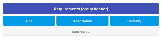
All three columns will appear under a shared "Requirements" group header in the sheet.
 Define multiple groups with different color schemes to visually separate entity domains:
```yaml theme={null}
columnGroups:
requirements:
groupName: Requirements
groupStyle: blue
headerStyle: lightblue
risks:
groupName: Risk Analysis
groupStyle: red
headerStyle: darkorange
collapseTo: hazard
controls:
groupName: Risk Controls
groupStyle: green
headerStyle: lightgreen
collapseTo: riskControls.riskControl
columns:
title:
title: User Need
columnGroup: requirements
systemRequirements.systemRequirement:
title: System Req
columnGroup: requirements
hazard:
title: Hazard
columnGroup: risks
riskControls.riskControl:
title: Risk Control
columnGroup: controls
```
When `collapseTo` is set, a collapse toggle button appears in the group header. Clicking it hides all columns in the group except the specified one:
```yaml theme={null}
columnGroups:
risks:
groupName: Risk Analysis
groupStyle: red
headerStyle: darkorange
collapseTo: hazard
```
When collapsed, only the `hazard` column is visible. Click the toggle again to expand all columns back.
The `collapseTo` value is specified by column binding path. If the target column is hidden (`visible: false`), the last visible column in the group is used instead.
Apply semantic colors: `red`/`darkorange` for risks, `blue`/`lightblue` for requirements, `green`/`lightgreen` for controls, `purple`/`lightpurple` for references. This helps users quickly identify column context in wide sheets.
## Predefined Style Names
You can use any of these built-in style names for `groupStyle` and `headerStyle`:
`none`, `grey`, `darkgrey`, `red`, `darkred`, `orange`, `darkorange`, `green`, `darkgreen`, `lightgreen`, `blue`, `darkblue`, `lightblue`, `teal`, `darkteal`, `purple`, `darkpurple`, `lightpurple`
For custom colors, define styles in the `styles` section and reference them by name. See [Apply Column Styles](/powersheet/guides/sheet-configuration/apply-style).
## Verify
After saving the sheet configuration, reload the powersheet document. You should now see:
* A group header row appears above the column headers
* Columns assigned to the same group share a merged group header cell
* Columns without a `columnGroup` show a blank group header
* Groups with `collapseTo` display a collapse toggle button
## See Also
* [Apply Column Styles](/powersheet/guides/sheet-configuration/apply-style) -- define custom styles for headers and groups
* [Styles Reference](/powersheet/reference/sheet-config/styles) -- advanced header styling
* [Configure Collapsible Groups](/powersheet/guides/sheet-configuration/configure-collapsible-groups) -- detailed collapse configuration
* [Add a Column](/powersheet/guides/sheet-configuration/add-column) -- column basics and binding paths
Define multiple groups with different color schemes to visually separate entity domains:
```yaml theme={null}
columnGroups:
requirements:
groupName: Requirements
groupStyle: blue
headerStyle: lightblue
risks:
groupName: Risk Analysis
groupStyle: red
headerStyle: darkorange
collapseTo: hazard
controls:
groupName: Risk Controls
groupStyle: green
headerStyle: lightgreen
collapseTo: riskControls.riskControl
columns:
title:
title: User Need
columnGroup: requirements
systemRequirements.systemRequirement:
title: System Req
columnGroup: requirements
hazard:
title: Hazard
columnGroup: risks
riskControls.riskControl:
title: Risk Control
columnGroup: controls
```
When `collapseTo` is set, a collapse toggle button appears in the group header. Clicking it hides all columns in the group except the specified one:
```yaml theme={null}
columnGroups:
risks:
groupName: Risk Analysis
groupStyle: red
headerStyle: darkorange
collapseTo: hazard
```
When collapsed, only the `hazard` column is visible. Click the toggle again to expand all columns back.
The `collapseTo` value is specified by column binding path. If the target column is hidden (`visible: false`), the last visible column in the group is used instead.
Apply semantic colors: `red`/`darkorange` for risks, `blue`/`lightblue` for requirements, `green`/`lightgreen` for controls, `purple`/`lightpurple` for references. This helps users quickly identify column context in wide sheets.
## Predefined Style Names
You can use any of these built-in style names for `groupStyle` and `headerStyle`:
`none`, `grey`, `darkgrey`, `red`, `darkred`, `orange`, `darkorange`, `green`, `darkgreen`, `lightgreen`, `blue`, `darkblue`, `lightblue`, `teal`, `darkteal`, `purple`, `darkpurple`, `lightpurple`
For custom colors, define styles in the `styles` section and reference them by name. See [Apply Column Styles](/powersheet/guides/sheet-configuration/apply-style).
## Verify
After saving the sheet configuration, reload the powersheet document. You should now see:
* A group header row appears above the column headers
* Columns assigned to the same group share a merged group header cell
* Columns without a `columnGroup` show a blank group header
* Groups with `collapseTo` display a collapse toggle button
## See Also
* [Apply Column Styles](/powersheet/guides/sheet-configuration/apply-style) -- define custom styles for headers and groups
* [Styles Reference](/powersheet/reference/sheet-config/styles) -- advanced header styling
* [Configure Collapsible Groups](/powersheet/guides/sheet-configuration/configure-collapsible-groups) -- detailed collapse configuration
* [Add a Column](/powersheet/guides/sheet-configuration/add-column) -- column basics and binding paths