> ## Documentation Index
> Fetch the complete documentation index at: https://learn.nextedy.com/llms.txt
> Use this file to discover all available pages before exploring further.
# Toolbar Controls
> The Nextedy PLANNINGBOARD toolbar is located in the upper-left corner of the board area.
***
## Toolbar Button Reference
The following table lists every toolbar button in the order they appear. All buttons are toggle or action controls — they do not require widget parameter configuration to be visible unless noted.
| Button | Label | Type | Description |
| -------------------- | -------------------------------------- | ------ | --------------------------------------------------------------------------------------------------------------------------------------------------------------------------------------------------------------------------------------------------------------------------- |
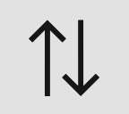
| Collapse all | **Collapse all** | Action | Collapses all swimlanes at once, hiding their card rows and showing only the swimlane header. Equivalent to clicking each swimlane's individual collapse control. |
| Expand all | **Expand all** | Action | Expands all collapsed swimlanes, restoring their card rows. Individual swimlane collapse state is reset. |
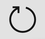
| Refresh | **Refresh data** | Action | Reloads board data from the server. Use after making changes in Polarion that are not yet reflected on the board, or after another user has modified planned items. |
| Toggle Resource Load | **Toggle Resource Load visualization** | Toggle | Shows or hides capacity bars in each swimlane and Plan column, indicating the current load per assignee. Must be configured via widget parameters to produce meaningful values (see [Capacity Parameters](/planningboard/reference/widget-parameters/capacity-parameters)). |
| Show Unplanned | **Show Unplanned** | Toggle | Shows or hides the Unplanned sidebar on the right side of the board. The sidebar holds work items not yet assigned to a Plan. See [Unplanned Sidebar](/planningboard/reference/ui-elements/sidebar) for full details. |
| Create New Plan | **Create New Plan** | Action | Creates a new Plan (board column) from the configured template, using the New Plan widget parameters (Template ID, Parent ID, Plan Name/ID Pattern, Duration). See [Creating Plans](/planningboard/guides/planning/creating-plans). |
| Prioritize | **Prioritize** | Toggle | Enables Prioritization mode on the board. In this mode, cards can be reordered within swimlanes to set planning priority. Drag-and-drop scheduling is blocked while Prioritize is active. |
| Show Dependencies | **Show Dependencies** | Toggle | Displays all dependency links between cards simultaneously across the entire board. This is a board-wide view; for link visibility on a single card, use the Show Links quick action on the card. Requires dependency display to be enabled via widget parameters. |
***
## Toolbar Icon Reference
The icons below correspond to each toolbar button in the order they appear:




 ***
## Collapse and Expand Controls
Collapse and expand operate at two levels:
* **Toolbar level** — **Collapse all** and **Expand all** apply to every swimlane simultaneously.
* **Swimlane level** — Individual swimlane headers can be clicked to collapse or expand that swimlane independently. See [Swimlane Controls](/planningboard/reference/ui-elements/swimlane-controls).
***
## Collapse and Expand Controls
Collapse and expand operate at two levels:
* **Toolbar level** — **Collapse all** and **Expand all** apply to every swimlane simultaneously.
* **Swimlane level** — Individual swimlane headers can be clicked to collapse or expand that swimlane independently. See [Swimlane Controls](/planningboard/reference/ui-elements/swimlane-controls).
 ***
## Show Dependencies vs. Show Links
Two separate mechanisms exist for viewing dependencies between cards. They operate at different scopes:
| Mechanism | Scope | Location | Activation |
| --------------------- | ----------------------------------------- | ----------------- | ----------------------------------- |
| **Show Dependencies** | All cards on the board simultaneously | Toolbar | Toolbar toggle button |
| **Show Links** | Single selected card and its linked cards | Card quick action | Hover over card → quick action icon |
When **Show Dependencies** is active, all cards not involved in any link are hidden and all dependency links are drawn across the board. When **Show Links** is used from a card, only that card's linked cards remain visible and all others are hidden.
The **Show Dependencies** toolbar button requires that dependency display is enabled in the widget configuration. If the button is absent or non-functional, check the relevant widget parameter. See [UI and Display Parameters](/planningboard/reference/widget-parameters/ui-parameters).
***
## Toggle Resource Load Visualization
The **Toggle Resource Load visualization** button shows or hides capacity bars on the board. Capacity bars appear in swimlane rows and Plan column headers to indicate how much capacity has been consumed relative to available capacity.
* When toggled **on**, each swimlane cell and Plan column header displays a progress bar reflecting the current load.
* When toggled **off**, capacity bars are hidden and the board displays cards only.
Capacity bar behavior depends on the capacity mode configured in widget parameters:
| Capacity Mode | Bars shown at | Description |
| --------------- | ----------------- | ---------------------------------------------------------------------- |
| Single capacity | Plan column level | One bar per column, shared across all swimlanes |
| Multi-capacity | Per swimlane cell | Each swimlane cell shows its own bar keyed to that resource's capacity |
| User capacity | Per-user swimlane | Capacity derived from each user's defined capacity |
When you hover over a capacity bar in a Plan column header, a tooltip appears with detailed capacity information for that Plan. This tooltip is only available when capacity is configured. See [Capacity Parameters](/planningboard/reference/widget-parameters/capacity-parameters).
***
## Prioritize Mode
When **Prioritize** is active:
* Cards within each swimlane can be reordered by dragging to set planning priority.
* Drag-and-drop scheduling (moving a card from the Unplanned sidebar onto the board, or between Plan columns) is **blocked** while Prioritize is active.
* The board remains read-only for plan assignment operations until Prioritize is toggled off.
Prioritization affects item sort order within swimlanes. The default sort order when Prioritize is off is: resource name → start date → priority or custom sort field → ID as tiebreaker.
While Prioritize mode is active, you cannot drag cards between columns or from the Unplanned sidebar. Toggle Prioritize off before reassigning items to Plans.
***
## Show Unplanned Sidebar
The **Show Unplanned** button toggles the Unplanned sidebar that appears on the right side of the board. The sidebar holds all work items that match the board's query but are not yet assigned to a Plan.
* When hidden, the full horizontal width of the browser window is available for the board area.
* The sidebar preference is not automatically saved between sessions.
For full sidebar reference including filtering, search, and drag-and-drop behavior, see [Unplanned Sidebar](/planningboard/reference/ui-elements/sidebar).
***
## Refresh Data
The **Refresh data** button reloads the board's data from the Polarion server without reloading the entire page. Use it when:
* Another user has made changes to planned items and you want to see the current state.
* You have made changes in Polarion directly (e.g., via the work item editor) and want the board to reflect them.
* After a save operation in the Work Item Properties sidebar, the board preserves scroll and swimlane position. A manual refresh will reload all data from the server.
***
## Toolbar Layout Diagram
***
## Show Dependencies vs. Show Links
Two separate mechanisms exist for viewing dependencies between cards. They operate at different scopes:
| Mechanism | Scope | Location | Activation |
| --------------------- | ----------------------------------------- | ----------------- | ----------------------------------- |
| **Show Dependencies** | All cards on the board simultaneously | Toolbar | Toolbar toggle button |
| **Show Links** | Single selected card and its linked cards | Card quick action | Hover over card → quick action icon |
When **Show Dependencies** is active, all cards not involved in any link are hidden and all dependency links are drawn across the board. When **Show Links** is used from a card, only that card's linked cards remain visible and all others are hidden.
The **Show Dependencies** toolbar button requires that dependency display is enabled in the widget configuration. If the button is absent or non-functional, check the relevant widget parameter. See [UI and Display Parameters](/planningboard/reference/widget-parameters/ui-parameters).
***
## Toggle Resource Load Visualization
The **Toggle Resource Load visualization** button shows or hides capacity bars on the board. Capacity bars appear in swimlane rows and Plan column headers to indicate how much capacity has been consumed relative to available capacity.
* When toggled **on**, each swimlane cell and Plan column header displays a progress bar reflecting the current load.
* When toggled **off**, capacity bars are hidden and the board displays cards only.
Capacity bar behavior depends on the capacity mode configured in widget parameters:
| Capacity Mode | Bars shown at | Description |
| --------------- | ----------------- | ---------------------------------------------------------------------- |
| Single capacity | Plan column level | One bar per column, shared across all swimlanes |
| Multi-capacity | Per swimlane cell | Each swimlane cell shows its own bar keyed to that resource's capacity |
| User capacity | Per-user swimlane | Capacity derived from each user's defined capacity |
When you hover over a capacity bar in a Plan column header, a tooltip appears with detailed capacity information for that Plan. This tooltip is only available when capacity is configured. See [Capacity Parameters](/planningboard/reference/widget-parameters/capacity-parameters).
***
## Prioritize Mode
When **Prioritize** is active:
* Cards within each swimlane can be reordered by dragging to set planning priority.
* Drag-and-drop scheduling (moving a card from the Unplanned sidebar onto the board, or between Plan columns) is **blocked** while Prioritize is active.
* The board remains read-only for plan assignment operations until Prioritize is toggled off.
Prioritization affects item sort order within swimlanes. The default sort order when Prioritize is off is: resource name → start date → priority or custom sort field → ID as tiebreaker.
While Prioritize mode is active, you cannot drag cards between columns or from the Unplanned sidebar. Toggle Prioritize off before reassigning items to Plans.
***
## Show Unplanned Sidebar
The **Show Unplanned** button toggles the Unplanned sidebar that appears on the right side of the board. The sidebar holds all work items that match the board's query but are not yet assigned to a Plan.
* When hidden, the full horizontal width of the browser window is available for the board area.
* The sidebar preference is not automatically saved between sessions.
For full sidebar reference including filtering, search, and drag-and-drop behavior, see [Unplanned Sidebar](/planningboard/reference/ui-elements/sidebar).
***
## Refresh Data
The **Refresh data** button reloads the board's data from the Polarion server without reloading the entire page. Use it when:
* Another user has made changes to planned items and you want to see the current state.
* You have made changes in Polarion directly (e.g., via the work item editor) and want the board to reflect them.
* After a save operation in the Work Item Properties sidebar, the board preserves scroll and swimlane position. A manual refresh will reload all data from the server.
***
## Toolbar Layout Diagram
 ***
## Related Reference Pages
* [Unplanned Sidebar](/planningboard/reference/ui-elements/sidebar) — full reference for the Unplanned sidebar panel
* [Card Quick Actions](/planningboard/reference/ui-elements/card-quick-actions) — card-level actions including Show Links, Add Link, and Unplan
* [Swimlane Controls](/planningboard/reference/ui-elements/swimlane-controls) — individual swimlane expand/collapse and other per-row controls
* [Capacity Parameters](/planningboard/reference/widget-parameters/capacity-parameters) — widget parameters controlling capacity bar behavior
* [UI and Display Parameters](/planningboard/reference/widget-parameters/ui-parameters) — widget parameters for dependency display and other UI options
* [Assignment Modes](/planningboard/reference/assignment-modes/index) — how swimlanes are populated (affects what the Resource Load visualization shows)
**KB Articles**
* Planningboard interface & basic interactions
**Source Code**
* `unplanned_sidebar.js`
* `enum-rows-filter-folder-scope.cy.ts`
* `widget.vm`
* `viewLicense.vm`
* `license-panel.js`
***
## Related Reference Pages
* [Unplanned Sidebar](/planningboard/reference/ui-elements/sidebar) — full reference for the Unplanned sidebar panel
* [Card Quick Actions](/planningboard/reference/ui-elements/card-quick-actions) — card-level actions including Show Links, Add Link, and Unplan
* [Swimlane Controls](/planningboard/reference/ui-elements/swimlane-controls) — individual swimlane expand/collapse and other per-row controls
* [Capacity Parameters](/planningboard/reference/widget-parameters/capacity-parameters) — widget parameters controlling capacity bar behavior
* [UI and Display Parameters](/planningboard/reference/widget-parameters/ui-parameters) — widget parameters for dependency display and other UI options
* [Assignment Modes](/planningboard/reference/assignment-modes/index) — how swimlanes are populated (affects what the Resource Load visualization shows)
**KB Articles**
* Planningboard interface & basic interactions
**Source Code**
* `unplanned_sidebar.js`
* `enum-rows-filter-folder-scope.cy.ts`
* `widget.vm`
* `viewLicense.vm`
* `license-panel.js`