> ## Documentation Index
> Fetch the complete documentation index at: https://learn.nextedy.com/llms.txt
> Use this file to discover all available pages before exploring further.
# Card Quick Actions
> Card quick actions are contextual controls that appear on a card when you hover over it.
## Overview
 The three quick actions appear in the upper-right corner of the card, from left to right:
 | Position | Action | One-line description |
| ------------ | ----------- | --------------------------------------------------------- |
| 1st (left) | Show Links | Filters the board to this card and its linked cards only |
| 2nd (middle) | Add Link | Enters link-creation mode to connect this card to another |
| 3rd (right) | Unplan Item | Moves this card back to the Unplanned section |
Quick actions are available on every card that represents a work item on the board. They are only visible on hover — they do not occupy permanent space on the card face — so the card display remains clean when not in use.
***
## Actions Reference
### Show Links
| Position | Action | One-line description |
| ------------ | ----------- | --------------------------------------------------------- |
| 1st (left) | Show Links | Filters the board to this card and its linked cards only |
| 2nd (middle) | Add Link | Enters link-creation mode to connect this card to another |
| 3rd (right) | Unplan Item | Moves this card back to the Unplanned section |
Quick actions are available on every card that represents a work item on the board. They are only visible on hover — they do not occupy permanent space on the card face — so the card display remains clean when not in use.
***
## Actions Reference
### Show Links
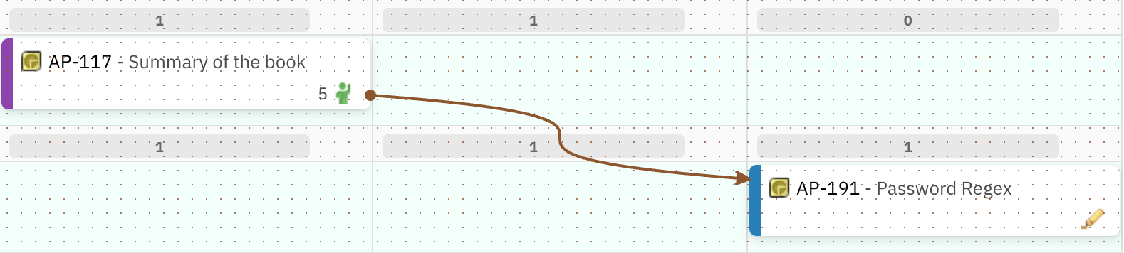
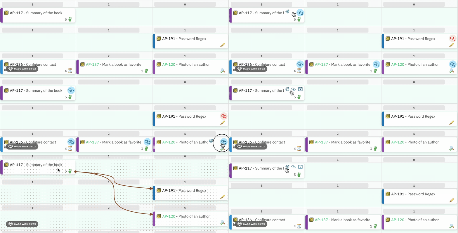
 **Behavior:** Clicking this action filters the board to show only the selected card and any cards that have a direct link to it. All other cards on the board are hidden while this mode is active. This gives a focused, clutter-free view of the dependencies and relationships for a single work item.
* All cards that are directly linked to the selected card (in any direction) remain visible.
* All cards with no direct link to the selected card are hidden.
* The selected card itself stays in its position within its swimlane and column.
* To return to the full board view, click the Show Links action on the same card again, or use the **Refresh data** button in the [toolbar](/planningboard/reference/ui-elements/toolbar).
This action is useful for quickly auditing a card's relationships — for example, confirming that a Story has a "depends on" link to the blocking item before planning it into a sprint.
**Show Links** (card quick action) is a per-card, focused filter: it hides all cards not directly linked to the selected card. **Show Dependencies** in the [toolbar](/planningboard/reference/ui-elements/toolbar) is a board-level toggle that renders all link lines across all cards simultaneously without hiding any cards. Use Show Links for inspecting one card's connections; use Show Dependencies for a board-wide dependency overview.
**Behavior:** Clicking this action filters the board to show only the selected card and any cards that have a direct link to it. All other cards on the board are hidden while this mode is active. This gives a focused, clutter-free view of the dependencies and relationships for a single work item.
* All cards that are directly linked to the selected card (in any direction) remain visible.
* All cards with no direct link to the selected card are hidden.
* The selected card itself stays in its position within its swimlane and column.
* To return to the full board view, click the Show Links action on the same card again, or use the **Refresh data** button in the [toolbar](/planningboard/reference/ui-elements/toolbar).
This action is useful for quickly auditing a card's relationships — for example, confirming that a Story has a "depends on" link to the blocking item before planning it into a sprint.
**Show Links** (card quick action) is a per-card, focused filter: it hides all cards not directly linked to the selected card. **Show Dependencies** in the [toolbar](/planningboard/reference/ui-elements/toolbar) is a board-level toggle that renders all link lines across all cards simultaneously without hiding any cards. Use Show Links for inspecting one card's connections; use Show Dependencies for a board-wide dependency overview.

 ***
### Add Link
***
### Add Link
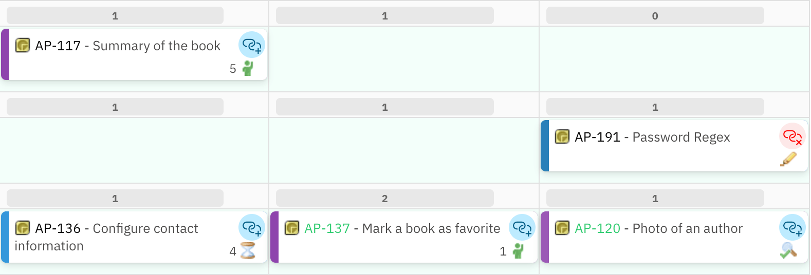
 **Behavior:** Clicking this action enters link-creation mode. The same link icon then appears on every other card currently displayed on the board. Click a second card to create a link between the originating card and that target card.
* When Add Link mode is active, every other card shows the link icon.
* A **red icon** on a target card indicates a link between that target and the originating card already exists. Clicking a card with the red icon opens the option to **delete** that existing link.
* After the link is created or an existing link is deleted, the board exits link-creation mode and returns to the normal view.
* If you change your mind and do not want to create a link, click the originating card's link icon again (or click away from all cards) to cancel link-creation mode.
Link creation and deletion here operate on Polarion work item links — the same links that appear in the work item's Links tab inside Polarion. Changes are persisted to Polarion immediately.
After using Add Link to create a connection, use Show Links on the same card to verify the full set of connections now attached to it.
**Behavior:** Clicking this action enters link-creation mode. The same link icon then appears on every other card currently displayed on the board. Click a second card to create a link between the originating card and that target card.
* When Add Link mode is active, every other card shows the link icon.
* A **red icon** on a target card indicates a link between that target and the originating card already exists. Clicking a card with the red icon opens the option to **delete** that existing link.
* After the link is created or an existing link is deleted, the board exits link-creation mode and returns to the normal view.
* If you change your mind and do not want to create a link, click the originating card's link icon again (or click away from all cards) to cancel link-creation mode.
Link creation and deletion here operate on Polarion work item links — the same links that appear in the work item's Links tab inside Polarion. Changes are persisted to Polarion immediately.
After using Add Link to create a connection, use Show Links on the same card to verify the full set of connections now attached to it.

 ***
### Unplan Item
***
### Unplan Item
 **Behavior:** Clicking this action removes the card from its current Plan column on the board and moves it to the [Unplanned sidebar](/planningboard/reference/ui-elements/sidebar). The work item's Plan assignment is cleared.
* The card appears in the Unplanned section immediately after the action.
* The card is removed from the Plan (column) it was previously assigned to.
* This action is functionally equivalent to dragging the card from the board back into the Unplanned section.
* After unplanning, the card is available to be dragged back to any Plan column on the board.
Cards with the **Verified** status are locked on the board. The Unplan Item quick action has no effect on verified work items, and drag-and-drop movement is also blocked for them. This lock applies to all card interactions — not just the quick action — to prevent accidental changes to completed, verified work.
***
## Behavior Under License Restrictions
Quick actions are part of the interactive editing surface of the board. Nextedy PLANNINGBOARD enforces license-based access control. Unlicensed users can view the full board but cannot make any changes:
| User type | Quick action availability |
| --------------- | ----------------------------------------------------------------- |
| Licensed user | All three quick actions are visible on hover and fully functional |
| Unlicensed user | Quick actions are not available; the board is read-only |
Specifically, for unlicensed users:
* The Unplan Item action is not accessible (the Unplanned sidebar is also hidden).
* The Add Link action is not accessible.
* The Show Links action availability for read-only users is {/* TODO: verify against the live product */}.
* Drag-and-drop is also blocked — cards cannot be moved even if dragged.
See [License Panel](/planningboard/reference/ui-elements/license-panel) for details on license states and how to obtain a license.
***
## Accessibility and Card Identification
Cards on the board are identified by an `aria-label` attribute that contains the work item ID and title (for example, `MAP-531 - Fix login screen`). This label is used by assistive technologies and is also what appears when the browser's accessibility tree reads a card. The quick action icons inherit their context from the parent card's label.
***
## Interaction Summary
| Action | Trigger | Reversible? | Side effects on other cards |
| ----------- | ---------------------------------------------------- | ------------------------------------------- | ---------------------------------------------- |
| Show Links | Hover card → click Show Links icon | Yes — click again or refresh board | Hides all cards not linked to this card |
| Add Link | Hover card → click Add Link icon → click target card | Yes — use red icon to delete link | Shows link icon on all other cards during mode |
| Unplan Item | Hover card → click Unplan Item icon | Yes — drag card back from Unplanned section | None |
***
## Edge Cases and Limitations
* **Verified items:** Cards in **Verified** status cannot be moved or unplanned via any mechanism, including quick actions and drag-and-drop.
* **Show Links scope:** Show Links only reveals direct (one-hop) links. Cards linked to the selected card's linked cards (two-hop) are not shown.
* **Add Link scope:** Link-creation mode only shows cards that are currently rendered on the board (visible in their swimlanes and columns). Cards in the Unplanned section are not targetable in Add Link mode.
* **Link type:** The specific link role used when creating a link via Add Link is {/* TODO: verify against the live product */}. Consult the [Widget Parameters](/planningboard/reference/widget-parameters/ui-parameters) for any configuration affecting link behavior.
* **Unlicensed read-only:** All card editing actions, including quick actions, are blocked for unlicensed users. The board remains fully visible for transparency and collaboration.
***
## Related Pages
* [Toolbar Controls](/planningboard/reference/ui-elements/toolbar) — board-level controls including Show Dependencies (all links at once), Refresh, Collapse/Expand All, and Prioritize
* [Unplanned Sidebar](/planningboard/reference/ui-elements/sidebar) — where cards go after the Unplan Item action; filtering, searching, and drag-and-drop back to the board
* [Swimlane Controls](/planningboard/reference/ui-elements/swimlane-controls) — per-swimlane collapse, expand, and capacity information
* [Basic Board Interactions](/planningboard/getting-started/basic-interactions) — drag-and-drop planning, clicking cards to open the properties sidebar, and scroll/swimlane position preservation
* [UI Elements](/planningboard/reference/ui-elements/index) — full index of Planningboard UI element reference pages
* [License Panel](/planningboard/reference/ui-elements/license-panel) — license status display and what read-only mode affects
**KB Articles**
* Planningboard interface & basic interactions
**Source Code**
* `unplanned_sidebar.js`
* `viewLicense.vm`
* `widget.vm`
* `licenseReadonly.cy.ts`
* `enum-rows-filter-folder-scope.cy.ts`
**Behavior:** Clicking this action removes the card from its current Plan column on the board and moves it to the [Unplanned sidebar](/planningboard/reference/ui-elements/sidebar). The work item's Plan assignment is cleared.
* The card appears in the Unplanned section immediately after the action.
* The card is removed from the Plan (column) it was previously assigned to.
* This action is functionally equivalent to dragging the card from the board back into the Unplanned section.
* After unplanning, the card is available to be dragged back to any Plan column on the board.
Cards with the **Verified** status are locked on the board. The Unplan Item quick action has no effect on verified work items, and drag-and-drop movement is also blocked for them. This lock applies to all card interactions — not just the quick action — to prevent accidental changes to completed, verified work.
***
## Behavior Under License Restrictions
Quick actions are part of the interactive editing surface of the board. Nextedy PLANNINGBOARD enforces license-based access control. Unlicensed users can view the full board but cannot make any changes:
| User type | Quick action availability |
| --------------- | ----------------------------------------------------------------- |
| Licensed user | All three quick actions are visible on hover and fully functional |
| Unlicensed user | Quick actions are not available; the board is read-only |
Specifically, for unlicensed users:
* The Unplan Item action is not accessible (the Unplanned sidebar is also hidden).
* The Add Link action is not accessible.
* The Show Links action availability for read-only users is {/* TODO: verify against the live product */}.
* Drag-and-drop is also blocked — cards cannot be moved even if dragged.
See [License Panel](/planningboard/reference/ui-elements/license-panel) for details on license states and how to obtain a license.
***
## Accessibility and Card Identification
Cards on the board are identified by an `aria-label` attribute that contains the work item ID and title (for example, `MAP-531 - Fix login screen`). This label is used by assistive technologies and is also what appears when the browser's accessibility tree reads a card. The quick action icons inherit their context from the parent card's label.
***
## Interaction Summary
| Action | Trigger | Reversible? | Side effects on other cards |
| ----------- | ---------------------------------------------------- | ------------------------------------------- | ---------------------------------------------- |
| Show Links | Hover card → click Show Links icon | Yes — click again or refresh board | Hides all cards not linked to this card |
| Add Link | Hover card → click Add Link icon → click target card | Yes — use red icon to delete link | Shows link icon on all other cards during mode |
| Unplan Item | Hover card → click Unplan Item icon | Yes — drag card back from Unplanned section | None |
***
## Edge Cases and Limitations
* **Verified items:** Cards in **Verified** status cannot be moved or unplanned via any mechanism, including quick actions and drag-and-drop.
* **Show Links scope:** Show Links only reveals direct (one-hop) links. Cards linked to the selected card's linked cards (two-hop) are not shown.
* **Add Link scope:** Link-creation mode only shows cards that are currently rendered on the board (visible in their swimlanes and columns). Cards in the Unplanned section are not targetable in Add Link mode.
* **Link type:** The specific link role used when creating a link via Add Link is {/* TODO: verify against the live product */}. Consult the [Widget Parameters](/planningboard/reference/widget-parameters/ui-parameters) for any configuration affecting link behavior.
* **Unlicensed read-only:** All card editing actions, including quick actions, are blocked for unlicensed users. The board remains fully visible for transparency and collaboration.
***
## Related Pages
* [Toolbar Controls](/planningboard/reference/ui-elements/toolbar) — board-level controls including Show Dependencies (all links at once), Refresh, Collapse/Expand All, and Prioritize
* [Unplanned Sidebar](/planningboard/reference/ui-elements/sidebar) — where cards go after the Unplan Item action; filtering, searching, and drag-and-drop back to the board
* [Swimlane Controls](/planningboard/reference/ui-elements/swimlane-controls) — per-swimlane collapse, expand, and capacity information
* [Basic Board Interactions](/planningboard/getting-started/basic-interactions) — drag-and-drop planning, clicking cards to open the properties sidebar, and scroll/swimlane position preservation
* [UI Elements](/planningboard/reference/ui-elements/index) — full index of Planningboard UI element reference pages
* [License Panel](/planningboard/reference/ui-elements/license-panel) — license status display and what read-only mode affects
**KB Articles**
* Planningboard interface & basic interactions
**Source Code**
* `unplanned_sidebar.js`
* `viewLicense.vm`
* `widget.vm`
* `licenseReadonly.cy.ts`
* `enum-rows-filter-folder-scope.cy.ts`