> ## Documentation Index
> Fetch the complete documentation index at: https://learn.nextedy.com/llms.txt
> Use this file to discover all available pages before exploring further.
# Customize Card Colors
> Color-code cards on the Nextedy PLANNINGBOARD to communicate status, priority, or team ownership at a glance using the Item Script.
## Overview
Card colors in Planningboard are set via the **Item Script** in the widget's Advanced Properties. The `cli.cardColor` property accepts any CSS HEX or named color value and can be set conditionally based on any work item field — including workflow status, custom fields, or parent-item relationships.
Planningboard does not support automatic card coloring based on custom enumeration fields (such as topic category or component). This differs from Nextedy SCRUMBOARD, which supports enum-based card coloring out of the box. In Planningboard, all conditional coloring must be implemented via an Item Script.
***
## How to set a card color
### Step 1: Open widget parameters
1. Navigate to the Polarion LiveDoc or Wiki page that contains your Planningboard widget.
2. Enter edit mode and open the widget's **Advanced Properties** section.
3. Locate the **Item Script** field.
### Step 2: Set `cli.cardColor` in the script
Add a JavaScript expression that sets `cli.cardColor` to a color value. The color is applied as the card's background.
**Simplest form — fixed color for all cards:**
```javascript theme={null}
cli.cardColor = "#e3edff";
```
**Conditional color based on a work item field:**
```javascript theme={null}
var crType = wi.getValue("crType");
if (crType != null && crType.getId() === "parentCR") {
cli.cardColor = "#e3edff";
}
```
In this example, `wi` is the current work item (Polarion `IWorkItem`) and `wi.getValue("crType")` reads the `crType` custom field. Replace `"crType"` and `"parentCR"` with your actual field ID and enum ID.
### Step 3: Save and reload
Save the widget configuration and reload the page. Cards matching the condition will display with the new background color.
Right-click a card and choose **Inspect** to preview the applied background color in real time. This helps you confirm the script is working and lets you fine-tune HEX values visually before committing.
***
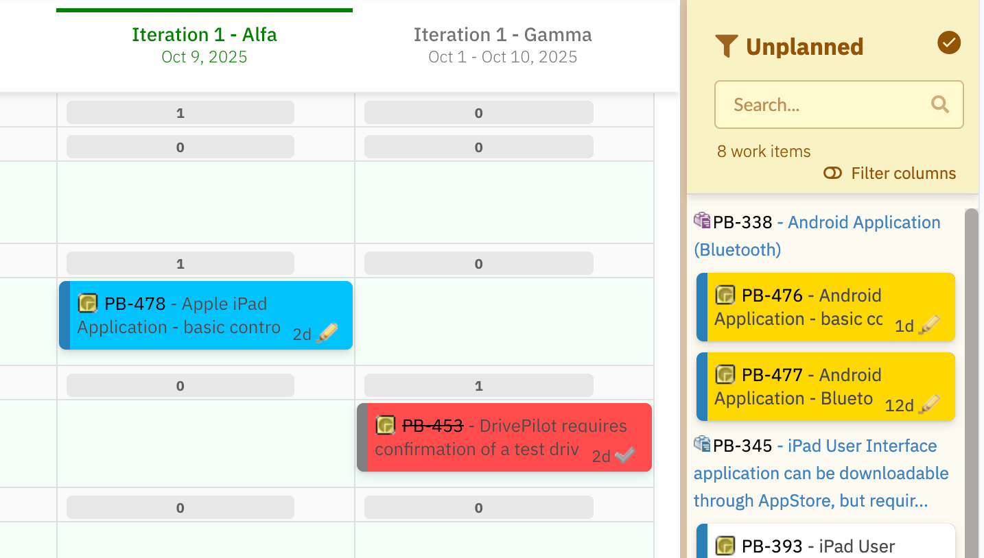
## Color cards by parent item
A common pattern is to let child items inherit a color from their parent — for example, all items belonging to the same System Requirement share a color. This makes it easy to trace hierarchy on a dense board.
 ### Step 1: Create a custom string field on the parent type
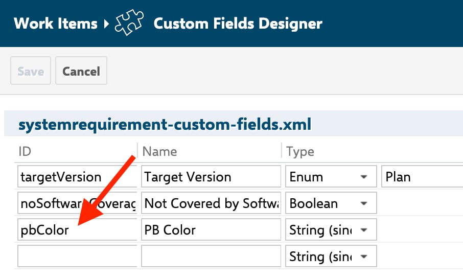
In Polarion Administration, add a custom field to your parent work item type:
* **Field ID:** `pbColor` (or any name you choose)
* **Type:** String
### Step 1: Create a custom string field on the parent type
In Polarion Administration, add a custom field to your parent work item type:
* **Field ID:** `pbColor` (or any name you choose)
* **Type:** String
 ### Step 2: Populate the field on parent items
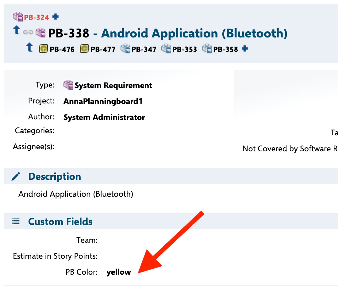
On each parent work item, enter a color name into the `pbColor` field: `blue`, `red`, `green`, or `yellow`.
### Step 2: Populate the field on parent items
On each parent work item, enter a color name into the `pbColor` field: `blue`, `red`, `green`, or `yellow`.
 ### Step 3: Add the Item Script
Paste the following into the **Item Script** field in the widget's Advanced Properties:
```javascript theme={null}
// Allow card attributes to be modified by this script
cli.readonly = false;
// Walk direct links to find the parent System Requirement
var i = wi.getLinkedWorkItemsStructsDirect().iterator();
var systemrequirement = null;
while (i.hasNext()) {
var link = i.next();
if (link.getLinkRole() && link.getLinkRole().getId() === "implements") {
systemrequirement = link.getLinkedItem();
}
}
// Apply the parent's color to this card
if (systemrequirement != null) {
var pbColor = systemrequirement.getValue("pbColor");
if (pbColor && pbColor.trim() !== "") {
pbColor = pbColor.toLowerCase().trim();
if (pbColor === "blue") cli.cardColor = "#00c3ff";
else if (pbColor === "red") cli.cardColor = "#ff4d4d";
else if (pbColor === "green") cli.cardColor = "#00f57f";
else if (pbColor === "yellow") cli.cardColor = "#ffd700";
}
}
```
The script uses the `"implements"` link role to identify the parent. If your project uses a different link role (e.g. `"is_part_of"` or a custom role), replace `"implements"` with that role's ID — use the exact ID as configured in Polarion, not the display label.
You are not limited to named colors. Replace or extend the `if/else` block with any HEX values:
```javascript theme={null}
if (pbColor === "teal") cli.cardColor = "#009688";
```
***
## Item Script API reference
The table below lists the `cli` properties relevant to card color customization. These are the confirmed properties available inside an Item Script.
| Property | Type | Description |
| ---------------- | ------- | ----------------------------------------------------------------------------------- |
| `cli.cardColor` | String | Background color of the card. Accepts CSS HEX (`#e3edff`) or named colors (`blue`). |
| `cli.color` | String | Frame (border) color of the card. |
| `cli.readonly` | Boolean | Set to `false` to allow the script to write card attributes. |
| `cli.fieldsLine` | String | HTML text displayed below the card title. |
| `cli.label` | String | Short text label shown on the card. |
| `cli.tooltip` | String | Text shown when hovering over the card (supports HTML). |
The main objects available in every Item Script:
| Object | Description |
| ---------- | --------------------------------------------------------------------------------------------------------------------- |
| `wi` | The current work item via the classic Polarion API (`IWorkItem`). Use `wi.getValue("fieldId")` to read custom fields. |
| `workitem` | The same item via the rendering API. Use `workitem.fields()` to access field renderers. |
| `cli` | The client-side card configuration object. Properties set here control what the card displays and how it looks. |
***
## Decision guide: which approach to use
### Step 3: Add the Item Script
Paste the following into the **Item Script** field in the widget's Advanced Properties:
```javascript theme={null}
// Allow card attributes to be modified by this script
cli.readonly = false;
// Walk direct links to find the parent System Requirement
var i = wi.getLinkedWorkItemsStructsDirect().iterator();
var systemrequirement = null;
while (i.hasNext()) {
var link = i.next();
if (link.getLinkRole() && link.getLinkRole().getId() === "implements") {
systemrequirement = link.getLinkedItem();
}
}
// Apply the parent's color to this card
if (systemrequirement != null) {
var pbColor = systemrequirement.getValue("pbColor");
if (pbColor && pbColor.trim() !== "") {
pbColor = pbColor.toLowerCase().trim();
if (pbColor === "blue") cli.cardColor = "#00c3ff";
else if (pbColor === "red") cli.cardColor = "#ff4d4d";
else if (pbColor === "green") cli.cardColor = "#00f57f";
else if (pbColor === "yellow") cli.cardColor = "#ffd700";
}
}
```
The script uses the `"implements"` link role to identify the parent. If your project uses a different link role (e.g. `"is_part_of"` or a custom role), replace `"implements"` with that role's ID — use the exact ID as configured in Polarion, not the display label.
You are not limited to named colors. Replace or extend the `if/else` block with any HEX values:
```javascript theme={null}
if (pbColor === "teal") cli.cardColor = "#009688";
```
***
## Item Script API reference
The table below lists the `cli` properties relevant to card color customization. These are the confirmed properties available inside an Item Script.
| Property | Type | Description |
| ---------------- | ------- | ----------------------------------------------------------------------------------- |
| `cli.cardColor` | String | Background color of the card. Accepts CSS HEX (`#e3edff`) or named colors (`blue`). |
| `cli.color` | String | Frame (border) color of the card. |
| `cli.readonly` | Boolean | Set to `false` to allow the script to write card attributes. |
| `cli.fieldsLine` | String | HTML text displayed below the card title. |
| `cli.label` | String | Short text label shown on the card. |
| `cli.tooltip` | String | Text shown when hovering over the card (supports HTML). |
The main objects available in every Item Script:
| Object | Description |
| ---------- | --------------------------------------------------------------------------------------------------------------------- |
| `wi` | The current work item via the classic Polarion API (`IWorkItem`). Use `wi.getValue("fieldId")` to read custom fields. |
| `workitem` | The same item via the rendering API. Use `workitem.fields()` to access field renderers. |
| `cli` | The client-side card configuration object. Properties set here control what the card displays and how it looks. |
***
## Decision guide: which approach to use
 ***
## Verification
After saving the Item Script and reloading the page, you should now see:
* Cards that match your condition displaying the assigned background color.
* Cards that do not match the condition retaining the default (uncolored) appearance.
* If you implemented parent-color inheritance, all child items linked to the same parent appear with the same color.
If cards show no color change, verify that:
1. The `cli.readonly = false;` line is present if needed.
2. The field ID and enum ID strings match exactly what is configured in Polarion (IDs are case-sensitive).
3. The `pbColor` field (or equivalent) is populated on the parent items.
4. The correct link role ID is used in `getLinkRole().getId()`.
***
## See also
* [Customize Card Content](/planningboard/guides/customization/card-content) — control which fields and HTML appear on card faces
* [Customize Card Appearance](/planningboard/guides/customization/card-appearance) — adjust card height, layout, and overall style
* [Highlight Work Items by Rules](/planningboard/guides/customization/highlighting-rules) — rule-based highlighting for items such as those planned after their due date
* [Item Scripts](/planningboard/guides/advanced/item-scripts) — full reference for the Item Script API and scripting patterns
* [Widget Parameters Overview](/planningboard/guides/configuration/widget-parameters) — all widget parameters including the Advanced Properties section where Item Script is configured
**KB Articles**
* Customize the content of the card
* Planningboard: Customizable Statistics and Capacity Indicators
* Planningboard interface & basic interactions
**Support Tickets**
* [#6679](https://support.nextedy.com/helpdesk/tickets/6679)
* [#6612](https://support.nextedy.com/helpdesk/tickets/6612)
* [#6523](https://support.nextedy.com/helpdesk/tickets/6523)
**Source Code**
* `PlanningBoardWidget.java`
* `licenseReadonly.cy.ts`
* `Item.java`
* `Plan.java`
* `Config.java`
***
## Verification
After saving the Item Script and reloading the page, you should now see:
* Cards that match your condition displaying the assigned background color.
* Cards that do not match the condition retaining the default (uncolored) appearance.
* If you implemented parent-color inheritance, all child items linked to the same parent appear with the same color.
If cards show no color change, verify that:
1. The `cli.readonly = false;` line is present if needed.
2. The field ID and enum ID strings match exactly what is configured in Polarion (IDs are case-sensitive).
3. The `pbColor` field (or equivalent) is populated on the parent items.
4. The correct link role ID is used in `getLinkRole().getId()`.
***
## See also
* [Customize Card Content](/planningboard/guides/customization/card-content) — control which fields and HTML appear on card faces
* [Customize Card Appearance](/planningboard/guides/customization/card-appearance) — adjust card height, layout, and overall style
* [Highlight Work Items by Rules](/planningboard/guides/customization/highlighting-rules) — rule-based highlighting for items such as those planned after their due date
* [Item Scripts](/planningboard/guides/advanced/item-scripts) — full reference for the Item Script API and scripting patterns
* [Widget Parameters Overview](/planningboard/guides/configuration/widget-parameters) — all widget parameters including the Advanced Properties section where Item Script is configured
**KB Articles**
* Customize the content of the card
* Planningboard: Customizable Statistics and Capacity Indicators
* Planningboard interface & basic interactions
**Support Tickets**
* [#6679](https://support.nextedy.com/helpdesk/tickets/6679)
* [#6612](https://support.nextedy.com/helpdesk/tickets/6612)
* [#6523](https://support.nextedy.com/helpdesk/tickets/6523)
**Source Code**
* `PlanningBoardWidget.java`
* `licenseReadonly.cy.ts`
* `Item.java`
* `Plan.java`
* `Config.java`