> ## Documentation Index
> Fetch the complete documentation index at: https://learn.nextedy.com/llms.txt
> Use this file to discover all available pages before exploring further.
# Customize Card Appearance
> Control the visual look of cards on your Nextedy PLANNINGBOARD — background color, border color, field layout, and card height — using the Item Script and Config Script in the widget's Advanced Properties.
## What you can change
The following appearance properties are available through the `cli` object in the Item Script:
| Property | Type | Effect |
| ---------------- | ------- | ------------------------------------------------------------------------ |
| `cli.cardColor` | String | Card background color (HEX or named color, e.g. `"#e3edff"` or `"blue"`) |
| `cli.color` | String | Card frame (border) color |
| `cli.label` | String | Short text label shown on the card |
| `cli.fieldsLine` | String | HTML displayed under the card title |
| `cli.tooltip` | String | Text shown when hovering over the card (supports HTML) |
| `cli.resolved` | Boolean | Marks the item as resolved — can trigger visual cues |
| `cli.readonly` | Boolean | When `true`, prevents script-driven card modifications |
Card height is controlled separately via a CSS rule in the Config Script (see [Adjust card height](#adjust-card-height) below).
1. Open the Polarion Wiki page or LiveDoc that contains your Planningboard widget.
2. Switch to **Edit** mode for the page.
3. Click the widget to select it, then open its **Widget Parameters**.
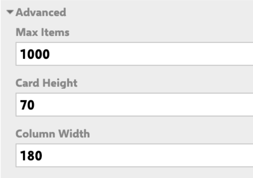
4. Scroll to the **Advanced Properties** section. You will find two script fields:
* **Item Script** — runs once per card, controls per-item appearance.
* **Config Script** — runs once when the board loads, used for board-wide CSS overrides.
 Add the following to the **Item Script** to apply a fixed background color to every card:
```javascript theme={null}
cli.cardColor = "#e3edff";
```
To apply color conditionally based on a work item field value (for example, a custom `crType` enumeration field):
```javascript theme={null}
var crType = wi.getValue("crType");
if (crType != null && crType.getId() === "parentCR") {
cli.cardColor = "#e3edff";
}
```
Named colors such as `"blue"` are supported, but HEX codes give you full control over shade and contrast. Pick values that remain legible against white card text.
The `cli.fieldsLine` property controls what appears under the card title. You can combine multiple rendered fields using the `workitem.fields()` rendering API:
```javascript theme={null}
cli.fieldsLine =
workitem.fields().get("initialStoryPoints").render().htmlFor().forFrame() +
" sp, " +
workitem.fields().priority().render().withText(true).withIcon(false).htmlFor().forFrame() +
", " +
workitem.fields().status().render().withText(false).htmlFor().forFrame() +
"
Add the following to the **Item Script** to apply a fixed background color to every card:
```javascript theme={null}
cli.cardColor = "#e3edff";
```
To apply color conditionally based on a work item field value (for example, a custom `crType` enumeration field):
```javascript theme={null}
var crType = wi.getValue("crType");
if (crType != null && crType.getId() === "parentCR") {
cli.cardColor = "#e3edff";
}
```
Named colors such as `"blue"` are supported, but HEX codes give you full control over shade and contrast. Pick values that remain legible against white card text.
The `cli.fieldsLine` property controls what appears under the card title. You can combine multiple rendered fields using the `workitem.fields()` rendering API:
```javascript theme={null}
cli.fieldsLine =
workitem.fields().get("initialStoryPoints").render().htmlFor().forFrame() +
" sp, " +
workitem.fields().priority().render().withText(true).withIcon(false).htmlFor().forFrame() +
", " +
workitem.fields().status().render().withText(false).htmlFor().forFrame() +
"
" +
workitem.fields().assignee().render().htmlFor().forFrame();
```
If a custom field referenced with `workitem.fields().get("fieldId")` does not exist on the work item type, or has no value, the rendered output will be empty — and no error is shown. Verify field IDs match those configured in your Polarion project.
A common pattern is to color child cards based on a color value set on their parent item. This groups related cards visually without manual per-item configuration.
**Prerequisites:**
* Create a custom field named `pbColor` (type: String) on the parent work item type (for example, on your System Requirement type).
* Enter a color value (`blue`, `red`, `green`, `yellow`, or a HEX code) in this field for each parent item.
**Item Script:**
```javascript theme={null}
// Allow editing of card attributes
cli.readonly = false;
// Get all direct links for this work item
var i = wi.getLinkedWorkItemsStructsDirect().iterator();
var systemrequirement = null;
// Identify linked parent System Requirement
while (i.hasNext()) {
var link = i.next();
if (link.getLinkRole() && link.getLinkRole().getId() === "implements") {
systemrequirement = link.getLinkedItem();
}
}
// Apply the parent's color if defined
if (systemrequirement != null) {
var pbColor = systemrequirement.getValue("pbColor");
if (pbColor && pbColor.trim() !== "") {
pbColor = pbColor.toLowerCase().trim();
if (pbColor === "blue") cli.cardColor = "#00c3ff";
else if (pbColor === "red") cli.cardColor = "#ff4d4d";
else if (pbColor === "green") cli.cardColor = "#00f57f";
else if (pbColor === "yellow") cli.cardColor = "#ffd700";
}
}
```
The script above uses the `"implements"` link role. If your project uses a different relationship name (for example `"refines"` or `"derives"`), replace `"implements"` with the correct link role ID. Wrong link role IDs cause no error — the color simply will not apply.
You can expand the color list to include arbitrary HEX values. Just add more `else if` branches or check `pbColor.startsWith("#")` to pass the value through directly.
If your card titles are long, or if your `cli.fieldsLine` spans multiple lines, increase the card height using the **Config Script**:
```javascript theme={null}
var style = document.createElement('style');
style.innerHTML = ".eventitem .title { height: 87px; }";
document.head.appendChild(style);
```
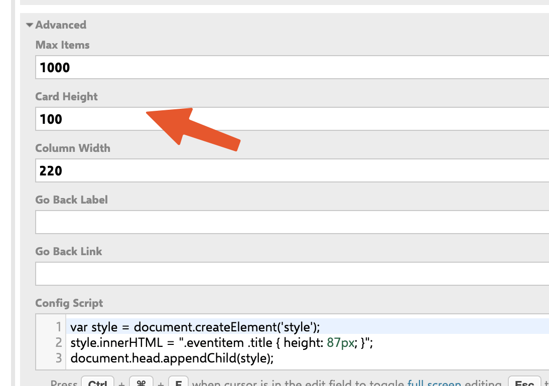 Set the title height slightly smaller than the **Card Height** widget parameter value to prevent content overflow. Use your browser's developer tools (right-click a card → **Inspect**) to test height values in real time before committing a value.
 ## Scripting API reference
The Item Script has access to three main objects:
| Object | Description |
| ---------- | ----------------------------------------------------------------------------------------------------------------------- |
| `wi` | The current work item via the classic Polarion API (`IWorkItem`). Use `wi.getValue("fieldId")` to read field values. |
| `workitem` | The same item via the rendering API. Use `workitem.fields()` to access field rendering helpers. |
| `cli` | The card's client-side configuration object. Setting properties here controls what is displayed and how the card looks. |
## Card appearance flow
```text theme={null}
Item Script runs (per card)
|
+---> wi.getValue("fieldId") Read raw field values from Polarion
|
+---> workitem.fields()... Build rendered HTML for fieldsLine
|
+---> cli.cardColor = "..." Set background color
+---> cli.color = "..." Set border color
+---> cli.fieldsLine = "..." Set subtitle HTML
+---> cli.label = "..." Set short label text
|
v
Card renders with updated appearance
Config Script runs (once, on board load)
|
+---> inject CSS via document.createElement('style')
|
v
Board-wide style overrides applied (e.g. card height)
```
## Limitation: color by custom enumeration is not supported
Planningboard card coloring through the standard widget configuration is based on workflow status only. **Coloring cards based on a custom enumeration field** (such as a topic category or priority field) via point-and-click configuration is not currently supported.
If you need enumeration-based coloring, use the Item Script approach described above: read the enum field with `wi.getValue("fieldId")`, then map the enum ID to a HEX color and assign it to `cli.cardColor`.
Users migrating from Nextedy Scrumboard may expect custom-enum card coloring to be available as a built-in configuration option. In Planningboard this requires an Item Script workaround. The built-in color configuration applies workflow status colors only.
## Verification
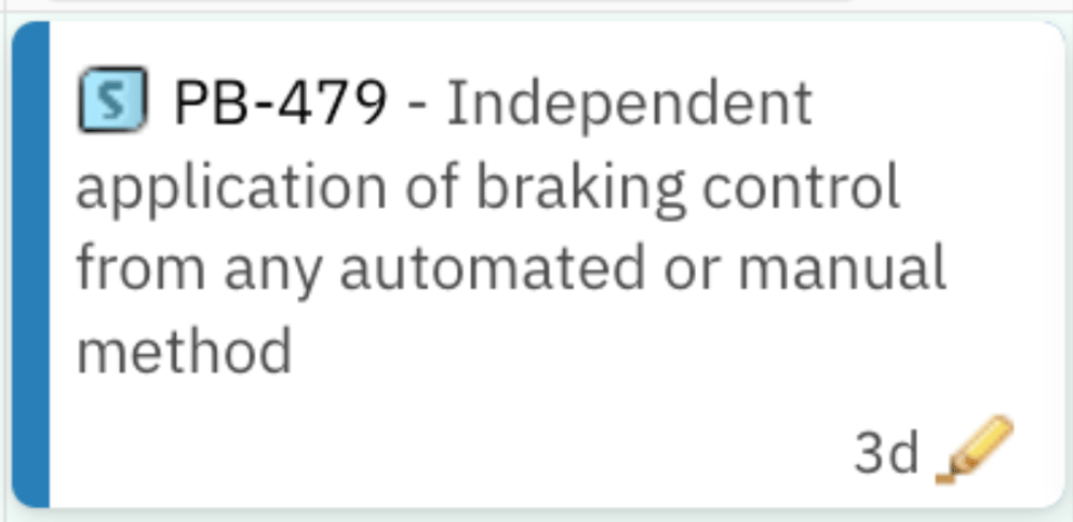
Save the widget parameters and reload the board. You should now see:
* Cards with the background color you configured (solid color or conditionally per item).
* The fields line showing the fields you specified under each card title.
* Cards with adjusted height if you added a Config Script CSS rule.
If colors or fields are not appearing, check: the Item Script for syntax errors (open the browser console), that all referenced field IDs exist on the work item type, and that the `pbColor` custom field is populated on parent items if you are using color inheritance.
## See also
* [Customize Card Content](/planningboard/guides/customization/card-content) — control which fields appear on the card
* [Customize Card Colors](/planningboard/guides/customization/card-colors) — color rules and status-based coloring
* [Highlight Work Items by Rules](/planningboard/guides/customization/highlighting-rules) — rule-based visual highlighting
* [Item Scripts](/planningboard/guides/advanced/item-scripts) — full Item Script API reference
* [Config Scripts](/planningboard/guides/advanced/config-scripts) — board-wide scripting
* [Widget Parameters Overview](/planningboard/guides/configuration/widget-parameters) — all widget parameters including Card Height
**KB Articles**
* Customize the content of the card
* Planningboard interface & basic interactions
* Planningboard: Customizable Statistics and Capacity Indicators
**Support Tickets**
* [#6679](https://support.nextedy.com/helpdesk/tickets/6679)
* [#6612](https://support.nextedy.com/helpdesk/tickets/6612)
* [#6523](https://support.nextedy.com/helpdesk/tickets/6523)
**Source Code**
* `PlanningBoardWidget.java`
* `licenseReadonly.cy.ts`
* `Config.java`
* `viewLicense.vm`
* `PlanningBoardWidgetRenderer.java`
## Scripting API reference
The Item Script has access to three main objects:
| Object | Description |
| ---------- | ----------------------------------------------------------------------------------------------------------------------- |
| `wi` | The current work item via the classic Polarion API (`IWorkItem`). Use `wi.getValue("fieldId")` to read field values. |
| `workitem` | The same item via the rendering API. Use `workitem.fields()` to access field rendering helpers. |
| `cli` | The card's client-side configuration object. Setting properties here controls what is displayed and how the card looks. |
## Card appearance flow
```text theme={null}
Item Script runs (per card)
|
+---> wi.getValue("fieldId") Read raw field values from Polarion
|
+---> workitem.fields()... Build rendered HTML for fieldsLine
|
+---> cli.cardColor = "..." Set background color
+---> cli.color = "..." Set border color
+---> cli.fieldsLine = "..." Set subtitle HTML
+---> cli.label = "..." Set short label text
|
v
Card renders with updated appearance
Config Script runs (once, on board load)
|
+---> inject CSS via document.createElement('style')
|
v
Board-wide style overrides applied (e.g. card height)
```
## Limitation: color by custom enumeration is not supported
Planningboard card coloring through the standard widget configuration is based on workflow status only. **Coloring cards based on a custom enumeration field** (such as a topic category or priority field) via point-and-click configuration is not currently supported.
If you need enumeration-based coloring, use the Item Script approach described above: read the enum field with `wi.getValue("fieldId")`, then map the enum ID to a HEX color and assign it to `cli.cardColor`.
Users migrating from Nextedy Scrumboard may expect custom-enum card coloring to be available as a built-in configuration option. In Planningboard this requires an Item Script workaround. The built-in color configuration applies workflow status colors only.
## Verification
Save the widget parameters and reload the board. You should now see:
* Cards with the background color you configured (solid color or conditionally per item).
* The fields line showing the fields you specified under each card title.
* Cards with adjusted height if you added a Config Script CSS rule.
If colors or fields are not appearing, check: the Item Script for syntax errors (open the browser console), that all referenced field IDs exist on the work item type, and that the `pbColor` custom field is populated on parent items if you are using color inheritance.
## See also
* [Customize Card Content](/planningboard/guides/customization/card-content) — control which fields appear on the card
* [Customize Card Colors](/planningboard/guides/customization/card-colors) — color rules and status-based coloring
* [Highlight Work Items by Rules](/planningboard/guides/customization/highlighting-rules) — rule-based visual highlighting
* [Item Scripts](/planningboard/guides/advanced/item-scripts) — full Item Script API reference
* [Config Scripts](/planningboard/guides/advanced/config-scripts) — board-wide scripting
* [Widget Parameters Overview](/planningboard/guides/configuration/widget-parameters) — all widget parameters including Card Height
**KB Articles**
* Customize the content of the card
* Planningboard interface & basic interactions
* Planningboard: Customizable Statistics and Capacity Indicators
**Support Tickets**
* [#6679](https://support.nextedy.com/helpdesk/tickets/6679)
* [#6612](https://support.nextedy.com/helpdesk/tickets/6612)
* [#6523](https://support.nextedy.com/helpdesk/tickets/6523)
**Source Code**
* `PlanningBoardWidget.java`
* `licenseReadonly.cy.ts`
* `Config.java`
* `viewLicense.vm`
* `PlanningBoardWidgetRenderer.java`