> ## Documentation Index
> Fetch the complete documentation index at: https://learn.nextedy.com/llms.txt
> Use this file to discover all available pages before exploring further.
# Customize Board Appearance
> Adjust the overall visual layout, card sizing, column and swimlane display, and toolbar visibility of your Nextedy PLANNINGBOARD to match your team's planning workflow.
## Overview of appearance controls
Planningboard appearance is shaped by three complementary mechanisms:
| Mechanism | What it controls | Where to configure |
| ----------------- | ------------------------------------------------ | --------------------------------------- |
| Widget parameters | Plans shown, swimlane mode, capacity display | Widget **Advanced Properties** |
| Item Script | Per-card color, label, fields line, height | **Advanced Properties > Item Script** |
| Config Script | Global CSS overrides (card height, title height) | **Advanced Properties > Config Script** |
The sections below address each in turn.
***
The number of Plans (columns) displayed on the board is governed by two widget parameters:
* `lastPlans` — number of past or completed Plans to show (default: `1`)
* `nextPlans` — number of upcoming Plans to show (default: `5`)
Open the widget's **Advanced Properties** panel and set these values to narrow or widen the column range. Showing fewer columns reduces visual noise on large boards; showing more gives teams an extended planning horizon.
**Example — show one past Plan and three upcoming Plans:**
```properties theme={null}
lastPlans=1
nextPlans=3
```
To restrict which Plans appear at all, set `plansQuery` to a Lucene query that matches only the Plans you want:
```properties theme={null}
plansQuery=title:"Sprint*" AND NOT status:closed
```
Reducing `nextPlans` to the number of active sprints keeps the board focused and reduces the time to load capacity data. Very large values (>10) can noticeably slow board rendering.
### Plan header date display
Each column header shows the plan name and its date range on a single line. The year is not repeated if both dates fall within the same year:
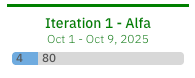 If neither a Start nor a Due Date is defined, no value is shown below the plan name:
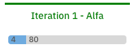 Start date only: an infinity symbol (∞) is displayed instead of the missing Due date:
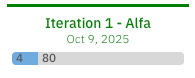
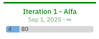 Due date only: only the Due date is displayed:
 ***
Swimlanes (rows) are controlled by the `assignmentMode` widget parameter. The board supports these modes:
| `assignmentMode` value | Groups rows by |
| ---------------------- | -------------------------------------------------- |
| `ASSIGNEE` (default) | Individual users / assignees |
| `ENUM` | An enumeration custom field (e.g. team, component) |
| `PARENT` | Parent work items (matched by a Lucene query) |
| `PROJECT` | Sub-projects within the current project group |
| `SAFE_TEAM` | SAFe teams within the current program |
| `SAFE_TRAIN_TEAM` | Teams within a specific Agile Release Train |
| `SAFE_PROGRAMS` | SAFe programs within a solution train |
Set the mode in **Advanced Properties**:
```properties theme={null}
assignmentMode=ASSIGNEE
```
For the **Enumeration Field** (`ENUM`) mode, also set `enumFieldId` to the custom field ID you want to group by:
```properties theme={null}
assignmentMode=ENUM
enumFieldId=team
```
The **Enumeration Field** (`ENUM`) mode does not support the `status`, `resolution`, or `type` built-in fields. If you specify one of these as `enumFieldId`, swimlanes will not render correctly. Use a custom enumeration field instead.
See [Configure Swimlanes (Rows)](/planningboard/guides/configuration/swimlanes-configuration) for the full swimlane configuration reference.
***
Card-level appearance — background color, border color, the fields shown below the title, and optional labels — is controlled by an **Item Script** in the widget's Advanced Properties. The script runs per work item and sets properties on the `cli` object.
### Available `cli` properties
| Property | Type | Effect |
| ---------------- | ------- | -------------------------------------------------- |
| `cli.cardColor` | String | Card background color (HEX or named color) |
| `cli.color` | String | Card frame (border) color |
| `cli.label` | String | Short text label displayed on the card |
| `cli.fieldsLine` | String | HTML rendered below the card title |
| `cli.tooltip` | String | HTML shown on card hover |
| `cli.resolved` | Boolean | Visual resolved state |
| `cli.readonly` | Boolean | Prevent drag-and-drop modification from the script |
### Example — color cards by workflow status
```javascript theme={null}
var status = wi.getStatus().getId();
if (status === "open") {
cli.cardColor = "#e3edff";
} else if (status === "inProgress") {
cli.cardColor = "#fff8e1";
} else if (status === "done") {
cli.cardColor = "#e8f5e9";
}
```
Planningboard card coloring is driven by workflow status values or by explicit scripted logic. **Custom enumeration-based card coloring (as available in Scrumboard) is not supported.** If you need cards colored by a custom enumeration field (e.g. topic category, component), you must implement this manually in the Item Script — there is no built-in enum-to-color mapping. Users migrating from Scrumboard should be aware of this difference.
### Example — color cards by parent item (inherit parent's color)
When child items should share the visual grouping of their parent, define a `pbColor` custom field (type: String) on the parent work item type, populate it with a color name per parent, and use this Item Script:
```javascript theme={null}
cli.readonly = false;
var i = wi.getLinkedWorkItemsStructsDirect().iterator();
var parentItem = null;
while (i.hasNext()) {
var link = i.next();
if (link.getLinkRole() && link.getLinkRole().getId() === "implements") {
parentItem = link.getLinkedItem();
}
}
if (parentItem != null) {
var pbColor = parentItem.getValue("pbColor");
if (pbColor && pbColor.trim() !== "") {
pbColor = pbColor.toLowerCase().trim();
if (pbColor === "blue") cli.cardColor = "#00c3ff";
else if (pbColor === "red") cli.cardColor = "#ff4d4d";
else if (pbColor === "green") cli.cardColor = "#00f57f";
else if (pbColor === "yellow") cli.cardColor = "#ffd700";
}
}
```
Replace `"implements"` with the link role your project uses to connect child items to their parent. You can extend the color list with any HEX code. This pattern works best when each child item has a single parent in the hierarchy.
### Example — customizing the fields line
Show story points, priority, and assignee under the card title:
```javascript theme={null}
cli.fieldsLine =
workitem.fields().get("storyPoints").render().htmlFor().forFrame() +
" sp, " +
workitem.fields().priority().render().withText(true).withIcon(false).htmlFor().forFrame() +
", " +
workitem.fields().assignee().render().htmlFor().forFrame();
```
***
If card titles are long, the default card height may truncate them. Use a **Config Script** to inject a CSS override that increases the title area:
```javascript theme={null}
var style = document.createElement('style');
style.innerHTML = ".eventitem .title { height: 87px; }";
document.head.appendChild(style);
```
Set the `height` value to slightly less than the total card height you intend (set card height in the widget parameters). To find the right value, right-click a card in your browser and choose **Inspect** — the Elements panel shows the live rendered height, which you can override until the content fits cleanly.
The title height set in the Config Script must be smaller than the card's total height, or content will overflow. Always test by inspecting the card in your browser's developer tools after applying the script.
***
The Planningboard toolbar (upper-left) provides toggles for swimlane collapse, data refresh, capacity/resource load visualization, the Unplanned section, prioritization mode, and dependency display. These are runtime controls — no widget parameter is required to show the toolbar.
To control the **Unplanned Sidebar** (the right-hand backlog panel), use the widget parameter `PARAMETER_US_DEPTH` to set how many levels of parent hierarchy load for the unplanned items. Setting a lower depth reduces load time on projects with deep item trees.
Dependencies overlay (the **Show Dependencies** toolbar button) must be explicitly enabled via the `dependencyLinkRole` widget parameter — it is off by default.
```properties theme={null}
dependencyLinkRole=depends_on
```
See [Configure Dependencies Display](/planningboard/guides/configuration/dependencies-configuration) for details.
***
## Board layout reference diagram
***
Swimlanes (rows) are controlled by the `assignmentMode` widget parameter. The board supports these modes:
| `assignmentMode` value | Groups rows by |
| ---------------------- | -------------------------------------------------- |
| `ASSIGNEE` (default) | Individual users / assignees |
| `ENUM` | An enumeration custom field (e.g. team, component) |
| `PARENT` | Parent work items (matched by a Lucene query) |
| `PROJECT` | Sub-projects within the current project group |
| `SAFE_TEAM` | SAFe teams within the current program |
| `SAFE_TRAIN_TEAM` | Teams within a specific Agile Release Train |
| `SAFE_PROGRAMS` | SAFe programs within a solution train |
Set the mode in **Advanced Properties**:
```properties theme={null}
assignmentMode=ASSIGNEE
```
For the **Enumeration Field** (`ENUM`) mode, also set `enumFieldId` to the custom field ID you want to group by:
```properties theme={null}
assignmentMode=ENUM
enumFieldId=team
```
The **Enumeration Field** (`ENUM`) mode does not support the `status`, `resolution`, or `type` built-in fields. If you specify one of these as `enumFieldId`, swimlanes will not render correctly. Use a custom enumeration field instead.
See [Configure Swimlanes (Rows)](/planningboard/guides/configuration/swimlanes-configuration) for the full swimlane configuration reference.
***
Card-level appearance — background color, border color, the fields shown below the title, and optional labels — is controlled by an **Item Script** in the widget's Advanced Properties. The script runs per work item and sets properties on the `cli` object.
### Available `cli` properties
| Property | Type | Effect |
| ---------------- | ------- | -------------------------------------------------- |
| `cli.cardColor` | String | Card background color (HEX or named color) |
| `cli.color` | String | Card frame (border) color |
| `cli.label` | String | Short text label displayed on the card |
| `cli.fieldsLine` | String | HTML rendered below the card title |
| `cli.tooltip` | String | HTML shown on card hover |
| `cli.resolved` | Boolean | Visual resolved state |
| `cli.readonly` | Boolean | Prevent drag-and-drop modification from the script |
### Example — color cards by workflow status
```javascript theme={null}
var status = wi.getStatus().getId();
if (status === "open") {
cli.cardColor = "#e3edff";
} else if (status === "inProgress") {
cli.cardColor = "#fff8e1";
} else if (status === "done") {
cli.cardColor = "#e8f5e9";
}
```
Planningboard card coloring is driven by workflow status values or by explicit scripted logic. **Custom enumeration-based card coloring (as available in Scrumboard) is not supported.** If you need cards colored by a custom enumeration field (e.g. topic category, component), you must implement this manually in the Item Script — there is no built-in enum-to-color mapping. Users migrating from Scrumboard should be aware of this difference.
### Example — color cards by parent item (inherit parent's color)
When child items should share the visual grouping of their parent, define a `pbColor` custom field (type: String) on the parent work item type, populate it with a color name per parent, and use this Item Script:
```javascript theme={null}
cli.readonly = false;
var i = wi.getLinkedWorkItemsStructsDirect().iterator();
var parentItem = null;
while (i.hasNext()) {
var link = i.next();
if (link.getLinkRole() && link.getLinkRole().getId() === "implements") {
parentItem = link.getLinkedItem();
}
}
if (parentItem != null) {
var pbColor = parentItem.getValue("pbColor");
if (pbColor && pbColor.trim() !== "") {
pbColor = pbColor.toLowerCase().trim();
if (pbColor === "blue") cli.cardColor = "#00c3ff";
else if (pbColor === "red") cli.cardColor = "#ff4d4d";
else if (pbColor === "green") cli.cardColor = "#00f57f";
else if (pbColor === "yellow") cli.cardColor = "#ffd700";
}
}
```
Replace `"implements"` with the link role your project uses to connect child items to their parent. You can extend the color list with any HEX code. This pattern works best when each child item has a single parent in the hierarchy.
### Example — customizing the fields line
Show story points, priority, and assignee under the card title:
```javascript theme={null}
cli.fieldsLine =
workitem.fields().get("storyPoints").render().htmlFor().forFrame() +
" sp, " +
workitem.fields().priority().render().withText(true).withIcon(false).htmlFor().forFrame() +
", " +
workitem.fields().assignee().render().htmlFor().forFrame();
```
***
If card titles are long, the default card height may truncate them. Use a **Config Script** to inject a CSS override that increases the title area:
```javascript theme={null}
var style = document.createElement('style');
style.innerHTML = ".eventitem .title { height: 87px; }";
document.head.appendChild(style);
```
Set the `height` value to slightly less than the total card height you intend (set card height in the widget parameters). To find the right value, right-click a card in your browser and choose **Inspect** — the Elements panel shows the live rendered height, which you can override until the content fits cleanly.
The title height set in the Config Script must be smaller than the card's total height, or content will overflow. Always test by inspecting the card in your browser's developer tools after applying the script.
***
The Planningboard toolbar (upper-left) provides toggles for swimlane collapse, data refresh, capacity/resource load visualization, the Unplanned section, prioritization mode, and dependency display. These are runtime controls — no widget parameter is required to show the toolbar.
To control the **Unplanned Sidebar** (the right-hand backlog panel), use the widget parameter `PARAMETER_US_DEPTH` to set how many levels of parent hierarchy load for the unplanned items. Setting a lower depth reduces load time on projects with deep item trees.
Dependencies overlay (the **Show Dependencies** toolbar button) must be explicitly enabled via the `dependencyLinkRole` widget parameter — it is off by default.
```properties theme={null}
dependencyLinkRole=depends_on
```
See [Configure Dependencies Display](/planningboard/guides/configuration/dependencies-configuration) for details.
***
## Board layout reference diagram
 Columns = Plans (controlled by `lastPlans` / `nextPlans` / `plansQuery`).
Rows = swimlanes (controlled by `assignmentMode`).
Cards = work items (appearance controlled by Item Script and Config Script).
***
## Verification
After applying your changes, reload the Planningboard page. You should now see:
* The correct number of Plan columns based on your `lastPlans` and `nextPlans` values
* Swimlane rows grouped according to your chosen `assignmentMode`
* Card background colors and field lines reflecting your Item Script logic
* Card title areas tall enough to display full titles without truncation
If cards still appear with default styling after saving the Item Script, check that the script contains no syntax errors — open your browser's developer console (F12) while the board loads to see any JavaScript errors from the script execution.
***
## See also
* [Customize Card Content](/planningboard/guides/customization/card-content) — add or remove fields from card bodies
* [Customize Card Appearance](/planningboard/guides/customization/card-appearance) — card-level styling options
* [Customize Card Colors](/planningboard/guides/customization/card-colors) — color configuration patterns
* [Highlight Work Items by Rules](/planningboard/guides/customization/highlighting-rules) — rule-based card highlighting
* [Configure Swimlanes (Rows)](/planningboard/guides/configuration/swimlanes-configuration) — full swimlane configuration
* [Widget Parameters Overview](/planningboard/guides/configuration/widget-parameters) — complete widget parameter reference
* [Item Scripts](/planningboard/guides/advanced/item-scripts) — scripting API reference
* [Config Scripts](/planningboard/guides/advanced/config-scripts) — global CSS and config scripting
**KB Articles**
* Planningboard: Customizable Statistics and Capacity Indicators
* Planningboard interface & basic interactions
* Customize the content of the card
**Support Tickets**
* [#6612](https://support.nextedy.com/helpdesk/tickets/6612)
* [#6679](https://support.nextedy.com/helpdesk/tickets/6679)
* [#6523](https://support.nextedy.com/helpdesk/tickets/6523)
**Source Code**
* `Config.java`
* `viewLicense.vm`
* `PlanningBoardWidgetRenderer.java`
* `perUserCapacity.cy.ts`
* `capacityHelperData.cy.ts`
Columns = Plans (controlled by `lastPlans` / `nextPlans` / `plansQuery`).
Rows = swimlanes (controlled by `assignmentMode`).
Cards = work items (appearance controlled by Item Script and Config Script).
***
## Verification
After applying your changes, reload the Planningboard page. You should now see:
* The correct number of Plan columns based on your `lastPlans` and `nextPlans` values
* Swimlane rows grouped according to your chosen `assignmentMode`
* Card background colors and field lines reflecting your Item Script logic
* Card title areas tall enough to display full titles without truncation
If cards still appear with default styling after saving the Item Script, check that the script contains no syntax errors — open your browser's developer console (F12) while the board loads to see any JavaScript errors from the script execution.
***
## See also
* [Customize Card Content](/planningboard/guides/customization/card-content) — add or remove fields from card bodies
* [Customize Card Appearance](/planningboard/guides/customization/card-appearance) — card-level styling options
* [Customize Card Colors](/planningboard/guides/customization/card-colors) — color configuration patterns
* [Highlight Work Items by Rules](/planningboard/guides/customization/highlighting-rules) — rule-based card highlighting
* [Configure Swimlanes (Rows)](/planningboard/guides/configuration/swimlanes-configuration) — full swimlane configuration
* [Widget Parameters Overview](/planningboard/guides/configuration/widget-parameters) — complete widget parameter reference
* [Item Scripts](/planningboard/guides/advanced/item-scripts) — scripting API reference
* [Config Scripts](/planningboard/guides/advanced/config-scripts) — global CSS and config scripting
**KB Articles**
* Planningboard: Customizable Statistics and Capacity Indicators
* Planningboard interface & basic interactions
* Customize the content of the card
**Support Tickets**
* [#6612](https://support.nextedy.com/helpdesk/tickets/6612)
* [#6679](https://support.nextedy.com/helpdesk/tickets/6679)
* [#6523](https://support.nextedy.com/helpdesk/tickets/6523)
**Source Code**
* `Config.java`
* `viewLicense.vm`
* `PlanningBoardWidgetRenderer.java`
* `perUserCapacity.cy.ts`
* `capacityHelperData.cy.ts`