> ## Documentation Index
> Fetch the complete documentation index at: https://learn.nextedy.com/llms.txt
> Use this file to discover all available pages before exploring further.
# Configure Unplanned Sidebar
> Set up and control the unplanned sidebar — the backlog panel on the right of the board where cards wait to be dragged into a Plan.
## What the unplanned sidebar does
The Nextedy PLANNINGBOARD layout is split into two sections: the **Planningboard Area** (columns and swimlanes) on the left and the **Unplanned Section** on the right. The unplanned sidebar holds cards that have not yet been assigned to a Plan. You drag cards from the sidebar onto the board to schedule them.
 ## Prerequisites
* A Planningboard widget already embedded in a Polarion LiveDoc or Wiki page.
* Access to the widget parameters editor (expand the widget's tools menu and click **Edit**).
The unplanned sidebar can be toggled with the **Show Unplanned** toolbar button (the panel icon). If the sidebar is not visible:
1. Locate the toolbar in the upper-left corner of the Planningboard.
2. Click **Show Unplanned** to toggle the sidebar on.
The sidebar appears on the right. Your preference is saved between sessions.
The sidebar can group cards under their parent work items, showing a tree structure. The depth is controlled by the `PARAMETER_US_DEPTH` widget parameter, which sets how many levels of parent work items are loaded.
1. Open the widget parameters editor (expand tools → click **Edit**).
2. Find the **Unplanned Sidebar** section.
3. Set the depth value:
| Depth value | Effect |
| ----------- | ---------------------------------------------------- |
| `0` | No parent grouping — all cards appear as a flat list |
| `1` | Cards grouped under their immediate parent |
| `2` | Two levels of parent hierarchy shown |
Loading more levels of parent hierarchy means more work items fetched from Polarion. For large backlogs, keep the depth at `1` or `2`. Deep hierarchies on large projects can slow sidebar loading noticeably.
The parent-child relationships are determined by the `PARAMETER_PARENTS_LINK_ROLE` parameter, which specifies which Polarion link role defines the parent relationship. Set this to the link role ID used in your project for parent-child links (for example, `parent`).
**Example widget parameter configuration:**
```properties theme={null}
PARAMETER_US_DEPTH=1
PARAMETER_PARENTS_LINK_ROLE=parent
```
With these settings, the sidebar groups each card under its direct parent, and uses the `parent` link role to resolve the hierarchy.
You can predefine Polarion queries that users can activate from the sidebar filter, making it easy to surface specific subsets of unplanned cards without typing a query each time.
1. In the widget parameters editor, locate the **Queries** section.
2. Add one or more named queries. Each query has a display name and a Lucene query string.
## Prerequisites
* A Planningboard widget already embedded in a Polarion LiveDoc or Wiki page.
* Access to the widget parameters editor (expand the widget's tools menu and click **Edit**).
The unplanned sidebar can be toggled with the **Show Unplanned** toolbar button (the panel icon). If the sidebar is not visible:
1. Locate the toolbar in the upper-left corner of the Planningboard.
2. Click **Show Unplanned** to toggle the sidebar on.
The sidebar appears on the right. Your preference is saved between sessions.
The sidebar can group cards under their parent work items, showing a tree structure. The depth is controlled by the `PARAMETER_US_DEPTH` widget parameter, which sets how many levels of parent work items are loaded.
1. Open the widget parameters editor (expand tools → click **Edit**).
2. Find the **Unplanned Sidebar** section.
3. Set the depth value:
| Depth value | Effect |
| ----------- | ---------------------------------------------------- |
| `0` | No parent grouping — all cards appear as a flat list |
| `1` | Cards grouped under their immediate parent |
| `2` | Two levels of parent hierarchy shown |
Loading more levels of parent hierarchy means more work items fetched from Polarion. For large backlogs, keep the depth at `1` or `2`. Deep hierarchies on large projects can slow sidebar loading noticeably.
The parent-child relationships are determined by the `PARAMETER_PARENTS_LINK_ROLE` parameter, which specifies which Polarion link role defines the parent relationship. Set this to the link role ID used in your project for parent-child links (for example, `parent`).
**Example widget parameter configuration:**
```properties theme={null}
PARAMETER_US_DEPTH=1
PARAMETER_PARENTS_LINK_ROLE=parent
```
With these settings, the sidebar groups each card under its direct parent, and uses the `parent` link role to resolve the hierarchy.
You can predefine Polarion queries that users can activate from the sidebar filter, making it easy to surface specific subsets of unplanned cards without typing a query each time.
1. In the widget parameters editor, locate the **Queries** section.
2. Add one or more named queries. Each query has a display name and a Lucene query string.
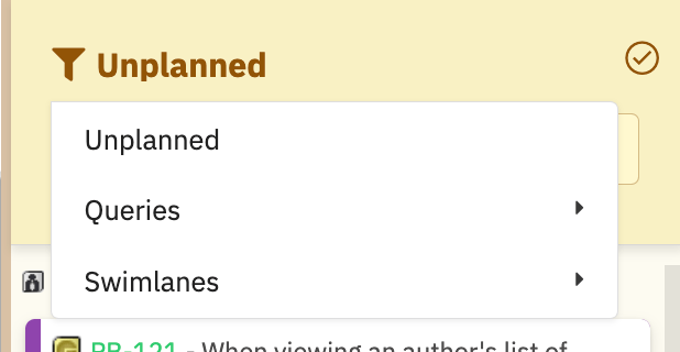
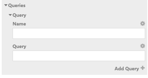 **Example:** Create a query named `Reviewed` with the Lucene query `status:reviewed`. When a user clicks the funnel icon in the sidebar and selects **Reviewed**, the sidebar shows only cards with status `reviewed`.
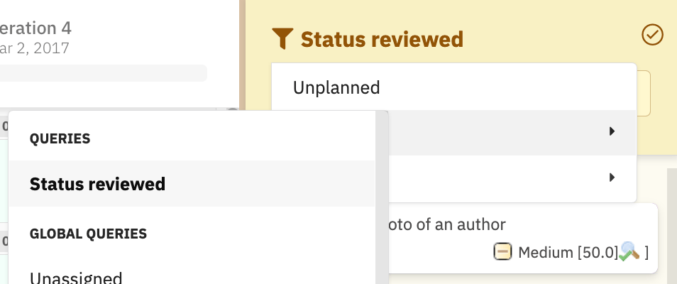
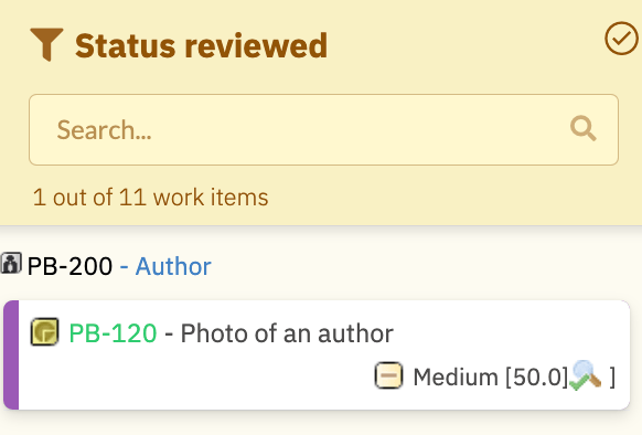
 Define a query for your sprint-ready states (for example, `status:approved`) so the planning team can quickly see which backlog items are ready to drag into the next iteration — without scrolling through unrelated cards.
When a user clicks a card in the unplanned sidebar, the **Work Item Properties** sidebar opens showing configurable fields. These are set via the `PARAMETER_SIDEBAR_FIELDS` widget parameter (defaults to `title`, `status`, `plannedIn`).
1. In the widget parameters editor, find **Sidebar Fields**.
2. Add the field IDs you want users to see when clicking a card.
```properties theme={null}
PARAMETER_SIDEBAR_FIELDS=title,status,plannedIn,assignee
```
Users can also personalize their sidebar view using the **Select Fields** (gear icon) button in the sidebar. Fields added this way apply only to that user and affect all work items of the same type.
## Using sidebar filters at runtime
Once configured, users interact with the sidebar filters in several ways:
**Filter by assignee or team**
Click the funnel icon to filter cards by assignee or team. If custom queries are defined, they appear here as selectable filters.
**Hide verified work items**
Click the upper-right button in the sidebar to filter out cards with the `Verified` status.
**Filter out already-planned verified items**
The **Filter columns** option hides verified cards that are already assigned to a Plan.
Once a card with the `Verified` status has been placed on the board, it is locked — it cannot be dragged or unplanned. If you need to reschedule a verified item, change its status first in Polarion.
**Resource filter and query filter are mutually exclusive**
Filtering by resource and filtering by query cannot be active simultaneously. Activating one clears the other. Use **Clear filter** to remove all active filters (this does not clear the search text or the verified toggle).
**Search**
The search box performs real-time, case-insensitive text search across card content and parent names. Search combines with other active filters.
## Verification
After saving the widget parameters, reload the Planningboard page. You should now see:
* The unplanned sidebar showing cards grouped under parent items (if `PARAMETER_US_DEPTH` is `1` or higher).
* The funnel icon in the sidebar, with your custom queries listed when clicked.
* The sidebar header showing an item count in the format `X out of Y work items`.
* Dragging a card from the sidebar onto a Plan column assigns it and removes it from the sidebar.
Use the **Show Unplanned** toolbar button to hide the sidebar when you need more horizontal space to review the board, then show it again when you need to drag in more cards.
## See also
* [Widget Parameters Overview](/planningboard/guides/configuration/widget-parameters)
* [Configure Work Items Dataset](/planningboard/guides/configuration/work-items-configuration)
* [Manage Unplanned Backlog](/planningboard/guides/planning/unplanned-backlog)
* [Drag and Drop Planning](/planningboard/guides/planning/drag-and-drop)
* [Basic Board Interactions](/planningboard/getting-started/basic-interactions)
**KB Articles**
* Planningboard Widget Parameters
* Planningboard interface & basic interactions
* Planningboard: Customizable Statistics and Capacity Indicators
**Support Tickets**
* [#5879](https://support.nextedy.com/helpdesk/tickets/5879)
* [#5796](https://support.nextedy.com/helpdesk/tickets/5796)
* [#6174](https://support.nextedy.com/helpdesk/tickets/6174)
**Source Code**
* `PlanningBoardWidget.java`
* `widget.vm`
* `Config.java`
* `viewSetup.vm`
* `PlanningBoardWidgetRenderer.java`
Define a query for your sprint-ready states (for example, `status:approved`) so the planning team can quickly see which backlog items are ready to drag into the next iteration — without scrolling through unrelated cards.
When a user clicks a card in the unplanned sidebar, the **Work Item Properties** sidebar opens showing configurable fields. These are set via the `PARAMETER_SIDEBAR_FIELDS` widget parameter (defaults to `title`, `status`, `plannedIn`).
1. In the widget parameters editor, find **Sidebar Fields**.
2. Add the field IDs you want users to see when clicking a card.
```properties theme={null}
PARAMETER_SIDEBAR_FIELDS=title,status,plannedIn,assignee
```
Users can also personalize their sidebar view using the **Select Fields** (gear icon) button in the sidebar. Fields added this way apply only to that user and affect all work items of the same type.
## Using sidebar filters at runtime
Once configured, users interact with the sidebar filters in several ways:
**Filter by assignee or team**
Click the funnel icon to filter cards by assignee or team. If custom queries are defined, they appear here as selectable filters.
**Hide verified work items**
Click the upper-right button in the sidebar to filter out cards with the `Verified` status.
**Filter out already-planned verified items**
The **Filter columns** option hides verified cards that are already assigned to a Plan.
Once a card with the `Verified` status has been placed on the board, it is locked — it cannot be dragged or unplanned. If you need to reschedule a verified item, change its status first in Polarion.
**Resource filter and query filter are mutually exclusive**
Filtering by resource and filtering by query cannot be active simultaneously. Activating one clears the other. Use **Clear filter** to remove all active filters (this does not clear the search text or the verified toggle).
**Search**
The search box performs real-time, case-insensitive text search across card content and parent names. Search combines with other active filters.
## Verification
After saving the widget parameters, reload the Planningboard page. You should now see:
* The unplanned sidebar showing cards grouped under parent items (if `PARAMETER_US_DEPTH` is `1` or higher).
* The funnel icon in the sidebar, with your custom queries listed when clicked.
* The sidebar header showing an item count in the format `X out of Y work items`.
* Dragging a card from the sidebar onto a Plan column assigns it and removes it from the sidebar.
Use the **Show Unplanned** toolbar button to hide the sidebar when you need more horizontal space to review the board, then show it again when you need to drag in more cards.
## See also
* [Widget Parameters Overview](/planningboard/guides/configuration/widget-parameters)
* [Configure Work Items Dataset](/planningboard/guides/configuration/work-items-configuration)
* [Manage Unplanned Backlog](/planningboard/guides/planning/unplanned-backlog)
* [Drag and Drop Planning](/planningboard/guides/planning/drag-and-drop)
* [Basic Board Interactions](/planningboard/getting-started/basic-interactions)
**KB Articles**
* Planningboard Widget Parameters
* Planningboard interface & basic interactions
* Planningboard: Customizable Statistics and Capacity Indicators
**Support Tickets**
* [#5879](https://support.nextedy.com/helpdesk/tickets/5879)
* [#5796](https://support.nextedy.com/helpdesk/tickets/5796)
* [#6174](https://support.nextedy.com/helpdesk/tickets/6174)
**Source Code**
* `PlanningBoardWidget.java`
* `widget.vm`
* `Config.java`
* `viewSetup.vm`
* `PlanningBoardWidgetRenderer.java`