> ## Documentation Index
> Fetch the complete documentation index at: https://learn.nextedy.com/llms.txt
> Use this file to discover all available pages before exploring further.
# Configure Dependencies Display
> Enable dependency visualization on the Nextedy PLANNINGBOARD so that link relationships between cards are drawn as arrows, making scheduling conflicts and blockers immediately visible.
## Prerequisites
* A Planningboard widget is already embedded in a Polarion LiveDoc or Wiki page.
* The Polarion work item link roles you want to visualize already exist in the project (for example, `depends_on`, `blocks`, or a custom link role).
* You have permission to edit widget parameters on the page.
1. Navigate to the Polarion page containing the Planningboard widget.
2. Click **Edit** to enter page editing mode.
3. Open the widget's parameter editor (click the widget configuration icon or choose **Edit Widget Parameters** from the widget context menu).
In the **Parameters for Work Items** section, locate the **Dependency Roles** field.
Enter one or more work item link role IDs that should be treated as dependencies. Separate multiple roles with a comma.
```text theme={null}
Dependency Roles: depends_on
```
Or for multiple roles:
```text theme={null}
Dependency Roles: depends_on, blocks
```
Enter the internal link role ID exactly as defined in the Polarion project configuration — not the display label. Wrong IDs are silently ignored: no dependency arrows will appear, and no error is shown. Check **Administration > Work Items > Link Roles** to confirm the exact ID.
In Polarion, go to **Administration > Work Items > Link Roles** to see all defined roles and their IDs. Common defaults include `depends_on` and `parent`. Custom project roles vary.
Save the widget parameters and reload the page to apply the change.
With `Dependency Roles` configured, the **Show Dependencies** button in the Planningboard toolbar becomes functional.
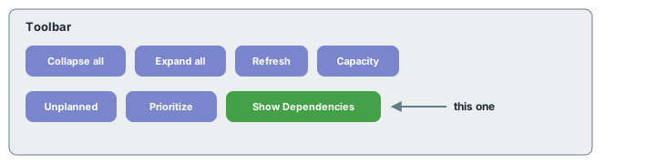 Click **Show Dependencies** to toggle dependency arrows on for all cards currently visible on the board. Clicking it again hides the arrows.
The toolbar **Show Dependencies** button reveals all dependency arrows for the entire board at once. The per-card **Show Links** quick action (hover over a card) shows only links for that specific card and dims all others. Both use the same `Dependency Roles` configuration.
When you need to trace a single card's dependencies without visual clutter:
1. Hover over the card whose dependencies you want to inspect.
2. Click the **Show Links** icon (chain link icon) that appears in the card's upper-right corner.
3. All other cards are dimmed; only the selected card and its directly linked cards remain highlighted.
4. Click the icon again or click elsewhere to return to the full board.
To create a new dependency link between two cards directly on the board:
1. Hover over the source card and click the **Add Link** icon (also in the upper-right corner).
2. The same icon appears on all other cards. A red icon means a link already exists.
3. Click the target card to establish the link. Click a card with a red icon to remove that link.
## How dependency arrows are visualized
The diagram below shows how dependencies flow between cards across columns (Plans):
Click **Show Dependencies** to toggle dependency arrows on for all cards currently visible on the board. Clicking it again hides the arrows.
The toolbar **Show Dependencies** button reveals all dependency arrows for the entire board at once. The per-card **Show Links** quick action (hover over a card) shows only links for that specific card and dims all others. Both use the same `Dependency Roles` configuration.
When you need to trace a single card's dependencies without visual clutter:
1. Hover over the card whose dependencies you want to inspect.
2. Click the **Show Links** icon (chain link icon) that appears in the card's upper-right corner.
3. All other cards are dimmed; only the selected card and its directly linked cards remain highlighted.
4. Click the icon again or click elsewhere to return to the full board.
To create a new dependency link between two cards directly on the board:
1. Hover over the source card and click the **Add Link** icon (also in the upper-right corner).
2. The same icon appears on all other cards. A red icon means a link already exists.
3. Click the target card to establish the link. Click a card with a red icon to remove that link.
## How dependency arrows are visualized
The diagram below shows how dependencies flow between cards across columns (Plans):
 Cards with unresolved predecessors in earlier columns indicate scheduling risks: the dependent card may be planned before its dependency is complete.
## Configuration example
The following widget parameter snippet shows a typical dependency configuration alongside related work item parameters:
```properties theme={null}
# Work Items parameters
query = type:story
sortBy = priority
dependencyRoles = depends_on,blocks
sidebarFields = title,status,plannedIn
```
Dependency arrows are only drawn between cards that are currently loaded on the board. If a predecessor card is outside the current plan range (filtered out by **Show # of last plans** / **Show # of next plans**), its arrow will not appear even if the link exists in Polarion. Increase the plan window if you need to trace cross-sprint dependencies.
## Verification
After completing these steps you should see:
* A **Show Dependencies** button is active in the toolbar (it was previously greyed out or had no effect without `Dependency Roles` configured).
* Clicking **Show Dependencies** draws arrow lines between cards that have links of the configured role types.
* Hovering over a card and clicking **Show Links** highlights only that card's direct links.
* Clicking **Add Link** on a card, then clicking another card, creates a new Polarion link of the configured role between the two work items.
If no arrows appear after enabling **Show Dependencies**, verify the link role IDs are correct (Step 2) and that linked cards are both within the loaded plan range.
## See also
* [Widget Parameters Overview](/planningboard/guides/configuration/widget-parameters) — full reference for all widget parameters including `Dependency Roles` and `Sidebar Fields`
* [Visualize and Manage Dependencies](/planningboard/guides/planning/dependencies) — planning workflow for working with dependencies day-to-day
* [Basic Board Interactions](/planningboard/getting-started/basic-interactions) — card quick actions including Show Links and Add Link
* [Configure Plans (Columns)](/planningboard/guides/configuration/plans-configuration) — controlling which Plans (and therefore which cards) are visible on the board
**KB Articles**
* Planningboard Widget Parameters
* Planningboard: Customizable Statistics and Capacity Indicators
* Planningboard interface & basic interactions
**Support Tickets**
* [#6174](https://support.nextedy.com/helpdesk/tickets/6174)
* [#5879](https://support.nextedy.com/helpdesk/tickets/5879)
* [#5796](https://support.nextedy.com/helpdesk/tickets/5796)
**Source Code**
* `PlanningBoardWidget.java`
* `widget.vm`
* `Config.java`
* `viewSetup.vm`
* `planningboard.js`
Cards with unresolved predecessors in earlier columns indicate scheduling risks: the dependent card may be planned before its dependency is complete.
## Configuration example
The following widget parameter snippet shows a typical dependency configuration alongside related work item parameters:
```properties theme={null}
# Work Items parameters
query = type:story
sortBy = priority
dependencyRoles = depends_on,blocks
sidebarFields = title,status,plannedIn
```
Dependency arrows are only drawn between cards that are currently loaded on the board. If a predecessor card is outside the current plan range (filtered out by **Show # of last plans** / **Show # of next plans**), its arrow will not appear even if the link exists in Polarion. Increase the plan window if you need to trace cross-sprint dependencies.
## Verification
After completing these steps you should see:
* A **Show Dependencies** button is active in the toolbar (it was previously greyed out or had no effect without `Dependency Roles` configured).
* Clicking **Show Dependencies** draws arrow lines between cards that have links of the configured role types.
* Hovering over a card and clicking **Show Links** highlights only that card's direct links.
* Clicking **Add Link** on a card, then clicking another card, creates a new Polarion link of the configured role between the two work items.
If no arrows appear after enabling **Show Dependencies**, verify the link role IDs are correct (Step 2) and that linked cards are both within the loaded plan range.
## See also
* [Widget Parameters Overview](/planningboard/guides/configuration/widget-parameters) — full reference for all widget parameters including `Dependency Roles` and `Sidebar Fields`
* [Visualize and Manage Dependencies](/planningboard/guides/planning/dependencies) — planning workflow for working with dependencies day-to-day
* [Basic Board Interactions](/planningboard/getting-started/basic-interactions) — card quick actions including Show Links and Add Link
* [Configure Plans (Columns)](/planningboard/guides/configuration/plans-configuration) — controlling which Plans (and therefore which cards) are visible on the board
**KB Articles**
* Planningboard Widget Parameters
* Planningboard: Customizable Statistics and Capacity Indicators
* Planningboard interface & basic interactions
**Support Tickets**
* [#6174](https://support.nextedy.com/helpdesk/tickets/6174)
* [#5879](https://support.nextedy.com/helpdesk/tickets/5879)
* [#5796](https://support.nextedy.com/helpdesk/tickets/5796)
**Source Code**
* `PlanningBoardWidget.java`
* `widget.vm`
* `Config.java`
* `viewSetup.vm`
* `planningboard.js`