> ## Documentation Index
> Fetch the complete documentation index at: https://learn.nextedy.com/llms.txt
> Use this file to discover all available pages before exploring further.
# Custom Icons
> Replace the default checklist result state icons with custom Font Awesome icons to match your team's visual conventions.
export const LastReviewed = ({date}) => {
if (!date) return null;
const formatted = new Date(`${date}T00:00:00Z`).toLocaleDateString("en-US", {
year: "numeric",
month: "long",
day: "numeric",
timeZone: "UTC"
});
return
Last reviewed on {formatted}
;
};
## Default Icons
By default, Checklist uses a built-in icon set for the three primary result states:
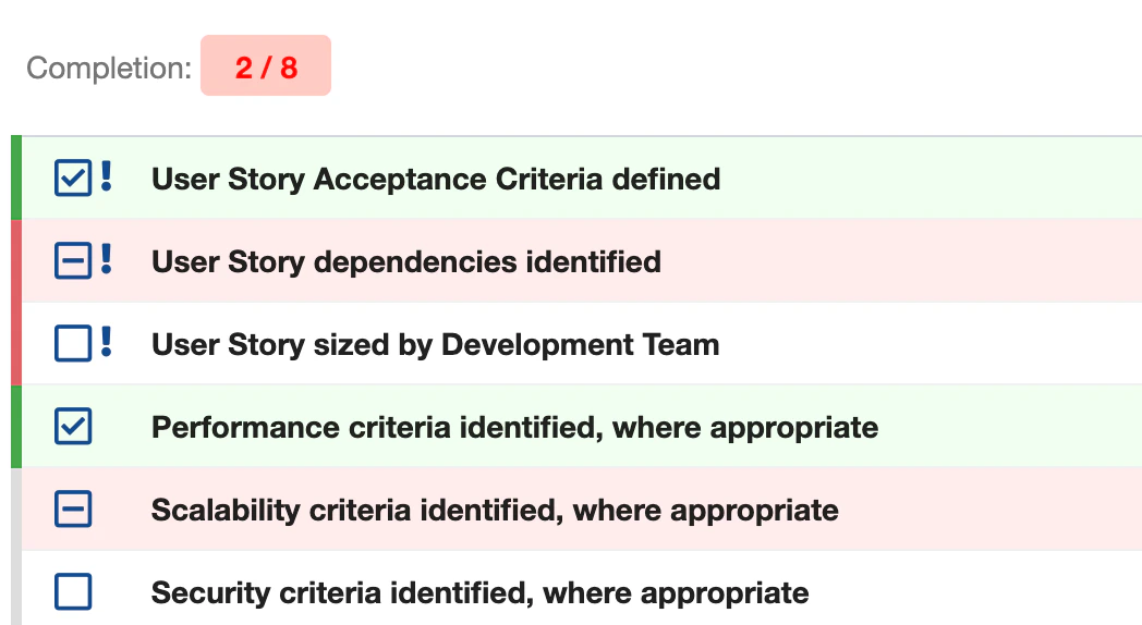 You can change these to any icon from the Font Awesome v5.15 free icon set. For example:
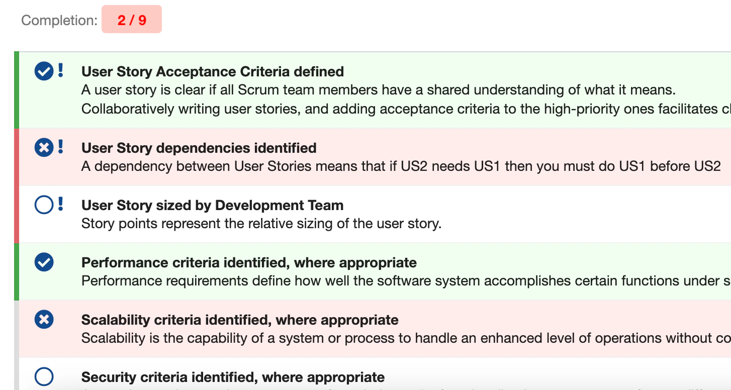 Browse the Font Awesome v5.15 free icon gallery to find icons that suit your use case:
[Font Awesome v5.15 Free Icons](https://fontawesome.com/v5.15/icons?d=gallery\&p=2\&m=free)
Click on an icon to open its detail page and note the CSS class names:
Browse the Font Awesome v5.15 free icon gallery to find icons that suit your use case:
[Font Awesome v5.15 Free Icons](https://fontawesome.com/v5.15/icons?d=gallery\&p=2\&m=free)
Click on an icon to open its detail page and note the CSS class names:
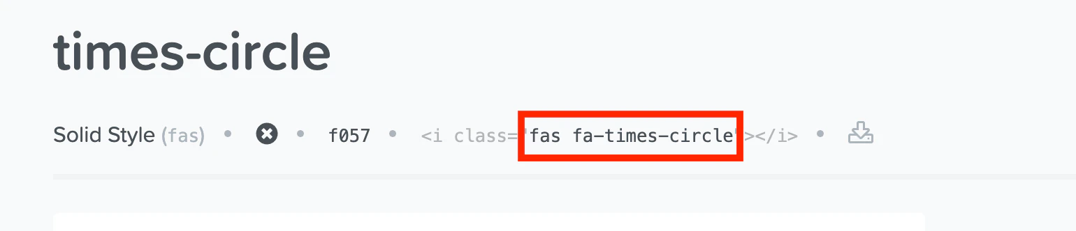 The class format is:
* `fas` -- solid style (filled icons)
* `far` -- regular style (outline icons)
* `fab` -- brand icons
Followed by the icon name, for example `fa-check-circle`.
Checklist bundles Font Awesome v5.15 (free set). Icons from newer versions or the Pro set are not supported. Verify your chosen icon appears in the free gallery before configuring.
Open **Polarion Administration > Configuration Properties** and add the following properties:
```properties theme={null}
nextedy.checklist.checked_sign=fas fa-check-circle
nextedy.checklist.unchecked_sign=fas fa-times-circle
nextedy.checklist.no_sign=far fa-circle
```
Each property maps to a result state:
| Property | Result State | Default Behavior |
| ---------------------------------- | ------------------------- | -------------------------------------------------- |
| `nextedy.checklist.checked_sign` | OK (checked) | Controls the icon shown when an item is marked OK |
| `nextedy.checklist.unchecked_sign` | NOK (rejected) | Controls the icon shown when an item is marked NOK |
| `nextedy.checklist.no_sign` | Empty (not yet addressed) | Controls the icon shown for items with no result |
After saving the configuration properties:
1. Open a work item with a checklist
2. The icons update immediately for all checklist items
3. Click through the result states to verify each icon displays correctly
Custom icon configuration is global -- it applies to all checklists across the project. You do not need to configure icons per checklist field or per work item type.
## Understanding Icon Classes
Font Awesome icons use a two-part class syntax: a style prefix followed by the icon name.
The class format is:
* `fas` -- solid style (filled icons)
* `far` -- regular style (outline icons)
* `fab` -- brand icons
Followed by the icon name, for example `fa-check-circle`.
Checklist bundles Font Awesome v5.15 (free set). Icons from newer versions or the Pro set are not supported. Verify your chosen icon appears in the free gallery before configuring.
Open **Polarion Administration > Configuration Properties** and add the following properties:
```properties theme={null}
nextedy.checklist.checked_sign=fas fa-check-circle
nextedy.checklist.unchecked_sign=fas fa-times-circle
nextedy.checklist.no_sign=far fa-circle
```
Each property maps to a result state:
| Property | Result State | Default Behavior |
| ---------------------------------- | ------------------------- | -------------------------------------------------- |
| `nextedy.checklist.checked_sign` | OK (checked) | Controls the icon shown when an item is marked OK |
| `nextedy.checklist.unchecked_sign` | NOK (rejected) | Controls the icon shown when an item is marked NOK |
| `nextedy.checklist.no_sign` | Empty (not yet addressed) | Controls the icon shown for items with no result |
After saving the configuration properties:
1. Open a work item with a checklist
2. The icons update immediately for all checklist items
3. Click through the result states to verify each icon displays correctly
Custom icon configuration is global -- it applies to all checklists across the project. You do not need to configure icons per checklist field or per work item type.
## Understanding Icon Classes
Font Awesome icons use a two-part class syntax: a style prefix followed by the icon name.
 The `fas` prefix produces filled (solid) icons, while `far` produces outline (regular) icons. Most checklist configurations use `fas` for checked and rejected states (bold, highly visible) and `far` for the empty state (subtle, outline only).
## Common Icon Combinations
Here are some popular icon configurations for different team preferences:
**Circle-based (check/cross/empty):**
```properties theme={null}
nextedy.checklist.checked_sign=fas fa-check-circle
nextedy.checklist.unchecked_sign=fas fa-times-circle
nextedy.checklist.no_sign=far fa-circle
```
This combination uses green-style check circles for OK items, red-style cross circles for NOK items, and an empty circle outline for items not yet addressed. It provides a clean, universally recognizable visual language.
**Square-based (checkbox style):**
```properties theme={null}
nextedy.checklist.checked_sign=fas fa-check-square
nextedy.checklist.unchecked_sign=fas fa-window-close
nextedy.checklist.no_sign=far fa-square
```
Mimics traditional checkbox behavior familiar from paper forms. Good for teams transitioning from paper-based checklists to digital workflows.
**Traffic light (thumbs):**
```properties theme={null}
nextedy.checklist.checked_sign=fas fa-thumbs-up
nextedy.checklist.unchecked_sign=fas fa-thumbs-down
nextedy.checklist.no_sign=fas fa-minus-circle
```
An informal, intuitive style suitable for agile teams that use checklists for lightweight approval or feedback tracking.
**Compliance-oriented:**
```properties theme={null}
nextedy.checklist.checked_sign=fas fa-shield-alt
nextedy.checklist.unchecked_sign=fas fa-exclamation-triangle
nextedy.checklist.no_sign=far fa-question-circle
```
Emphasizes a security and compliance aesthetic. The shield icon for verified items and warning triangle for rejected items communicate the gravity of compliance checklists in regulated environments such as ISO 26262 or IEC 62304 workflows.
## Icon Size Considerations
Font Awesome icons may render at slightly different visual sizes depending on the icon shape. Test your chosen icons together to ensure they look consistent in the checklist UI. Simple geometric shapes (circles, squares) tend to render more uniformly than complex icons.
## Icons in PDF Export
When a checklist is exported to PDF, Checklist converts the interactive UI to a static HTML table. Custom icons are rendered as their Font Awesome equivalents in the PDF output.
Verify that your chosen icons render correctly in PDF exports. Some Font Awesome icons may not display identically in all PDF rendering environments.
## Reverting to Default Icons
To revert to the default icon set, remove the three configuration properties:
1. Open **Polarion Administration > Configuration Properties**
2. Delete `nextedy.checklist.checked_sign`
3. Delete `nextedy.checklist.unchecked_sign`
4. Delete `nextedy.checklist.no_sign`
5. Refresh the work item page
## Verification
After configuring custom icons:
1. Open a work item with a checklist
2. You should now see the custom icons for each result state instead of the defaults
3. Click an item to cycle through OK, NOK, and Empty states
4. Verify all three custom icons appear correctly
5. Open a second work item to confirm the icons apply globally
## See Also
* [Assigning Notes to Items](/checklist/guides/item-notes) -- add contextual notes to checklist items
* [Creating and Managing Templates](/checklist/guides/templates) -- define checklist items with mandatory flags
* [Troubleshooting](/checklist/guides/troubleshooting) -- resolve icon rendering issues
The `fas` prefix produces filled (solid) icons, while `far` produces outline (regular) icons. Most checklist configurations use `fas` for checked and rejected states (bold, highly visible) and `far` for the empty state (subtle, outline only).
## Common Icon Combinations
Here are some popular icon configurations for different team preferences:
**Circle-based (check/cross/empty):**
```properties theme={null}
nextedy.checklist.checked_sign=fas fa-check-circle
nextedy.checklist.unchecked_sign=fas fa-times-circle
nextedy.checklist.no_sign=far fa-circle
```
This combination uses green-style check circles for OK items, red-style cross circles for NOK items, and an empty circle outline for items not yet addressed. It provides a clean, universally recognizable visual language.
**Square-based (checkbox style):**
```properties theme={null}
nextedy.checklist.checked_sign=fas fa-check-square
nextedy.checklist.unchecked_sign=fas fa-window-close
nextedy.checklist.no_sign=far fa-square
```
Mimics traditional checkbox behavior familiar from paper forms. Good for teams transitioning from paper-based checklists to digital workflows.
**Traffic light (thumbs):**
```properties theme={null}
nextedy.checklist.checked_sign=fas fa-thumbs-up
nextedy.checklist.unchecked_sign=fas fa-thumbs-down
nextedy.checklist.no_sign=fas fa-minus-circle
```
An informal, intuitive style suitable for agile teams that use checklists for lightweight approval or feedback tracking.
**Compliance-oriented:**
```properties theme={null}
nextedy.checklist.checked_sign=fas fa-shield-alt
nextedy.checklist.unchecked_sign=fas fa-exclamation-triangle
nextedy.checklist.no_sign=far fa-question-circle
```
Emphasizes a security and compliance aesthetic. The shield icon for verified items and warning triangle for rejected items communicate the gravity of compliance checklists in regulated environments such as ISO 26262 or IEC 62304 workflows.
## Icon Size Considerations
Font Awesome icons may render at slightly different visual sizes depending on the icon shape. Test your chosen icons together to ensure they look consistent in the checklist UI. Simple geometric shapes (circles, squares) tend to render more uniformly than complex icons.
## Icons in PDF Export
When a checklist is exported to PDF, Checklist converts the interactive UI to a static HTML table. Custom icons are rendered as their Font Awesome equivalents in the PDF output.
Verify that your chosen icons render correctly in PDF exports. Some Font Awesome icons may not display identically in all PDF rendering environments.
## Reverting to Default Icons
To revert to the default icon set, remove the three configuration properties:
1. Open **Polarion Administration > Configuration Properties**
2. Delete `nextedy.checklist.checked_sign`
3. Delete `nextedy.checklist.unchecked_sign`
4. Delete `nextedy.checklist.no_sign`
5. Refresh the work item page
## Verification
After configuring custom icons:
1. Open a work item with a checklist
2. You should now see the custom icons for each result state instead of the defaults
3. Click an item to cycle through OK, NOK, and Empty states
4. Verify all three custom icons appear correctly
5. Open a second work item to confirm the icons apply globally
## See Also
* [Assigning Notes to Items](/checklist/guides/item-notes) -- add contextual notes to checklist items
* [Creating and Managing Templates](/checklist/guides/templates) -- define checklist items with mandatory flags
* [Troubleshooting](/checklist/guides/troubleshooting) -- resolve icon rendering issues